散布図を書くにはscatterを使う。
以下にいくつかの例を示す。
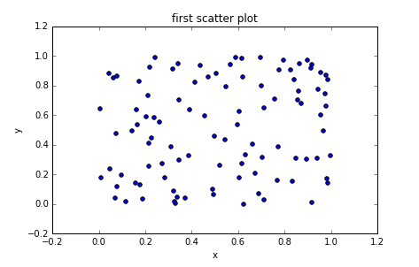
単純な散布図
下記は最も単純な散布図の例。
import numpy as np
import matplotlib.pyplot as plt

# generate data
x = np.random.rand(100)
y = np.random.rand(100)

fig = plt.figure()

ax = fig.add_subplot(1,1,1)

ax.scatter(x,y)

ax.set_title('first scatter plot')
ax.set_xlabel('x')
ax.set_ylabel('y')

fig.show()
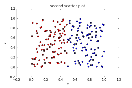
データごとに色を変える
パラメータにc='red'のように指定して色を変えることができる。
import numpy as np
import matplotlib.pyplot as plt

# generate data
x1 = np.random.rand(100)*0.5
y1 = np.random.rand(100)

x2 = np.random.rand(100)*0.5 + 0.5
y2 = np.random.rand(100)

fig = plt.figure()

ax = fig.add_subplot(1,1,1)

ax.scatter(x1,y1, c='red')
ax.scatter(x2,y2, c='blue')

ax.set_title('second scatter plot')
ax.set_xlabel('x')
ax.set_ylabel('y')

fig.show()
RGBで指定しても同じ結果になる。この時値は0.0 - 1.0の値で指定する。
ax.scatter(x1,y1, c=(1.0,0,0))
ax.scatter(x2,y2, c=(0, 0, 1.0))
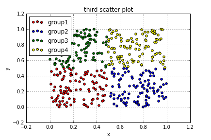
凡例とgrid線の追加
凡例はlegendを使用する。引数で表示する位置を変えることができる。
grid線を引きたい場合はgrid(True)とする。
| 位置 |
|---|
| upper right |
| upper left |
| lower left |
| lower right |
| right |
| center left |
| center right |
| lower center |
| upper center |
| center |
import numpy as np
import matplotlib.pyplot as plt

# generate data
x1 = np.random.rand(100)*0.5
y1 = np.random.rand(100)*0.5

x2 = np.random.rand(100)*0.5 + 0.5
y2 = np.random.rand(100)*0.5

x3 = np.random.rand(100)*0.5
y3 = np.random.rand(100)*0.5 + 0.5

x4 = np.random.rand(100)*0.5 + 0.5
y4 = np.random.rand(100)*0.5 + 0.5

fig = plt.figure()

ax = fig.add_subplot(1,1,1)

ax.scatter(x1,y1, c='red', label='group1')
ax.scatter(x2,y2, c='blue', label='group2')
ax.scatter(x3,y3, c='green', label='group3')
ax.scatter(x4,y4, c='yellow', label='group4')

ax.set_title('third scatter plot')
ax.set_xlabel('x')
ax.set_ylabel('y')

ax.grid(True)

ax.legend(loc='upper left')
fig.show()
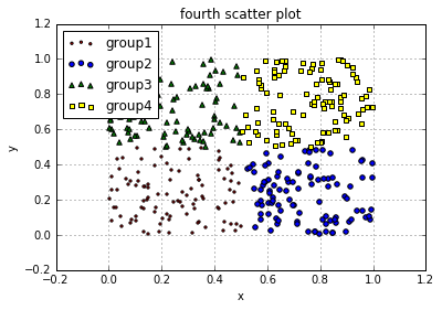
マーカーを変える
マーカーはmarker='o'のように指定する。
代表的な4つのマーカを例に使用した。他にもいろいろある。ここを参照するとよい。
import numpy as np
import matplotlib.pyplot as plt

# generate data
x1 = np.random.rand(100)*0.5
y1 = np.random.rand(100)*0.5

x2 = np.random.rand(100)*0.5 + 0.5
y2 = np.random.rand(100)*0.5

x3 = np.random.rand(100)*0.5
y3 = np.random.rand(100)*0.5 + 0.5

x4 = np.random.rand(100)*0.5 + 0.5
y4 = np.random.rand(100)*0.5 + 0.5

fig = plt.figure()

ax = fig.add_subplot(1,1,1)

ax.scatter(x1,y1, c='red', marker='.', label='group1')
ax.scatter(x2,y2, c='blue',marker='o', label='group2')
ax.scatter(x3,y3, c='green',marker='^', label='group3')
ax.scatter(x4,y4, c='yellow',marker='s', label='group4')

ax.set_title('fourth scatter plot')
ax.set_xlabel('x')
ax.set_ylabel('y')

ax.grid(True)

ax.legend(loc='upper left')
fig.show()
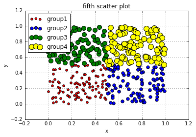
マーカーの大きさを変える
マーカーの大きさはパラメータでs=20のようにする。デフォルトの大きさは20。
import numpy as np
import matplotlib.pyplot as plt

# generate data
x1 = np.random.rand(100)*0.5
y1 = np.random.rand(100)*0.5

x2 = np.random.rand(100)*0.5 + 0.5
y2 = np.random.rand(100)*0.5

x3 = np.random.rand(100)*0.5
y3 = np.random.rand(100)*0.5 + 0.5

x4 = np.random.rand(100)*0.5 + 0.5
y4 = np.random.rand(100)*0.5 + 0.5

fig = plt.figure()

ax = fig.add_subplot(1,1,1)

ax.scatter(x1,y1, c='red', s=20, marker='o', label='group1')
ax.scatter(x2,y2, c='blue',s=40, marker='o', label='group2')
ax.scatter(x3,y3, c='green',s=80, marker='o', label='group3')
ax.scatter(x4,y4, c='yellow',s=120, marker='o', label='group4')

ax.set_title('fifth scatter plot')
ax.set_xlabel('x')
ax.set_ylabel('y')

ax.grid(True)

ax.legend(loc='upper left')
fig.show()