はじめに
CSSアニメーションに関して説明する機会があったため、それらに関してまとめました。
「CSSは書けるがCSSアニメーションがよくわからん!」といった人達向けに書いた記事であり、
CSSアニメーションに関するプロパティを理解できるようになることを目的としています。
デモはCodePen上に置いてあります。編集して変化を見てみると理解が深まると思います。
デモのJavaScriptはjQueryを読み込んでいないと動かないため、ローカル環境でデモを実行する場合はご注意ください。
CSSアニメーションとは
要素をアニメーションさせるCSSの機能。
CSS TransitionとCSS Animationの2つの機能がある。
CSS Transitionとは
プロパティに変更があった時に、一定時間でプロパティを変化させる機能。
単純な動きのアニメーションを実装する時に利用する。
CSS Transitionの利用例
Web Fundamentals

メニューのスライドイン・スライドアウトにCSS Transitionが利用されている。
Udacity

要素をホバー時の色の変化にCSS Transitionが利用されている。
CSS Animationとは
キーフレームアニメーションを適用できる機能。
細かい動きのアニメーションを実装する時に利用する。
キーフレームアニメーションとは
キーフレームアニメーションとはアニメーションの開始(0%)から終了(100%)までの任意の経過地点に
プロパティを指定できるアニメーションのこと。(プロパティを指定した経過地点のことをキーフレームという)
CSS Animationの利用例
Single Element CSS Spinners

ローディングアニメーションにCSS Animationが利用されている。
何故CSSアニメーションを利用するのか
- JavaScriptが不要
- 単純なアニメーションならJavaScriptを利用するより実装が容易。
- JavaScriptが書けない人でもアニメーションの実装ができる。
- JavaScriptを利用したアニメーションと比べてパフォーマンスの遜色はない。(利用シーンや実装方法によっては優れていることもある。)
など手軽さやパフォーマンスの点において魅力的だから。
現状、CSSアニメーションが利用されているサイトは多い。
※JavaScriptが不要と書いてありますが、あくまでCSSアニメーションはアニメーション機能しか有していないため、クリック等の何らかのアクションの後にアニメーションを開始させたい場合は、JavaScriptも必要になります。
CSSアニメーションの使いどころ
アニメーションの実装はなんでもCSSアニメーションを利用すれば良いというわけではない。
以下のページを見てみると、CSSアニメーションを利用した複雑なアニメーションが多数あるが、
「CSSアニメーションだけでこんなことができるぜ!(コストは度外視)」という意図を感じられるデモもある。
そのため、利用シーンにあわせて使い分ける。
UI 要素の状態の切り替えなど、単純な「ワンショット」遷移にはCSS アニメーションを使用します。
バウンド、停止、一時停止、巻き戻し、スローダウンなど、高度な効果を実現したい場合はJavaScript アニメーションを使用します。
CSSアニメーションの利用方法
CSS TransitionとCSS Animationを利用するためには以下のプロパティを指定する。
CSS Transitionを利用できるプロパティ
- transition
- transition-property
- transition-duration
- transition-delay
- transition-timing-function
CSS Animationを利用できるプロパティ
- animation
- animation-name
- animation-duration
- animation-timing-function
- animation-delay
- animation-iteration-count
- animation-direction
- animation-fill-mode
- animation-play-state
またCSS Animationを利用するためには
適用するキーフレームアニメーションを@keyframesで定義する必要がある。
詳細はそれぞれのデモの後に記載。
CSS Transitionを利用したアニメーションを実装してみる
CSS Transitionを利用するために、transitionを指定して要素をアニメーションさせてみる。
要素をホバーした時にアニメーションさせてみる
以下は、.boxをホバーした時にbackgroundとwidthを変更しているデモ。
backgroundが#000 → #cccへ、widthが100px → 300pxへ瞬時に変化していることがわかる。

<div class="box"></div>
.box {
  width: 100px;
  height: 100px;
  background: #000;
}

.box:hover {
  background: #ccc;
  width: 300px;
}
これを瞬時にではなく、一定時間で変化させたい。(アニメーションさせたい)
今回は0.3秒かけて変化させたいため、.boxにtransition: all 300ms 0s ease;の記述を追加してみる。
<div class="box"></div>
.box {
  width: 100px;
  height: 100px;
  background: #000;
  transition: all 300ms 0s ease;
}

.box:hover {
  background: #ccc;
  width: 300px;
}
デモを見る
一定時間で変化するようになった。(アニメーションになった。)
このようにtransitionを指定することでアニメーションを実装できる。
また、transitionは複数のプロパティの値をまとめて指定するプロパティのため。
transition: all 300ms 0s ease;を以下のように記述できる。
.box {
  width: 100px;
  height: 100px;
  background: #000;
  transition-property: all;
  transition-duration: 300ms;
  transition-delay: 0s;
  transition-timing-function: ease;
}
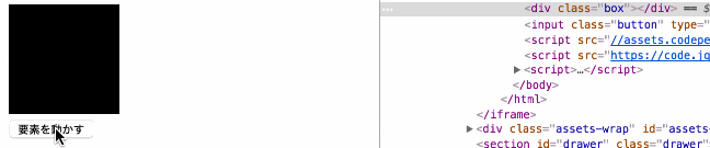
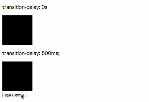
要素にクラスを付けたり消したりしてアニメーションさせてみる
CSS transition自体はプロパティを変更できないため、
上記のデモのように:hover等の疑似クラスや、以下のデモのようにJavaScriptでプロパティを変更する必要がある。
以下は「要素を動かす」ボタンをクリック時に、transformとbackgroundを指定した
.activeを.boxに付けたり消したりしているデモ。
<div class="box"></div>
<input class="button" type="button" value="要素を動かす">
.box {
  width: 100px;
  height: 100px;
  background: #000;
  transition: all 300ms 0s ease;
}

.active {
  transform: translateX(300px);
  background: #ff0000;
}
var $box = $('.box');
var $button = $('.button');

$button.on('click', function(){
  $box.toggleClass('active');
});
transition
以下のプロパティの値をまとめて指定できるプロパティ。
- transition-property
- transition-duration
- transition-delay
- transition-timing-function
transition-property
どのプロパティにアニメーションを適用するか指定するプロパティ。
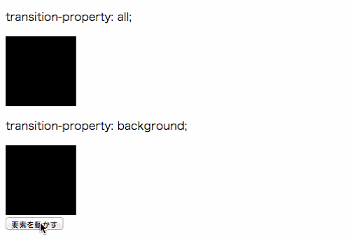
allを指定すると、全てのプロパティにアニメーションを適用する。
下の要素はbackgroundを指定しているため、それ以外のプロパティを変更しても
アニメーションが適用されない。(デモではtransformを変更しているがアニメーションしない)
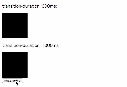
transition-duration
アニメーション開始から終了までの所要時間を指定するプロパティ。
transition-delay
アニメーションが開始するまでの遅延時間を指定するプロパティ。
transition-timing-function
アニメーションのイージングを指定するプロパティ。
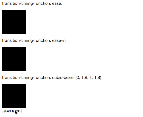
プロパティの値は定義済みの値(ease、linear、ease-in等)かcubic-bezier()で指定する。
CSS Transitionを利用したアニメーションのイベントを取得する
CSS Transitionを利用したアニメーションの開始時や、終了時などのイベントを取得できる。
以下はアニメーション終了時のtransitionendイベントを取得しアニメーション回数を加算しているデモ。
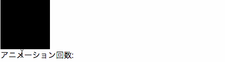
<div class="box"></div>
アニメーション回数:<span class="count"></div>
.box {
  width: 100px;
  height: 100px;
  background: #000;
  transition: all 300ms 0s ease;
}

.box:hover {
  background: #ccc;
  width: 300px;
}
var $box = $('.box');
var $count = $('.count');
var count = 1;

$box.on('transitionend', function(e){
  if (e.originalEvent.propertyName === 'width') {
    $count.text(count++);
  }
});
transitionendイベントはアニメーションを適用したプロパティの数だけイベントが発火するため注意。
デモではbackgroundとwidthをアニメーションさせているため、1回のアニメーションで2回イベントが発火する。
そのため、1回のアニメーションで1回だけ処理を実行したい場合はデモのように
特定のプロパティのアニメーション終了時に処理を実行する。
CSS Animationを利用したアニメーションを実装してみる
CSS Animationを利用するために、animationを指定して要素をアニメーションさせてみる。
要素にrotationという名前のキーフレームアニメーションを適用してアニメーションさせてみる
アニメーションの開始(0%)、中間(50%)、終了(100%)の地点にプロパティを
指定したrotationという名前のキーフレームアニメーションを.boxに適用したい。
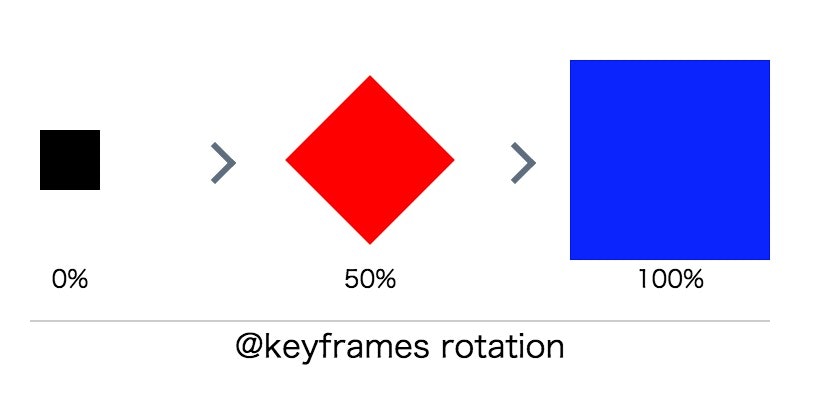
前述のとおり、適用するキーフレームアニメーションは定義する必要があるため、
@keyframesでrotationを定義する。
<div class="box"></div>
.box {
  width: 100px;
  height: 100px;
  background: #000;
}

@keyframes rotation {
  0% {
    transform: scale(.3);
  }

  50% {
    transform: scale(.6) rotate(-45deg);
    background: red;
  }

  100% {
    transform: scale(1) rotate(180deg);
    background: blue;
  }
}
 キーフレームアニメーションを定義しただけなので、
アニメーションはしていない状態。
キーフレームアニメーションを定義しただけなので、
アニメーションはしていない状態。
定義したrotationを.boxに適用するために、
.boxにanimation: rotation 2s ease 0s 1 alternate none running;の記述を追加する。
<div class="box"></div>
.box {
  width: 100px;
  height: 100px;
  background: #000;
  animation: rotation 2s ease 0s 1 alternate none running;
}

@keyframes rotation {
  0% {
    transform: scale(.3);
  }

  50% {
    transform: scale(.6) rotate(-45deg);
    background: red;
  }

  100% {
    transform: scale(1) rotate(180deg);
    background: blue;
  }
}

アニメーションした。
このようにキーフレームアニメーションを@keyframesで定義をし、
animationで指定することでアニメーションを実装できる。
また、animationは複数のプロパティの値をまとめて指定するプロパティのため。
animation: rotation 2s ease 0s 1 alternate none running;を以下のようにも記述できる。
.box {
  width: 100px;
  height: 100px;
  background: #000;
  animation-name: rotation;
  animation-duration: 2s;
  animation-timing-function: ease;
  animation-delay: 0s;
  animation-iteration-count: 1;
  animation-direction: alternate;
  animation-fill-mode: none;
  animation-play-state: running;
}
animation
以下のプロパティの値をまとめて指定できるプロパティ。
- animation-name
- animation-duration
- animation-timing-function
- animation-delay
- animation-iteration-count
- animation-direction
- animation-fill-mode
- animation-play-state
animation-name
要素に適用するキーフレームアニメーションを指定するプロパティ。
キーフレームアニメーションは@keyframesで定義する必要がある。
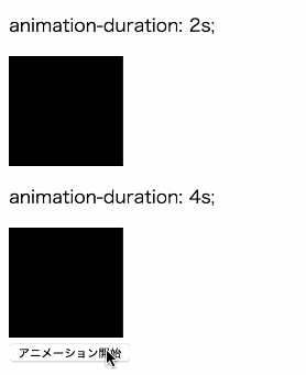
animation-duration
アニメーション開始から終了までの所要時間を指定するプロパティ。
animation-timing-function
アニメーションのイージングを指定するプロパティ。
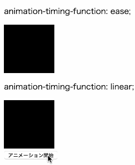
プロパティの値は定義済みの値(ease、linear、ease-in等)かcubic-bezier()で指定する。
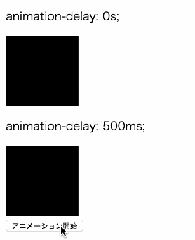
animation-delay
アニメーションが開始するまでの遅延時間を指定するプロパティ。
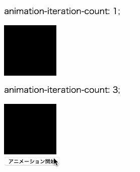
animation-iteration-count
アニメーションのループ回数を指定するプロパティ。
infiniteを指定すると無限ループする。
animation-direction
アニメーションの再生方向を指定するプロパティ。
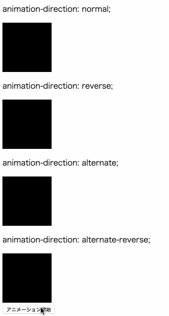
animation-direction: normal;
アニメーションを通常再生する。(0% → 100%)
アニメーションがループの場合、再び始め(0%)から再生する。
animation-direction: reverse;
アニメーションを逆再生する。(100% → 0%)
アニメーションがループの場合、再び逆再生の始め(100%)から再生する。
animation-direction: alternate;
アニメーションを通常再生するが、アニメーションがループの場合
通常再生(0% → 100%) → 逆再生(100% → 0%) → 通常再生(0% → 100%) → 逆再生(100% → 0%)
といった繰り返し順で再生される。
animation-direction: alternate-reverse;
アニメーションを逆再生するが、アニメーションがループの場合
逆再生(100% → 0%) → 通常再生(0% → 100%) → 逆再生(100% → 0%) → 通常再生(0% → 100%)
といった繰り返し順で再生される。
animation-fill-mode
キーフレームアニメーションで指定したプロパティを
アニメーション開始前、終了後に適用するかどうかを指定するプロパティ。
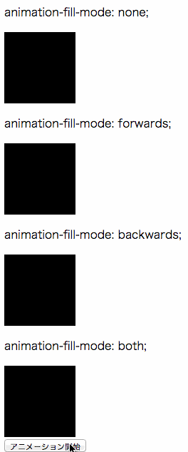
animation-fill-mode: none;
何も適用しない。
animation-fill-mode: forwards;
アニメーション終了後にキーフレームアニメーションで指定したプロパティを適用する。
そのため、アニメーションが終了しても要素はアニメーション終了時(100%)の状態のままになる。
※逆再生だったら(0%)の状態のままになる。
animation-fill-mode: backwards;
アニメーション開始前にキーフレームアニメーションで指定したプロパティを適用する。
そのため、animation-delayで遅延時間を指定し、アニメーションが開始していなくても
要素はアニメーション開始時(0%)の状態になる。
※逆再生だったら(100%)の状態になる。
animation-fill-mode: both;
アニメーション開始前と終了後にキーフレームアニメーションで指定したプロパティを適用する。
forwardsとbackwardsの両方を適用したもの。
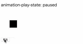
animation-play-state
アニメーションを再生中か一時停止にするプロパティ。
CSS Animationを利用したアニメーションのイベントを取得する
CSS Animationを利用したアニメーションの開始時や、終了時などのイベントをJavaScriptで取得できる。
以下はアニメーション終了時のanimationendイベントを取得しアニメーション回数を加算しているデモ。
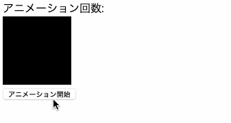
アニメーション回数:<span class="count"></span>
<div class="box"></div>
<input class="button" type="button" value="アニメーション開始">
.box {
  width: 100px;
  height: 100px;
  background: #000;
}

.animation {
  animation: 2s ease 0s 1 normal none running animation;
}

@keyframes animation {
  0% {
    transform: scale(.3);
  }

  50% {
    transform: scale(.6) rotate(-45deg);
    background: red;
  }

  100% {
    transform: scale(1) rotate(180deg);
    background: blue;
  }
}
var $box = $('.box');
var $button = $('.button');
var $count = $('.count');
var isAnimate = false;
var count = 0;

$button.on('click', function(){
  if (isAnimate) {
    return;
  }
  $button.val('アニメーション中');
  $box.addClass('animation');
  isAnimate = true;
});

$box.on('animationend', function(){
  count++;
  $button.val('アニメーション開始')
  $box.removeClass('animation');
  $count.text(count);
  isAnimate = false;
});
CSS Animationに関連するイベントは以下のものが存在する。
- animationstart
- animationend
- animationiteration
CSSアニメーションを利用するうえでの注意点・知っておいた方が良いこと
IE9以下は未対応
CSS TransitionとCSS AnimationはどちらもIE9以下では未対応なため、
transitionやanimationを指定しても動作しないため注意。
そのため、もしIE9以下も対応する必要がある場合、
CSSではなく、JavaScriptでのアニメーションの実装を検討した方が良い。
ベンダープレフィックスを付ける
デモではベンダープレフィックスを付けていないが、
現状、ベンダープレフィックスを付けないと動作しないブラウザもあるため-webkit-は必ず付けたほうが良い。
transitionの場合
.box {
  -webkit-transition: all 300ms 0s ease;
  transition: all 300ms 0s ease;
}
animationの場合
.box {
  -webkit-animation: 2s ease 0s 1 normal none running animation;
  animation: 2s ease 0s 1 normal none running animation;
}

@-webkit-keyframes animation {
  0% {
    transform: scale(.3);
  }

  50% {
    transform: scale(.6) rotate(-45deg);
    background: red;
  }

  100% {
    transform: scale(1) rotate(180deg);
    background: blue;
  }
}

@keyframes animation {
  0% {
    transform: scale(.3);
  }

  50% {
    transform: scale(.6) rotate(-45deg);
    background: red;
  }

  100% {
    transform: scale(1) rotate(180deg);
    background: blue;
  }
}
また、JavaScriptで取得できるイベントも、ベンダープレフィックスを付けないと
ブラウザによっては取得できないので注意。
$('.div').on('transitionend webkitTransitionEnd', function(e) {
  // 処理
});
描画コストが低いプロパティをアニメーションに適用する
アニメーションを適用するプロパティによって描画コストが異なり、パフォーマンスに影響するため
なるべく描画コストが低いtransform等のプロパティを適用する。
※CSSアニメーション入門の記事のためパフォーマンスに関しての詳細は割愛します。とりあえずですが、要素を動かす時はmarginやleft等ではなくtransformを適用した方が良い。ということを覚えておけば良いと思います。
Chrome DevToolsでイージングの動きを見る
Chrome DevToolsを利用すれば、設定したイージングの動きを見ることができるため、
実際にどんな動きをするのか確認しながらの実装ができる。
終わり
CSSアニメーションに関するプロパティを理解できれば、以下のようなコードも理解し易くなると思いますので
実装の参考にしたり手を加えてみるのも良いかと思います。
- CSSのみで実装するボタンデザインやホバーエフェクト 20+α
- コピペでラクラク、押したくなるボタン用HTMLコードスニペット39個まとめ
- SpinKit | Simple CSS Spinners
- Single Element CSS Spinners
とりあえず基本が理解できたら
CSS Animationをゴリゴリ実装する場合、一読をオススメします。
パフォーマンスに関して詳しく知りたい方は以下を読めば理解が深まるかと思います。
- CSS プロパティのアニメーション
- Rendering Performance
- Smooth as Butter: Achieving 60 FPS Animations with CSS3
- モバイルWebのUIを速くする基本テクニックがわかる──Google I/O 2016 High Performance Web UI3
お知らせ
Udemy で webpack の講座を公開したり、Kindle で技術書を出版しています。
Udemy:
webpack 最速入門(10,800 円 -> 2,000 円)
Kindle(Kindle Unlimited だったら無料):
React Hooks 入門(500 円)
興味を持ってくださった方はご購入いただけると大変嬉しいです。よろしくお願いいたします。