#回帰分析
回帰モデルは、連続値をとる目的変数を予測するために使用される
例)
・アイスが何個売れるか予測
・ある人の給与がいくらかを予測
1,線形回帰モデルとは
2,使用データの特性を可視化する
3,勾配降下法を使った回帰
4,RANSACを使ったロバスト回帰
5,線形回帰モデルの性能評価
6,多項式回帰モデル
7,非線形関係のモデリング
##1,線形回帰モデルとは
線形回帰とは単一の特徴量(x)と連続値の応答(y)との関係をモデルとして表現すること
例)気温(x)とアイスの売り上げ(y)
y=W_0 + W_1x

重みと切片を調整することで、「サンプル点を通過する直線のうち、最も適合するものを見つけ出す」
##2,使用データの特性を可視化する
Housingデータセット ボストン近郊の住宅情報データセット(サンプル数 506個)
データセットをインポート
最初の5行を取得する
import pandas as pd

df = pd.read_csv('https://archive.ics.uci.edu/ml/machine-learning-databases/'
                 'housing/housing.data',
                 header=None,
                 sep='\s+')

df.columns = ['CRIM', 'ZN', 'INDUS', 'CHAS',
              'NOX', 'RM', 'AGE', 'DIS', 'RAD',
              'TAX', 'PTRATIO', 'B', 'LSTAT', 'MEDV']
df.head()

このデータの特性を可視化する
探索的データ解析(EDA)は機械学習モデルのトレーニングを行う前の重要なステップとして推奨される
まず、「散布図行列」を作成する
散布図行列を利用すれば、データセットの特徴量ペアに対する相対関係を一つの平面で可視化できる
散布図行列のプロットには、seabornライブラリのpiplot関数を使用する
seaborunでは、matplotlibに基づいて統計グラフを描画するためのpythonライブラリ
import matplotlib.pyplot as plt
import seaborn as sns


sns.set(style='whitegrid', context='notebook')
cols = ['LSTAT', 'INDUS', 'NOX', 'RM', 'MEDV']

sns.pairplot(df[cols], size=2.5)
plt.tight_layout()
# plt.savefig('./figures/scatter.png', dpi=300)
plt.show()

これを見ることで
・データの分布
・外れ値
・カラムとカラムの関係性
カラムとカラムの関係性を見るには、相関行列を作成して見るのがよい
相関行列とは、ピアソンの積率相関係数を成分とする正方行列である
pythonでは
Numpyのcorrcoef関数によってピアソンの積率相関係数を計算する
そしてseabornのheatmap関数を使って相関行列をヒートマップとしてプロットする
import numpy as np


cm = np.corrcoef(df[cols].values.T)
sns.set(font_scale=1.5)
hm = sns.heatmap(cm,
                 cbar=True,
                 annot=True,
                 square=True,
                 fmt='.2f',
                 annot_kws={'size': 15},
                 yticklabels=cols,
                 xticklabels=cols)

# plt.tight_layout()
# plt.savefig('./figures/corr_mat.png', dpi=300)
plt.show()
これによって便利な集計グラフがもうひとつ得られる
##3,scikit-learnによる回帰
scikit-learnのLinearRegressionオブジェクトは標準化されていない変数に適応する
LIBLINEARライブラリや非常に最適化されたアルゴリズムを利用している
from sklearn.linear_model import LinearRegression

X = df[['RM']].values
y = df['MEDV'].values
slr = LinearRegression()
slr.fit(X, y)
y_pred = slr.predict(X)
print('Slope: %.3f' % slr.coef_[0])
print('Intercept: %.3f' % slr.intercept_)
Slope: 9.102
Intercept: -34.671
結果をプロットしてみる
lin_regplot(X, y, slr)
plt.xlabel('Average number of rooms [RM]')
plt.ylabel('Price in $1000\'s [MEDV]')
plt.tight_layout()
# plt.savefig('./figures/scikit_lr_fit.png', dpi=300)
plt.show()

##4,RANSACを使ったロバスト回帰
ロバスト回帰
外れ値の影響を抑えた上で回帰を実行する手法の総称
基本的な考え方としては、外れ値の重みを小さくする
RANSACとは、外れ値を無視して法則性を推定する方法のこと
例えばこんなグラフ

外れ値がとても多い
なのでこれで普通に回帰すると
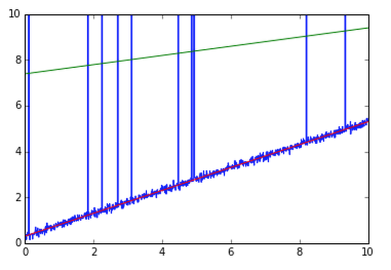
こんなところに線が引かれる
なので外れ値を無視してやると(RANSAC)
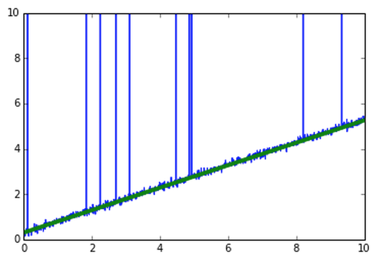
うまくできる
from sklearn.linear_model import RANSACRegressor

if Version(sklearn_version) < '0.18':
    ransac = RANSACRegressor(LinearRegression(),
                             max_trials=100,
                             min_samples=50,
                             residual_metric=lambda x: np.sum(np.abs(x), axis=1),
                             residual_threshold=5.0,
                             random_state=0)
else:
    ransac = RANSACRegressor(LinearRegression(),
                             max_trials=100,
                             min_samples=50,
                             loss='absolute_loss',
                             residual_threshold=5.0,
                             random_state=0)


ransac.fit(X, y)
inlier_mask = ransac.inlier_mask_
outlier_mask = np.logical_not(inlier_mask)

line_X = np.arange(3, 10, 1)
line_y_ransac = ransac.predict(line_X[:, np.newaxis])
plt.scatter(X[inlier_mask], y[inlier_mask],
            c='blue', marker='o', label='Inliers')
plt.scatter(X[outlier_mask], y[outlier_mask],
            c='lightgreen', marker='s', label='Outliers')
plt.plot(line_X, line_y_ransac, color='red')
plt.xlabel('Average number of rooms [RM]')
plt.ylabel('Price in $1000\'s [MEDV]')
plt.legend(loc='upper left')

plt.tight_layout()
# plt.savefig('./figures/ransac_fit.png', dpi=300)
plt.show()

##6,多項式回帰モデル
ここまでの内容は、説明変数と目的変数が線形であることを前提としていた
この前提が外れる場合には、多項式回帰モデルを使用する、という方法がある
y=w_o + w_1x + w_2x^2 + ... + w_dx^d
scikit-learnのPolymialFeatures変換器クラスを使用して、説明変数が一つだけの単縦な回帰問題に対して2次の項を追加し、多項式回帰と線形回帰を比較する
X = np.array([258.0, 270.0, 294.0,
              320.0, 342.0, 368.0,
              396.0, 446.0, 480.0, 586.0])[:, np.newaxis]

y = np.array([236.4, 234.4, 252.8,
              298.6, 314.2, 342.2,
              360.8, 368.0, 391.2,
              390.8])
from sklearn.preprocessing import PolynomialFeatures

lr = LinearRegression()
pr = LinearRegression()
quadratic = PolynomialFeatures(degree=2)
X_quad = quadratic.fit_transform(X)
# fit linear features
lr.fit(X, y)
X_fit = np.arange(250, 600, 10)[:, np.newaxis]
y_lin_fit = lr.predict(X_fit)

# fit quadratic features
pr.fit(X_quad, y)
y_quad_fit = pr.predict(quadratic.fit_transform(X_fit))

# plot results
plt.scatter(X, y, label='training points')
plt.plot(X_fit, y_lin_fit, label='linear fit', linestyle='--')
plt.plot(X_fit, y_quad_fit, label='quadratic fit')
plt.legend(loc='upper left')

plt.tight_layout()
# plt.savefig('./figures/poly_example.png', dpi=300)
plt.show()
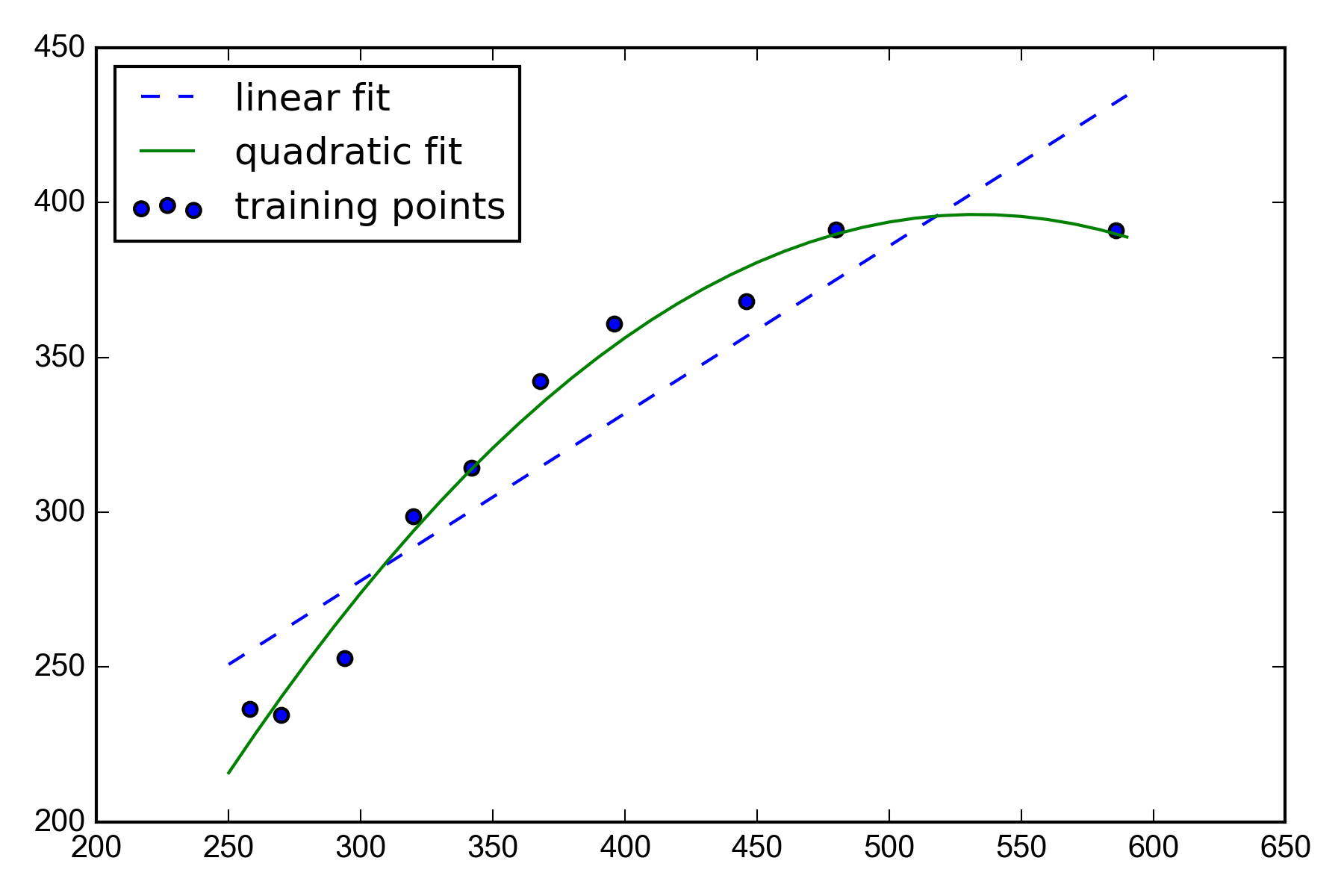
線形回帰より多項式回帰よりもうまく補足していることがわかる
##7,非線形関係のモデリング
決定木による回帰
前述のグローバルな線形回帰モデルや多項式回帰モデルとは対照的に
区分線形関数の和として考えることができる
つまり、決定木アルゴリズムを使って入力空間をより「管理しやすい」小さな領域に分割する
この領域はこの分布
その領域はこの分布
というふうに決めていく
ひとまず決定木でやってみる
from sklearn.tree import DecisionTreeRegressor

X = df[['LSTAT']].values
y = df['MEDV'].values

tree = DecisionTreeRegressor(max_depth=3)
tree.fit(X, y)

sort_idx = X.flatten().argsort()

lin_regplot(X[sort_idx], y[sort_idx], tree)
plt.xlabel('% lower status of the population [LSTAT]')
plt.ylabel('Price in $1000\'s [MEDV]')
# plt.savefig('./figures/tree_regression.png', dpi=300)
plt.show()

これを決定木からランダムフォレストを使うことできる