はいけい
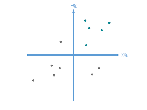
Rで以下のような図をプロットしたかったので、
X軸とY軸をどうやって追加しようか検討してみました.
かいけつさく
矢印についてはggplot2 : Connect observationsなど幾つか方法があるみたいですが、
geom_hline・_vlineを使う以下の方法で一旦満足しました。
plot_quadrant_matrix.R
if (!require("ggplot2")
  install.packages("ggplot2")

library(ggplot2)


df_for_plot <- data.frame(X = c(1,4,-5,2,-7,3,-9,1,9,10),
                          Y = c(5,-3,-5,6,9,10,-10,2,10,-1)
                          )

g <- ggplot(df_for_plot, aes(x = X, y = Y)) +
  ylab("Y") + xlab("X") +
  ggtitle ("Quadrant_matrix") +
  # y軸を追加
  geom_hline(yintercept = 0, size = 0.9, linetype = 1, color = "#5B9BD5") +
  # x軸を追加
  geom_vline(xintercept = 0, size = 0.9, linetype = 1, color = "#5B9BD5") +
  geom_point(color = "#02ccba", size = 5) +
  xlim(-10,10)+ylim(-10,10) +
  theme_minimal(base_family = "HiraKakuPro-W3", base_size = 18)
g
出力
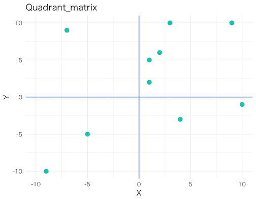
ある程度はイメージを再現できましたが、pointをクリックしたくなったりするので
googleVisなどのAPIを使って作図する方法もカバーしたいと思いました.
さんこう
ggplot2 : Differentiation related aesthetics: linetype, size, shape