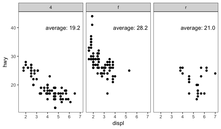
facet_wrap()で分割したグラフ毎に異なる統計値、例えば平均値を書き込むことを目標とする。
用いるデータ
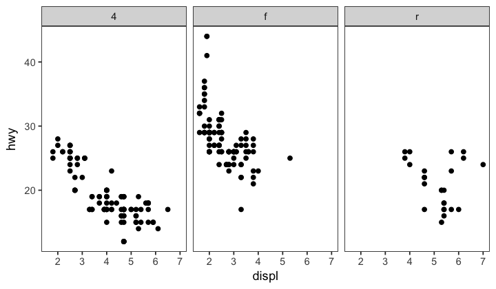
mpgを使い、排気量(displ)と高速燃費(hwy)の間で散布図を描き、駆動方式(drv)でグラフを分割するとする。
library(ggplot2)
p <- ggplot(mpg, aes(displ, hwy)) +
  geom_point() +
  facet_wrap(~drv) +
  theme_bw() +
  theme(panel.grid = element_blank())
p
そして、各駆動方式別に平均値を書き込みたい、とする。
これにはannotate()を使う。annotate()は分割されたグラフに使う場合、分割された枚数と同じ長さのベクトルを与えると、それぞれに対応した値を書き込む。
したがって…
集計し、文字列ベクトルにする
まずはデータを集計し、文字列ベクトルにする。このとき、グラフを分割する方法に対応するように集計する。つまりdrvで分割するのであればdrvでgroupを作って集計する。
library(dplyr)
a <- mpg %>%
  group_by(drv) %>%
  summarize(average = mean(hwy)) %>%
  apply(1, function(x){paste("average:", sprintf("%.1f", as.double(x[2])))})
plotする
あとは文字列ベクトルをannotate()に与える。
p + annotate("text", label = a, x = 7, y = 40, adj = "right")
表形式で書き込みたい場合
## function ----
svp <- function(t){ # 飽和水蒸気圧計算 Alduchov and Eskridge(1996)
  ifelse(t > 0,
         6.1094 * exp(17.625 * t / (243.04 + t)),
         6.1121 * exp(22.587 * t / (273.86 + t)))
}
vpd <- function(t, RH){ #飽差(VPD:水蒸気分圧差)
  svp(t) * (1 - RH/100)
}

## data ----
start <- as.POSIXct("2017/1/1", tz = "UTC")
end <- as.POSIXct("2017/1/4", tz = "UTC")
Time <- seq(start, end, by = "10 min") # 時間
Temp <- sin(seq(0, 3*pi, len = length(Time)) + runif(length(Time))*0.1) * 7 + 10 # 気温
RH <- cos(seq(0, 3*2*pi, len = length(Time)) + runif(length(Time))*0.2) * 5 + 60    # 相対湿度
VPD <- vpd(Temp, RH) # 飽差(VPD)


# テキスト用にデータを集計
tmp <- filter(ondo, day >= start, day <= end) %>%
tmp <- cbind(round(tmp[,2:10],1))

# 日付ごとにラベルを生成
df <- data.frame(Time, day = as.Date(Time), Temp, RH, VPD)
df <- df[-nrow(df),]
df_summary <- df %>% group_by(day) %>%
  summarize(tmax = max(Temp), tmean = mean(Temp), tmin = min(Temp),
            rmax = max(RH),   rmean = mean(RH),   rmin = min(RH),
            dmax = max(VPD),  dmean = mean(VPD),  dmin = min(VPD))
df_summary <- df_summary[,-1]
lab <- apply(df_summary, MARGIN = 1,
             function(x){
               x <- sprintf("%5.1f", x)
               paste(
                 "最高 ",  "平均 ", "最低\n",
                 "相対湿度 ", x[4], " ", x[5], " ", x[6], "\n",
                 "気温 ",     x[1], " ", x[2], " ", x[3], "\n",
                 "飽差 ",     x[7], " ", x[8], " ", x[9],  sep = ""
               )})

gather(df, key = param, value = val, -Time, -day) %>%
  ggplot(aes(x = as.POSIXlt(Time)$hour + as.POSIXlt(Time)$min/60, y = val, col = param)) +
  geom_line() +
  scale_y_continuous(limits = c(0,100)) +
  annotate("text", label = lab, x = 24, y = 90, family = "Osaka-Mono", adj = "right") +
  facet_wrap(~day) +
  theme_bw()
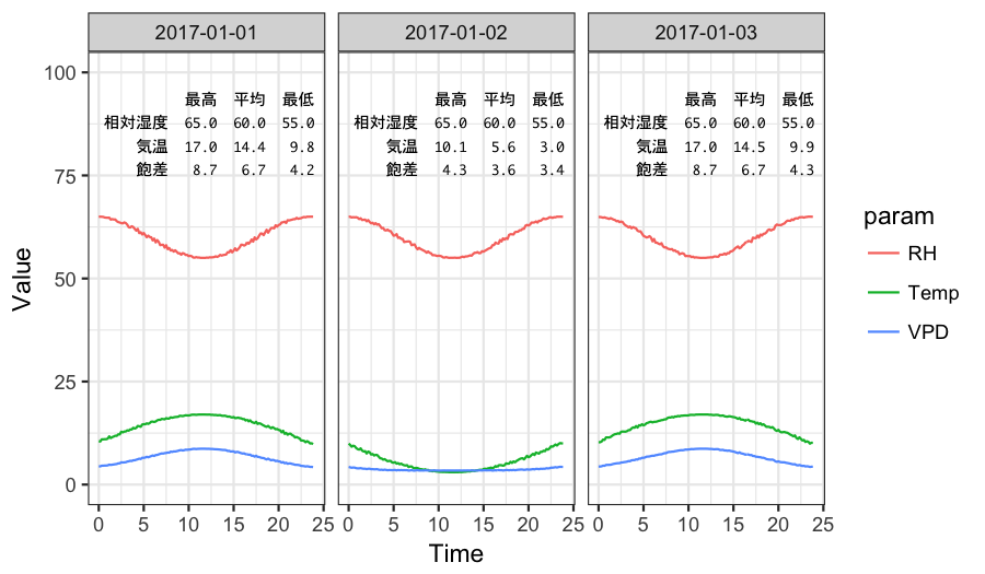
annotation_custom()でなんとかならないかと思ったけどよくわからず結局文字列ベクトルに押し込めるという力技で解決してしまった…。
縦に揃えたい場合はsprintf()で整形して等幅フォントを使うのがポイント。