ニアです、こんにちはー!
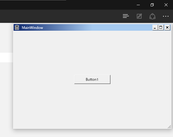
今回はWPFで、Windows 9xのクラッシックテーマのようなウィンドウを再現する方法を紹介していきます。
1. App.xamlにクラッシックスタイルのResourceDictionaryを追加
クラッシックスタイルのコントロールは、.NET Frameworkが標準で用意されているアセンブリを利用するという手があります。
プロジェクトのアセンブリ参照に「PresentationFramework.Classic」を追加し、App.xamlのResourceDictionaryに「/PresentationFramework.Classic, Version=4.0.0.0, Culture=neutral, PublicKeyToken=31bf3856ad364e35;component/themes/classic.xaml」を追加します。
<Application x:Class="ClassicStyle.App"
             xmlns="http://schemas.microsoft.com/winfx/2006/xaml/presentation"
             xmlns:x="http://schemas.microsoft.com/winfx/2006/xaml"
             xmlns:local="clr-namespace:ClassicStyle"
             StartupUri="MainWindow.xaml">
    <Application.Resources>
        <ResourceDictionary Source="/PresentationFramework.Classic, Version=4.0.0.0, Culture=neutral, PublicKeyToken=31bf3856ad364e35;component/themes/classic.xaml"/>
    </Application.Resources>
</Application>
これでボタンなどのコントロールをクラッシックスタイルにすることができました。
2. WindowChromeを利用してクラッシックテーマのウィンドウを作る
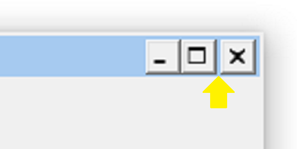
WindowChromeクラスを使って枠なしウィンドウを作り、右上にキャプションボタンを配置します。
ボタンにはStyleに何も入れず、1.で追加したクラッシックスタイルを適用します。
<Window x:Class="ClassicStyle.MainWindow"
        x:Name="MainWindow1"
        xmlns="http://schemas.microsoft.com/winfx/2006/xaml/presentation"
        xmlns:x="http://schemas.microsoft.com/winfx/2006/xaml"
        xmlns:d="http://schemas.microsoft.com/expression/blend/2008"
        xmlns:mc="http://schemas.openxmlformats.org/markup-compatibility/2006"
        xmlns:local="clr-namespace:ClassicStyle"
        mc:Ignorable="d"
        ResizeMode="CanResizeWithGrip"
        Title="MainWindow" Height="350" Width="525"
        Icon="small.ico">

    <Window.Resources>

        <!-- Window用カラー -->
        <SolidColorBrush x:Key="ClassicMainBackgroundKey" Color="#FFF0F0F0"/>
        <SolidColorBrush x:Key="ClassicMainForegroundKey" Color="Black"/>
        <SolidColorBrush x:Key="ClassicMainBorderBrushKey" Color="#FFF0F0F0"/>

        <!-- Converter -->
    </Window.Resources>

    <WindowChrome.WindowChrome>
        <WindowChrome CaptionHeight="{x:Static SystemParameters.CaptionHeight}"
                      ResizeBorderThickness="{x:Static SystemParameters.WindowResizeBorderThickness}"
                      GlassFrameThickness="0,0,0,1"/>
    </WindowChrome.WindowChrome>

    <Window.CommandBindings>
        <!-- 略 -->
    </Window.CommandBindings>

    <Border BorderBrush="{StaticResource ClassicMainBorderBrushKey}"
            BorderThickness="2"
            Background="{StaticResource ClassicMainBackgroundKey}">
        <Grid>

            <!-- 上からタイトルバー、コンテンツ -->
            <Grid.RowDefinitions>
                <RowDefinition Height="{x:Static SystemParameters.CaptionHeight}"/>
                <RowDefinition Height="*"/>
            </Grid.RowDefinitions>

            <!-- タイトルバー -->
            <Grid Grid.Row="0">

                <!-- 左からアイコン、タイトル、コマンドボタン -->
                <Grid.ColumnDefinitions>
                    <ColumnDefinition Width="Auto"/>
                    <ColumnDefinition Width="*"/>
                    <ColumnDefinition Width="Auto"/>
                </Grid.ColumnDefinitions>

                <Image Grid.Column="0"
                       Margin="3"
                       Source="{Binding Icon, ElementName=MainWindow1}"/>

                <!-- ウィンドウタイトルを表示します。 -->
                <Grid Grid.Column="1">
                    <StackPanel HorizontalAlignment="Left"
                                VerticalAlignment="Center">
                        <TextBlock Text="{Binding Title, ElementName=MainWindow1}"
                                   Foreground="White"
                                   Padding="5,0"/>
                    </StackPanel>
                </Grid>

                <!-- 最小化、最大化、閉じるボタンを設置します。 -->
                <Grid Grid.Column="2">
                    <StackPanel Orientation="Horizontal"
                                Margin="0,0,2,0"
                                HorizontalAlignment="Right"
                                VerticalAlignment="Center"
                                TextBlock.FontFamily="Marlett">
                        <Button Content="0"
                                Focusable="False"
                                WindowChrome.IsHitTestVisibleInChrome="True"
                                ToolTip="最小化"
                                Command="{x:Static SystemCommands.MinimizeWindowCommand}" />
                        <Button Content="1"
                                Focusable="False"
                                WindowChrome.IsHitTestVisibleInChrome="True"
                                ToolTip="最大化"
                                Command="{x:Static SystemCommands.MaximizeWindowCommand}"/>
                        <Button Content="r"
                                Focusable="False"
                                WindowChrome.IsHitTestVisibleInChrome="True"
                                Margin="2,0,0,0"
                                ToolTip="閉じる"
                                Command="{x:Static SystemCommands.CloseWindowCommand}"/>
                    </StackPanel>
                </Grid>

            </Grid>

            <!-- コンテンツ -->
            <Grid Grid.Row="1">
                <Button Content="Button1"
                        Margin="10"
                        Width="120" Height="30"
                        HorizontalAlignment="Center"
                        VerticalAlignment="Center"
                        Click="Button_Click"/>
            </Grid>

        </Grid>
    </Border>
</Window>
クラッシックテーマのウィンドウでは、最大化ボタンと閉じるボタンに少し間隔が空いているので、WPFでは両者のいずれか1つをMarginで調節します。
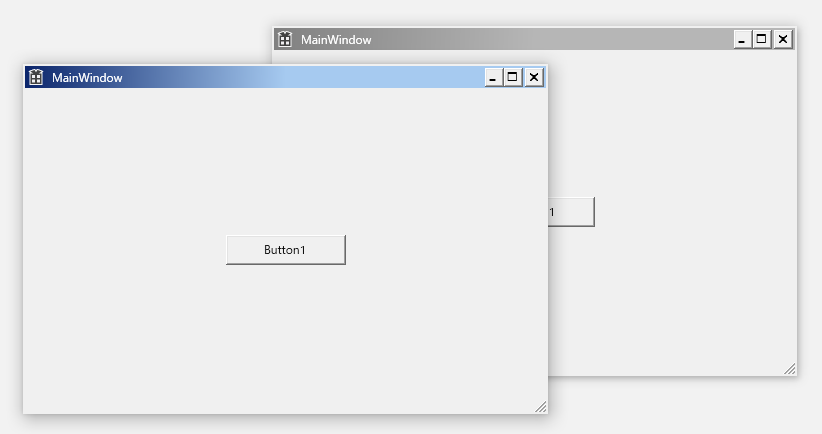
3. データバインディングとIValueConverterでタイトルバーの色を再現
ウィンドウのアクティブ状態(IsActive)に応じたタイトルバーの色を返すConverterクラスを実装します。
using System;
using System.Windows;
using System.Windows.Media;
using System.Windows.Data;
using System.Globalization;

namespace ClassicStyle {

    /// <summary>
    ///     ウィンドウのアクティブ状態に合わせて、タイトルバー部分Background値を調節します。
    /// </summary>
    public sealed class CaptionBarBackgroundConverter : IValueConverter {
        // クラッシックテーマ(Windows Me風)のタイトルバーの色
        static LinearGradientBrush Active = new LinearGradientBrush( Color.FromRgb( 0x0B, 0x25, 0x6B ), Color.FromRgb( 0xA6, 0xCA, 0xF0 ), new Point( 0, 0.5 ), new Point( 0.5, 1 ) );
        static LinearGradientBrush InActive = new LinearGradientBrush( Color.FromRgb( 0x80, 0x80, 0x80 ), Color.FromRgb( 0xB6, 0xB6, 0xB6 ), new Point( 0, 0.5 ), new Point( 0.5, 1 ) );

        public object Convert( object value, Type targetType, object parameter, CultureInfo culture ) =>
            value is bool && ( bool )value ? Active : InActive;

        public object ConvertBack( object value, Type targetType, object parameter, CultureInfo culture ) => null;
    }

}
MainWindow.xamlに先ほどのConverterクラスをリソースに追加し、タイトルバー部分のGridのBackgroundプロパティにWindow.IsActiveとデータバインディングします。
<Window >
    <Window.Resources>
        <!-- 略 -->

        <!-- Converter -->
        <local:CaptionBarBackgroundConverter x:Key="CaptionBarBackgroundConverterKey"/>
    </Window.Resources>

    <!-- 略 -->

    <Border >
        <Grid>

            <!-- 略 -->

            <!-- タイトルバー -->
            <Grid Grid.Row="0"
                  Background="{Binding IsActive,
                              Converter={StaticResource CaptionBarBackgroundConverterKey},
                              ElementName=MainWindow1}">

            <!-- 略 -->

            </Grid>

        <!-- 略 -->

        </Grid>
    </Border>
</Window>
これで、ウィンドウがアクティブ時にはタイトルバーの色が青と水色のグラデーションに、非アクティブの時にはグレーのグラデーションになりました。
4. おわりに
今回作成したクラッシックテーマ風ウィンドウのソースコードは、Gist上にアップしておきます。
あちらではウィンドウを最大化した時にコントロールが画面外にはみ出ないように調節したり、キャプションボタンをWindow.ResizeModeと連動(→ 関連記事)させたりしています。
また、Windows 95やWindows 98風のタイトルバーの色も載せています。
たまにはクラッシックスタイルで、昔を懐かしんでみてはいかがでしょう。
それでは、See you next time!