input type="range"、存在は知っているのになかなか使わないタグの1つかなと思います。
先日初めて使った際におもったよりCSSサンプルが転がっていなかったので
最近若者がよく使っている加工アプリ風のCSSを書いてみようと思います。
今回はスマホ用なので、PCでの表示は考慮しておりません。
また、Androidのアプリを参考にしているのでiPhone版だと違う場合があります。
HTML(共通)
<input type="range" class="input-range" value="100" min="0" max="200" data-unit="%">
デフォルトはこんな見た目です。
Instagram風
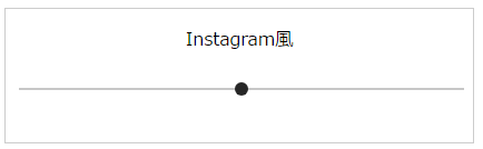
.input-range[type="range"] {
  -webkit-appearance: none;
  appearance: none;
  background-color: #c7c7c7;
  height: 2px;
  width: 100%;

  &:focus,
  &:active {
    outline: none;
  }

  &::-webkit-slider-thumb {
    -webkit-appearance: none;
    appearance: none;
    cursor: pointer;
    position: relative;
    border: none;
    width: 12px;
    height: 12px;
    display: block;
    background-color: #262626;
    border-radius: 50%;
    -webkit-border-radius: 50%;
  }
}
Twitter風
Twitterの公式アプリで写真をアップした際にフィルタ編集するときに出るスライダーです。

つまみを移動させるとき(active)

.input-range[type="range"] {
  -webkit-appearance: none;
  appearance: none;
  background-color: #fff;
  height: 5px;
  width: 100%;
  border-radius: 6px;

  &:focus,
  &:active {
    outline: none;
  }

  &::-webkit-slider-thumb {
    -webkit-appearance: none;
    appearance: none;
    cursor: pointer;
    position: relative;
    border: 2px solid rgba(0, 0, 0, .7);
    width: 22px;
    height: 22px;
    display: block;
    background-color: #fff;
    border-radius: 50%;
    -webkit-border-radius: 50%;
  }

  &:active::-webkit-slider-thumb {
    box-shadow: 0 0 0 4px rgba(255, 255, 255, .6);
    transition: .4s;
  }
}
LINE camera風
LINEカラーの緑が映えますね。
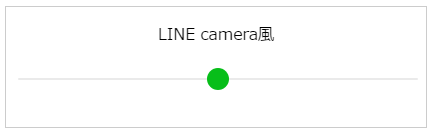
.input-range[type="range"] {
  -webkit-appearance: none;
  appearance: none;
  background-color: #eaeaea;
  height: 2px;
  width: 100%;
  border-radius: 6px;

  &:focus,
  &:active {
    outline: none;
  }

  &::-webkit-slider-thumb {
    -webkit-appearance: none;
    appearance: none;
    cursor: pointer;
    position: relative;
    width: 22px;
    height: 22px;
    display: block;
    background-color: #07be19;
    border-radius: 50%;
    -webkit-border-radius: 50%;
  }
}
snow風
実はスタンプ以外にもフィルターもあるsnow

.input-range[type="range"] {
  -webkit-appearance: none;
  appearance: none;
  background-color: rgba(255, 255, 255, .7);
  height: 2px;
  width: 100%;
  border-radius: 6px;

  &:focus,
  &:active {
    outline: none;
  }

  &::-webkit-slider-thumb {
    -webkit-appearance: none;
    appearance: none;
    cursor: pointer;
    position: relative;
    width: 20px;
    height: 20px;
    display: block;
    border: 1px solid #717171;
    background-color: #fff;
    border-radius: 50%;
    -webkit-border-radius: 50%;
  }
}
BeautyPlus風
ピンクがかわいいです
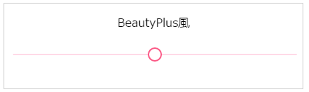
.input-range[type="range"] {
  -webkit-appearance: none;
  appearance: none;
  background-color: #ffdae7;
  height: 2px;
  width: 100%;
  border-radius: 6px;

  &:focus,
  &:active {
    outline: none;
  }

  &::-webkit-slider-thumb {
    -webkit-appearance: none;
    appearance: none;
    cursor: pointer;
    position: relative;
    width: 20px;
    height: 20px;
    display: block;
    border: 2px solid #fb5986;
    background-color: #fff;
    border-radius: 50%;
    -webkit-border-radius: 50%;
  }
}
以上です
こうしてみるとどのアプリも大きさやバーの太さがほぼ同じでした。
今回はCSSでデフォルトの変更だったので、動かしてバーに色を付けるところまでは行っていないのですが、
こちらの素敵なサンプルを参考にすると実装できるみたいです。