トグルボタンとは
トグルボタンとは、ユーザが2つの状態(On/Off)を交互に切り替えることのできるUIです。
AndroidではToggleButtonやCheckBoxがこれに当たります。
API Level 14でON/OFFをわかりやすく切り替えるためのViewとしてSwitchが追加されました。

トグルボタンについてより詳しい解説は以下にあります。
http://developer.android.com/guide/topics/ui/controls/togglebutton.html
問題
残念ながら、SwitchはSupportLibraryに含まれていません。
そのため、API Level 14未満の端末ではSwitchを使うことができません。
解決方法
主な解決方法は2つあります。
ひとつはAPI Level 14未満でも動作するSwitchと似たViewを自作することです。
GitHubでも以下のようなバックポートプロジェクトがいくつか存在します。
BoD/android-switch-backport
https://github.com/BoD/android-switch-backport
もうひとつの方法は、API Levelに応じて表示するViewを差し替える方法です。
API Level 14以降ではSwitch、それ以前の端末であればToggleButtonというように出し分けを行います。
一件複雑に思えますが、Androidではトグルボタン系のViewをまとめてCompoundButtonとして扱うことができるため、レイアウトファイルを分けるだけで簡単に対応することができます。
実装
まず、API Level 14未満の端末向けにToggleButtonを使ったレイアウトを定義します。
レイアウト階層に「API Level 14未満」という記述はできないので、デフォルトレイアウトに定義する形になります。
<RelativeLayout xmlns:android="http://schemas.android.com/apk/res/android"
    xmlns:tools="http://schemas.android.com/tools"
    android:layout_width="match_parent"
    android:layout_height="match_parent"
    tools:context=".MyActivity">

    <ToggleButton
        android:id="@+id/toggle"
        android:layout_width="wrap_content"
        android:layout_height="wrap_content" />

</RelativeLayout>
次に、API Level 14以上の端末向けにSwitchを使ったレイアウトを定義します。
このとき、レイアウトファイル名とトグルボタンのandroid:idはは完全に一致させる必要があります。
<RelativeLayout xmlns:android="http://schemas.android.com/apk/res/android"
    xmlns:tools="http://schemas.android.com/tools"
    android:layout_width="match_parent"
    android:layout_height="match_parent"
    tools:context=".MyActivity">

    <Switch
        android:id="@+id/toggle"
        android:layout_width="wrap_content"
        android:layout_height="wrap_content" />

</RelativeLayout>
最後に、Activity側の処理です。
ソースコード上ではSwitchもToggleButtonも一括してCompoundButtonとして扱います。
CompoundButtonはSwitchのように2つの状態を持つViewの抽象クラスで、状態の取得やリスナ関連の処理などが集約されており、
Switch、ToggleButton、CheckBoxなどはいずれもCompoundButtonを継承したサブクラスになっています。
    @Override
    protected void onCreate(Bundle savedInstanceState) {
        super.onCreate(savedInstanceState);
        setContentView(R.layout.activity);

        CompoundButton toggle = (CompoundButton)findViewById(R.id.compoundButton);
        toggle.setOnCheckedChangeListener(new CompoundButton.OnCheckedChangeListener() {
            @Override
            public void onCheckedChanged(CompoundButton buttonView, boolean isChecked) {
                // 状態が変更された
                Toast.makeText(MyActivity.this, "isChecked : " + isChecked, Toast.LENGTH_SHORT).show();
            }
        });
    }
これでどちらのトグルボタンもタップ時に現在の状態に応じたトーストが表示されるようになります。
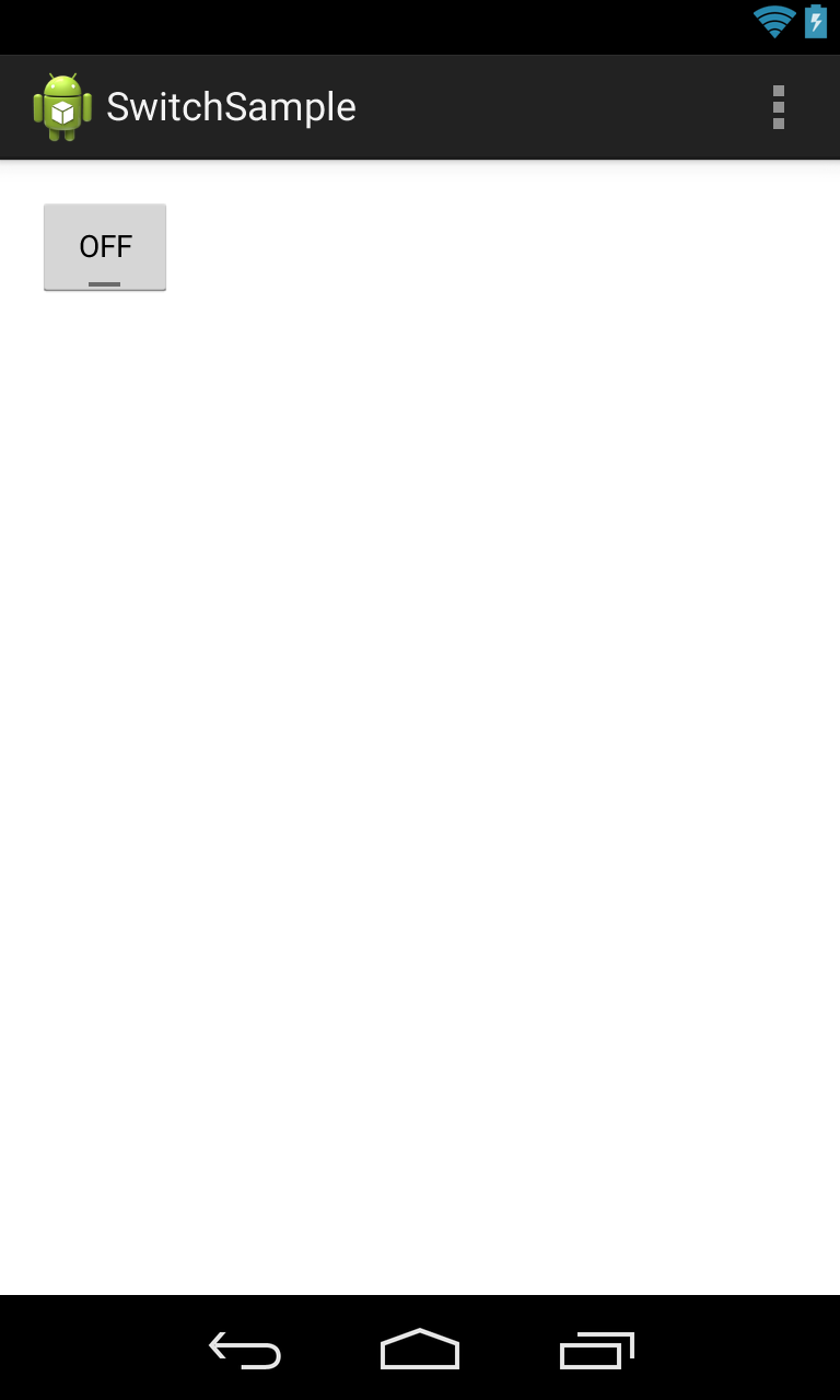
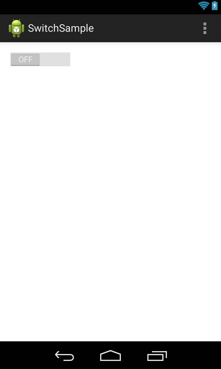
結果
ここまでの実装で、以下のように端末バージョンに応じて表示の出し分けができるようになりました。
1枚目が2.3端末、2枚目が4.4端末での表示となります。