CSSで●(まる)をたくさん描きたくなったときに助かる人がいるかもしれないので、書いておきます。
CSSで一つの要素だけで●(まる)は6つ描けそうです。
※ コメントにて、box-shadowはカンマ区切りで複数指定できるとのご指摘をいただきました。そのため、実質無限にいけます。
やり方
- before、after疑似要素を使う
- box-shadowを使う
コード
HTML
div要素をひとつだけ。
<div id="maru"></div>
CSS
※ SCSSを使ってます
$circle-size: 10vw;
$circle-saturation: 80%;

@mixin marumaru($size, $shadow-hue) {
    display: block;
    border-radius: 50%;
    width: $size;
    height: $size;
    box-shadow: 0 $size 0 hsl($shadow-hue, $circle-saturation, 80%);
}

# maru {
    $my-hue: 0;
    position: absolute;
    left: $circle-size;
    background-color: hsl($my-hue, $circle-saturation, 50%);
    @include marumaru($circle-size, $my-hue);
    &::before {
        $my-hue: 120;
        content: "";
        position: absolute;
        left: -$circle-size;
        background-color: hsl($my-hue, $circle-saturation, 50%);
        @include marumaru($circle-size, $my-hue);
    }
    &::after {
        $my-hue: 240;
        content: "";
        position: absolute;
        left: $circle-size;
        background-color: hsl($my-hue, $circle-saturation, 50%);
        @include marumaru($circle-size, $my-hue);
    }
}
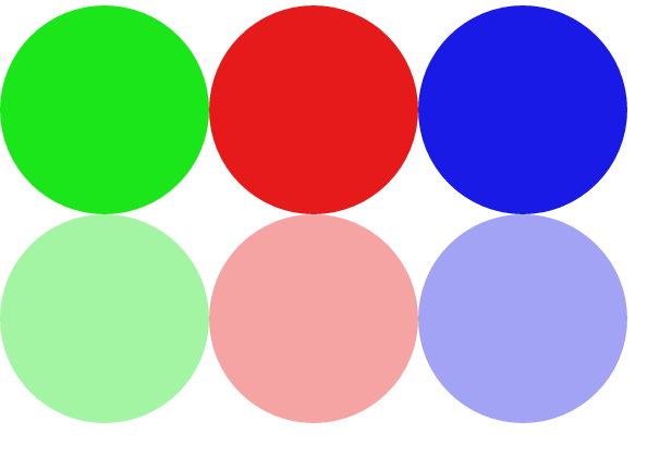
結果
こうなります感じになります。
さいごに
このやり方で、たしかに●はたくさん描けます。
しかし、before・afterの疑似要素では凝ったコンテンツは書けませんし、box-shadowは本体要素の影のためshadowだけの形を変えたりすることはできません。
よって、使い所が限定されてしまう小ネタではありますが、●をたくさん描きたくなったときにお使いください。