seaborn: pythonのデータ可視化ライブラリ。高レベルAPI。綺麗。
0. matplotlibとの使い分け
seabornで用意されてるならseabornを使う。そうじゃないならmatplotlibで描く。matplotlibで描くにしても、スタイルはseabornを使うのがいい(importするだけで設定される)
1. スタイルの設定
styleは default か "white"をよく使う。font_scaleは図を見て調整。
import seaborn as sns
sns.set(style="white", font_scale=1.3, palette="muted", color_codes=True)
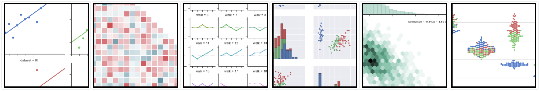
2. seabornでしたいことできるか確認
official doc. の gallery ページを見る。(使えそうな関数は下記に限られるので、関数名で何ができるかイメージできるとリンクを見なくてよくなる。引数の詳細はipythonのヘルプ機能で確認すればいい。)
分布の可視化
関数
* distplot : 1-dim.
* jointplot : 2-dim.
* pairplot : k-dim.
* heatmap: 相関行列引数
- kde: カーネル密度推定
- hist: ヒストグラム
- hue: 条件別の分布推定
回帰
関数
* lmplot: 信頼区間付き回帰引数
- order: 多項式回帰
- logistic: ロジスティック回帰
- hue: 条件別の回帰 (col, row)
カテゴリカルデータ
関数
* stripplot, swarmplot: 散布図
* boxplot, violinplot: 分布の可視化
* barplot, countplot, pointplot: 統計的性質の可視化
* factorplot(hue='key'): 条件別の統計的性質の可視化
3. その他
seabornで用意されているデータセット読み込み
# datasetリスト: https://github.com/mwaskom/seaborn-data
sns.load_dataset('titanic')
軸の除去
sns.despine() # 上と右
sns.despine(left=True) # 左も
color palettes
# 現在のカラーマップ
cmap_current = sns.color_palette()
sns.palplot(cmap_current)
# 新しいカラーマップ
# 参考: http://seaborn.pydata.org/tutorial/color_palettes.html
# 例: key = "set1" (categorical), "Blues" (sequential)
num = 8
cmap = sns.color_palette(key, num)
sns.palplot(cmap)