#経緯
Chart.jsをReact.jsの部品をして使用するための簡単なラッパークラスを作って見ました。以前、 「React.js + Chart.jsでインタラクティブなグラフを書く」で試行錯誤した結果をリファクタリングしてできたものです。うまくできたので、ぜひご紹介させていただこうと思います。
CoffeeScriptでJSXを使用せず書きました。
例えば、複数のシンプルなグラフがあり、かつユーザーがデータを追加・更新できるアプリケーションでのインタラクティブなグラフに活用できると考えています。
#環境
- react-js
- chart-js
#CustomChartメソッド
このメソッドにグラフの処理をまとめました。
引数としてChart.jsのグラフタイプ名を渡すだけで、指定したグラフタイプのReact.js の部品を作ることができます。例えば、"Bar"、"Pie"、 "PolarArea"等があります。使用できるグラフタイプについてはChart.jsドキュメンテーションを参照してください。
@CustomChart = (chartType) ->

  React.createClass
    getInitialState: ->
      chartInstance: null

    # グラフを書くキャンバスを作る。
    render: ->
      React.DOM.canvas
        ref:   @props.name
        style: { height: @props.height, width: @props.width }

    # 部品がDOMに搭載されたら、グラフを初期化。
    componentDidMount: ->
      @initializeChart()

    # 部品がDOMから外されたら、古いグラフを破壊。
    componentWillUnmount: ->
      @state.chartInstance.destroy() if @state.chartInstance

    # 初期化の処理
    initializeChart: ->
      canvas = React.findDOMNode(@refs[@props.name])
      ctx    = canvas.getContext("2d")
      chart  = new Chart(ctx)[chartType](@props.data, @props.options || {})
      @setState.chartInstance = chart
##メリット
- 簡単にChart.jsグラフをReact.jsの中で使用可能。
- 親部品から
CustomChartメソッドで作った部品に新しいデータが渡されると、そのデータに基づきグラフが自動的に更新されます。 -
CustomChartメソッドのみで、複数の異なるタイプのグラフ部品をドライに作ることが可能です。
##使用例
親部品のrenderメソッドの中でReact.createElementを用いオブジェクト化します。propsとして4項目渡す必要があります。
-
name: 後にキャンバスを探す手掛かりとなるものなので、固有の名前をつける。 -
data: グラフ用のデータ。 -
height: キャンバスの高さ。 -
width: キャンバスの幅。
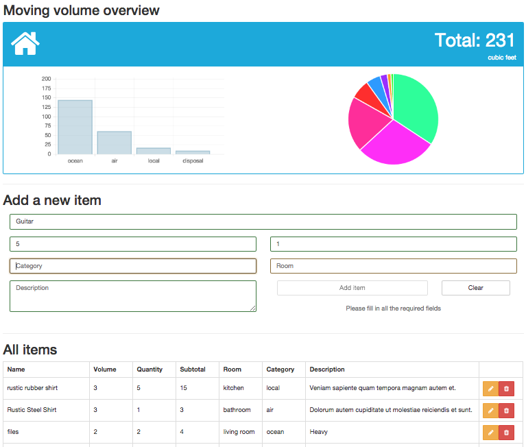
# "Bar"を引数とすると、Bar Chartを作ります。
React.createElement CustomChart("Bar"),
  name: "barChart"         # 固有の名前
  data: @dataForBarChart() # グラフタイプに対応したデータ構造であること
  height: 200
  width:  400

# "Pie"を引数とすると、Pie Chartを作ります。
React.createElement CustomChart("Pie"),
  name: "pieChart"
  data: @dataForPieChart()
  height: 200
  width:  200
グラフに渡すデータはグラフタイプによりデータ構造が異なります。例えば、"Bar"であれば、以下のデータ構造です。その他のグラフタイプのデータ構造については、Chart.jsドキュメンテーションを参照してください。
    labels: ["January", "February", "March", "April", "May", "June", "July"]
    datasets: [
      {
        label:           "My First dataset"
        fillColor:       "rgba(220,220,220,0.5)"
        strokeColor:     "rgba(220,220,220,0.8)"
        highlightFill:   "rgba(220,220,220,0.75)"
        highlightStroke: "rgba(220,220,220,1)"
        data: [65, 59, 80, 81, 56, 55, 40]
      }
      {
        label:           "My Second dataset"
        fillColor:       "rgba(151,187,205,0.5)"
        strokeColor:     "rgba(151,187,205,0.8)"
        highlightFill:   "rgba(151,187,205,0.75)"
        highlightStroke: "rgba(151,187,205,1)"
        data: [28, 48, 40, 19, 86, 27, 90]
      }
    ]
オプション設定を細かくしてしたい場合は、以下の様に必要な項目を設定することが可能です。グラフの種類により、設定項目が異なります。オプション設定項目詳細については、Chart.jsドキュメンテーションを参照してください。
React.createElement CustomChart("Bar"),
  name: "barChart"
  data: @dataForBarChart()
  height: 200
  width:  400
  options: {
    scaleBeginAtZero:         true
    scaleShowGridLines:       true
    scaleGridLineColor:       "rgba(0,0,0,.05)"
    scaleGridLineWidth:       1
    scaleShowHorizontalLines: true
    scaleShowVerticalLines:   true
    barShowStroke:            true
    barStrokeWidth:           2
    barValueSpacing:          5
    barDatasetSpacing:        1
  }
#まとめ
簡単に動的なChart.jsグラフをReact.jsの中で使用できるCustomChartメソッドをシェアさせていただきました。この方法論は色々他にも応用できると思います。今回学んだことを元にいろんな部品を作っていこうと思います。
#Github
https://github.com/mnishiguchi/InteractiveChartComponent
以上です。