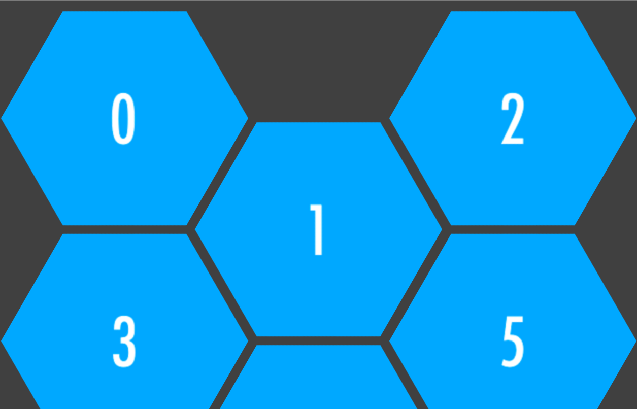
##経緯
- あるWebデザイナーのサイトの綺麗なレスポンシブ六角グリッドレイアウトが気に入ったので、勉強のために関連するCSSを抽出してみた。
- 作者:Rachid Mrad氏( http://www.rachidmrad.com/#/portfolio )
##依存性
- AngularJS, ngAnimate
- Bootstrap
HTML
<div class="wrapper">

  <section class="hex-grid">

    <div
      ng-repeat="item in app.items"
      class="grid-item repeat-animation">

      <div class="inner">
        <div
          class="inner-inner"
          ng-style="{ 'background-image': 'url({{ item.imgSrc }})' }">

          <a
            href=""
            class="grid-info">

            <div class ="inner-text">
              <div class="inner-text-inner">

                <h2>{{ item.name }}</h2>
                <p>{{ item.desc }}</p>

              </div><!-- /.inner-text-inner -->
            </div><!-- /.inner-text -->
          </a><!-- /.grid-info -->
        </div><!-- /.inner-inner -->
      </div><!-- /.inner -->
    </div><!-- /.grid-item -->
  </section><!-- /.hex-grid -->

</div><!-- /.wrapper -->
CSS: The hexagonal grid
.hex-grid {
  position: relative;
  width: 80%;
  left: 10%;
  padding-top: 120px;
}
@media (max-width: 767px) {
  .hex-grid {
    width: 100%;
    left: 0;
  }
}
.hex-grid .grid-item {
  position: relative;
  display: inline-block;
  float: left;
  overflow: hidden;
  visibility: hidden;
  -webkit-transform: rotate(120deg);
  -ms-transform: rotate(120deg);
  transform: rotate(120deg);
  cursor: pointer;
}
@media (max-width: 633px) {
  .hex-grid .grid-item {
    width: 222%;
    margin: 0 -61%;
    margin-bottom: 10px;
  }
}
@media (min-width: 634px) and (max-width: 1022px) {
  .hex-grid .grid-item {
    width: 133%;
    margin: 0 -42%;
    margin-bottom: -25%;
  }
  .hex-grid .grid-item:nth-child(2),
  .hex-grid .grid-item:nth-child(4),
  .hex-grid .grid-item:nth-child(6),
  .hex-grid .grid-item:nth-child(8),
  .hex-grid .grid-item:nth-child(10),
  .hex-grid .grid-item:nth-child(12),
  .hex-grid .grid-item:nth-child(14),
  .hex-grid .grid-item:nth-child(16),
  .hex-grid .grid-item:nth-child(18),
  .hex-grid .grid-item:nth-child(20),
  .hex-grid .grid-item:nth-child(22),
  .hex-grid .grid-item:nth-child(24),
  .hex-grid .grid-item:nth-child(26),
  .hex-grid .grid-item:nth-child(28),
  .hex-grid .grid-item:nth-child(30) {
    margin-top: 28%;
  }
  .hex-grid .grid-item:nth-child(3),
  .hex-grid .grid-item:nth-child(5),
  .hex-grid .grid-item:nth-child(7),
  .hex-grid .grid-item:nth-child(9),
  .hex-grid .grid-item:nth-child(11),
  .hex-grid .grid-item:nth-child(13),
  .hex-grid .grid-item:nth-child(15),
  .hex-grid .grid-item:nth-child(17),
  .hex-grid .grid-item:nth-child(19),
  .hex-grid .grid-item:nth-child(21),
  .hex-grid .grid-item:nth-child(23),
  .hex-grid .grid-item:nth-child(25),
  .hex-grid .grid-item:nth-child(27),
  .hex-grid .grid-item:nth-child(29) {
    clear: left;
  }
}
@media (min-width: 1023px) and (max-width: 1599px) {
  .hex-grid .grid-item {
    width: 91.6%;
    margin: 0 -29.2%;
    margin-bottom: -17.5%;
  }
  .hex-grid .grid-item:nth-child(2),
  .hex-grid .grid-item:nth-child(5),
  .hex-grid .grid-item:nth-child(8),
  .hex-grid .grid-item:nth-child(11),
  .hex-grid .grid-item:nth-child(14),
  .hex-grid .grid-item:nth-child(17),
  .hex-grid .grid-item:nth-child(20),
  .hex-grid .grid-item:nth-child(23),
  .hex-grid .grid-item:nth-child(26),
  .hex-grid .grid-item:nth-child(29) {
    margin-top: 19%;
  }
  .hex-grid .grid-item:nth-child(4),
  .hex-grid .grid-item:nth-child(7),
  .hex-grid .grid-item:nth-child(10),
  .hex-grid .grid-item:nth-child(13),
  .hex-grid .grid-item:nth-child(16),
  .hex-grid .grid-item:nth-child(19),
  .hex-grid .grid-item:nth-child(22),
  .hex-grid .grid-item:nth-child(25),
  .hex-grid .grid-item:nth-child(28) {
    clear: left;
  }
}
@media (min-width: 1600px) {
  .hex-grid .grid-item {
    width: 66.7%;
    margin: 0 -20.9%;
    margin-bottom: -12.5%;
  }
  .hex-grid .grid-item:nth-child(2),
  .hex-grid .grid-item:nth-child(4),
  .hex-grid .grid-item:nth-child(6),
  .hex-grid .grid-item:nth-child(8),
  .hex-grid .grid-item:nth-child(10),
  .hex-grid .grid-item:nth-child(12),
  .hex-grid .grid-item:nth-child(14),
  .hex-grid .grid-item:nth-child(16),
  .hex-grid .grid-item:nth-child(18),
  .hex-grid .grid-item:nth-child(20),
  .hex-grid .grid-item:nth-child(22),
  .hex-grid .grid-item:nth-child(24),
  .hex-grid .grid-item:nth-child(26),
  .hex-grid .grid-item:nth-child(28),
  .hex-grid .grid-item:nth-child(30) {
    margin-top: 14%;
  }
  .hex-grid .grid-item:nth-child(5),
  .hex-grid .grid-item:nth-child(9),
  .hex-grid .grid-item:nth-child(13),
  .hex-grid .grid-item:nth-child(17),
  .hex-grid .grid-item:nth-child(21),
  .hex-grid .grid-item:nth-child(25),
  .hex-grid .grid-item:nth-child(29) {
    clear: left;
  }
}
.hex-grid .grid-item .inner {
  overflow: hidden;
  position: relative;
  width: 100%;
  height: 100%;
  -webkit-transform: rotate(-60deg);
  -ms-transform: rotate(-60deg);
  transform: rotate(-60deg);
}
.hex-grid .grid-item .inner .inner-inner {
  -webkit-transform-style: preserve-3d;
  /* Chrome, Safari, Opera */
  transform-style: preserve-3d;
  visibility: visible;
  overflow: hidden;
  width: 100%;
  padding-bottom: 40%;
  -webkit-transform: rotate(-60deg);
  -ms-transform: rotate(-60deg);
  transform: rotate(-60deg);
  background-repeat: no-repeat;
  background-size: 50%;
  -webkit-transition: all 0.35s ease-out;
  transition: all 0.35s ease-out;
  background-position: 50%;
}
@media (min-width: 1100px) {
  .hex-grid .grid-item .inner .inner-inner {
    padding-bottom: 40%;
  }
}
.hex-grid .grid-item .inner .inner-inner:hover {
  background-size: 60%;
}
.hex-grid .grid-item .inner .inner-inner .grid-info {
  position: absolute;
  top: 0;
  left: 0;
  display: block;
  width: 100%;
  height: 100%;
  padding: 10%;
  background: #ffffff;
  color: #000000;
  text-decoration: none;
  text-align: center;
  z-index: 2;
  opacity: 0;
  filter: alpha(opacity=0);
  -webkit-transition: all 0.35s;
  transition: all 0.35s;
}
.hex-grid .grid-item .inner .inner-inner .grid-info:hover {
  opacity: 1;
  filter: alpha(opacity=100);
}
.hex-grid .grid-item .inner .inner-inner .grid-info .inner-text {
  display: table;
  position: relative;
  height: 100%;
  width: 46%;
  left: 27%;
}
.hex-grid .grid-item .inner .inner-inner .grid-info .inner-text .inner-text-inner {
  display: table-cell;
  vertical-align: middle;
}
.hex-grid .grid-item .inner .inner-inner {
  -webkit-backface-visibility: hidden;
}
CSS: The animation
.repeat-animation.ng-enter-stagger,
.repeat-animation.ng-leave-stagger,
.repeat-animation.ng-move-stagger {
  /* 100ms will be applied between each sucessive enter operation */
     -moz-transition-delay: 0.1s !important;
  -webkit-transition-delay: 0.1s !important;
          transition-delay: 0.1s !important;

  /* this is here to avoid accidental CSS inheritance */
  -webkit-transition-duration: 0 !important;
          transition-duration: 0 !important;
}

.repeat-animation.ng-enter,
.repeat-animation.ng-leave,
.repeat-animation.ng-move {
     -moz-transition: 0.2s ease-in-out all;
  -webkit-transition: 0.2s ease-in-out all;
          transition: 0.2s ease-in-out all;
}

.repeat-animation.ng-leave.ng-leave-active,
.repeat-animation.ng-enter,
.repeat-animation.ng-move {
     -moz-transition: 0.2s ease-in-out all;
  -webkit-transition: 0.2s ease-in-out all;
          transition: 0.2s ease-in-out all;

  opacity:0;
}

.repeat-animation.ng-leave,
.repeat-animation.ng-move.ng-move-active,
.repeat-animation.ng-enter.ng-enter-active {
  opacity:1;
}
AngularJS
'use strict';
(function() {
  /**
   * Declares the app module.
   */
  angular
    .module( 'app', [ 'ngAnimate' ] );

//...