四角い紙に影をつけるものはたくさんあったけど、
丸いのがなかったからつくってみた。
四角

<div class="square shadow"></div>
.shadow {
    position: relative;
}
.shadow:after {
    position: absolute;
    right: 2px;
    bottom: 5px;
    content: '';
    width: 45%;
    height: 10px;
    background: #aaa;
    box-shadow: 0 6px 12px #aaa;
    transform: rotate(3deg);
    z-index: -1;
}
丸
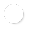
<div class="circle shadow circleShadow"></div>
.circleShadow:after {
    right: 1px;
    bottom: 8px;
    width: 80%;
    height: 80%;
    border-radius: 50%
}
おまけ
ホバーしたら影がつく
.shadow {
    position: relative;
    transition: 0.5s;
}
.shadow:after {
    opacity: 0;
    position: absolute;
    right: 2px;
    bottom: 5px;
    content: '';
    width: 45%;
    height: 10px;
    background: #aaa;
    box-shadow: 0 6px 12px #aaa;
    transform: rotate(3deg);
    z-index: -1;
    transition: 0.5s;
}
.shadow:hover:after {
    opacity: 1;
}
※transitionを使う場合、bodyに背景を設定しないとtransitionの時間の間背景色が変わってしまうみたいです。