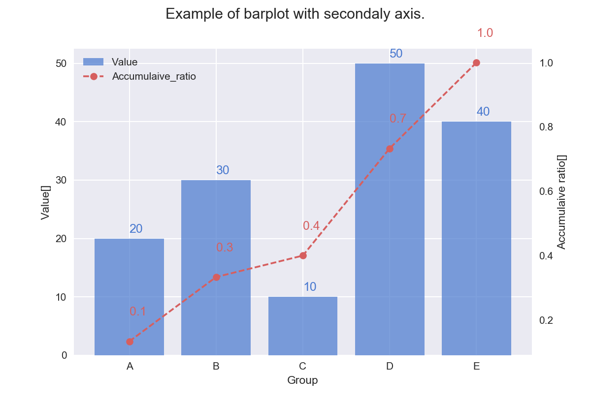
matplotlibのグラフに累積比率を追加するシリーズ。棒グラフに累積比率を追加。完成プロットはこちら
ポイントしては、matplotlib.bar()はbarと名を打つ割にカテゴリカルな変数をそのまま指定できないから、x軸のどこにプロットするか教えてあげる必要がある。具体的には、numpy.arange()などでカテゴリの数だけ連番・インデックスを生成して x軸の場所を教えてあげている。
"""maptlolibの棒グラフに累積比率を追加する例"""
import matplotlib.pyplot as plt
import numpy as np
import pandas as pd
import seaborn as sns

# seabornスタイルでかっこよくプロットする
# % matplotlib inline
sns.set(style="darkgrid", palette="muted", color_codes=True)

# トイデータ生成
df = pd.DataFrame({'group': ['A', 'B', 'C', 'D', 'E'],
                   'value': [20, 30, 10, 50, 40]})

# x軸のプロット位置を指定
# 勝手にやってくれないから生成する必要あり。
x_idx = np.arange(df.shape[0])

# プロット用のfigとaxを取得
fig, ax = plt.subplots()

# 棒グラフを追加(第1軸)
bar = ax.bar(left=x_idx,
             height=df['value'],
             align='center',
             tick_label=df['group'],
             alpha=0.7
             )

# 第2軸用の累積比率を計算
df['accumulative_ratio'] = df['value'].cumsum() / df['value'].sum()

# 第2軸に累積の折れ線グラフを追加
ax2 = ax.twinx()
line = ax2.plot(x_idx,
                df['accumulative_ratio'],
                ls='--',
                marker='o',
                color='r'
                )
ax2.grid(visible=False)
plt.show()
凡例など追加した完成版のコードはGistにあげてます。