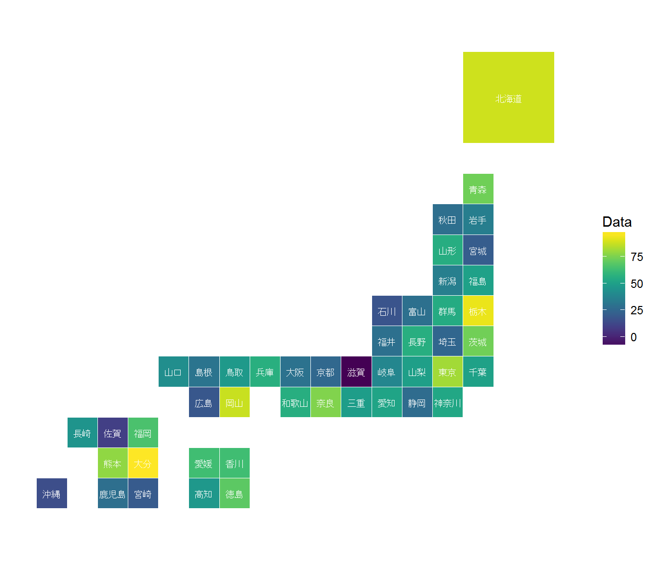
R bologgers (www.r-bloggers.com) で、カナダの地図上にデータをマッピングする例が紹介されていたので、日本用に書いておきます。これくらいのデザインの方が見やすい時もあるので。
Library
library(tidyverse)
library(viridis)
library(ggplot2)
Map Info.
# Location Data
JP_plot <- tribble(
    ~Prefecture, ~Code, ~x, ~y,
    "北海道", "HK", 16, 14,
    "青森県", "AO", 15, 11,
    "岩手県", "IT", 15, 10,
    "宮城県", "MG", 15, 9,
    "秋田県", "AK", 14, 10,
    "山形県", "YG", 14, 9,
    "福島県", "FS", 15, 8,
    "茨城県", "IB", 15, 6,
    "栃木県", "TC", 15, 7,
    "群馬県", "GU", 14, 7,
    "埼玉県", "ST", 14, 6,
    "千葉県", "CB", 15, 5,
    "東京都", "TY", 14, 5,
    "神奈川県", "KN", 14, 4,
    "新潟県", "NI", 14, 8,
    "富山県", "TM", 13, 7,
    "石川県", "IS", 12, 7,
    "福井県", "FI", 12, 6,
    "山梨県", "YN", 13, 5,
    "長野県", "NA", 13, 6,
    "岐阜県", "GI", 12, 5,
    "静岡県", "SZ", 13, 4,
    "愛知県", "AI", 12, 4,
    "三重県", "ME", 11, 4,
    "滋賀県", "SI", 11, 5,
    "京都府", "KY", 10, 5,
    "大阪府", "OS", 9, 5,
    "兵庫県", "HG", 8, 5,
    "奈良県", "NR", 10, 4,
    "和歌山県", "WA", 9, 4,
    "鳥取県", "TT", 7, 5,
    "島根県", "SM", 6, 5,
    "岡山県", "OY", 7, 4,
    "広島県", "HS", 6, 4,
    "山口県", "YA", 5, 5,
    "徳島県", "TK", 7, 1,
    "香川県", "KA", 7, 2,
    "愛媛県", "EH", 6, 2,
    "高知県", "KO", 6, 1,
    "福岡県", "FO", 4, 3,
    "佐賀県", "SG", 3, 3,
    "長崎県", "NS", 2, 3,
    "熊本県", "KU", 3, 2,
    "大分県", "OI", 4, 2,
    "宮崎県", "MZ", 4, 1,
    "鹿児島県", "KG", 3, 1,
    "沖縄県", "OK", 1, 1)

# Define Map sizes
JP_plot$Scale <- c(3,rep(1,46)) #北海道だけ少し大きく

# Abbreviated Prefectues
JP_plot$Prefec <- JP_plot$Prefecture
JP_plot$Prefec <- gsub("県", "", JP_plot$Prefec)
JP_plot$Prefec <- gsub("府", "", JP_plot$Prefec)
JP_plot$Prefec <- gsub("東京都", "東京", JP_plot$Prefec)
Data Preparation
# Fake Data
set.seed(27)
JP_plot$Data <- rnorm(n=47, mean=50, sd=20)
Plot by ggplot2
# Plot
JP_plot %>%
ggplot(aes(x = x,
y = y,
width = Scale,
height = Scale)) +
geom_tile(aes(fill = Data), color = "white") +
geom_text(aes(label = Prefec), size = 2.7, color = "white") +
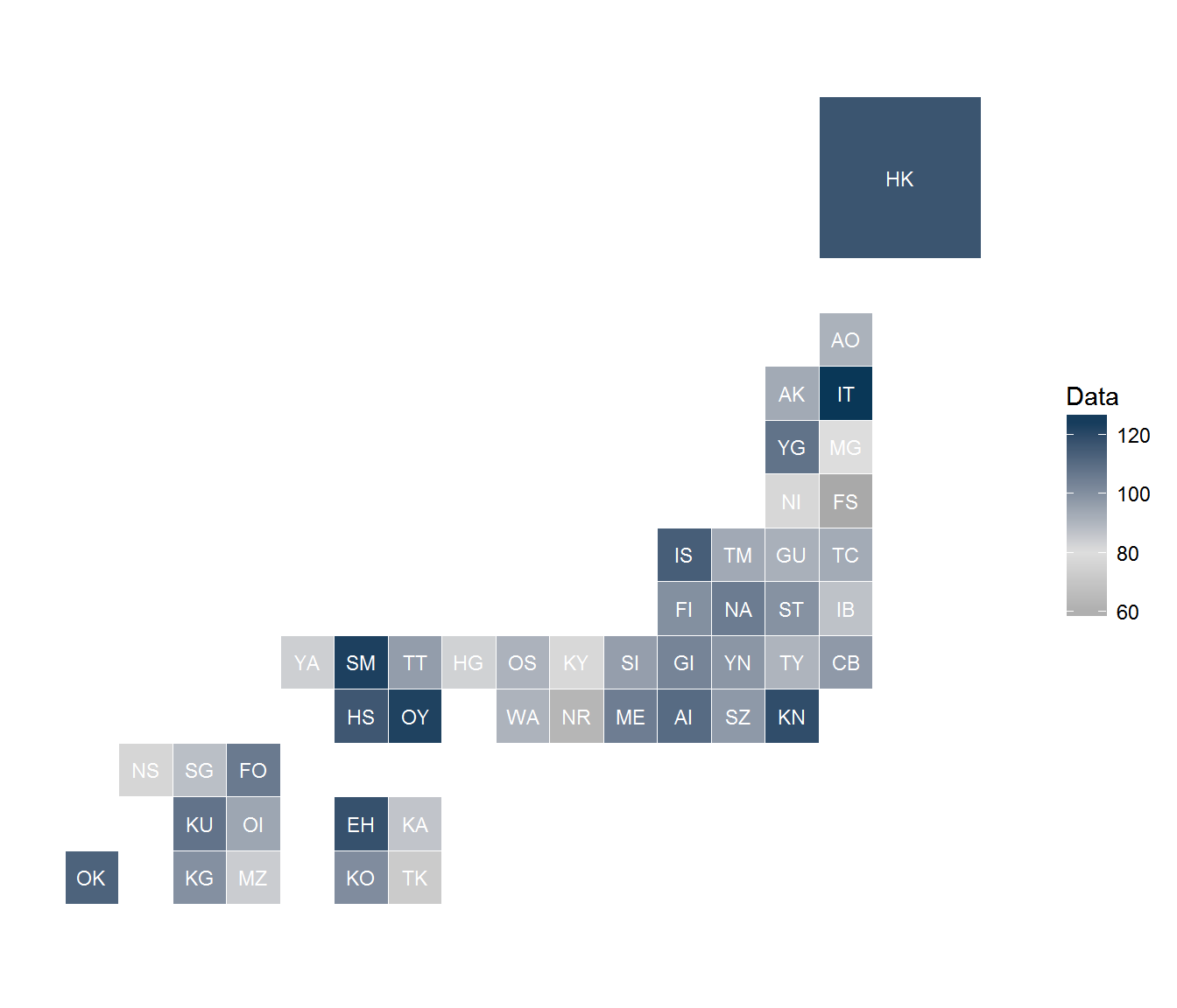
# Codeをラベルとして表示する場合
#geom_text(aes(label = Code), size = 2.7, color = "white") +
coord_fixed(ratio = 1) +
theme(
panel.background = element_blank(),
panel.grid = element_blank(),
axis.title = element_blank(),
axis.text = element_blank(),
axis.ticks = element_blank()) +
scale_fill_viridis(na.value = "#E1E1E1", option = "D", begin = 0, end = 1)
# マニュアルで色(3色)を指定する場合
# scale_fill_gradient2(low="#777777",
# mid="#DDDDDD",
# high="#2A465C,
# midpoint = 50)