@takabosoft さんとの議論で色々わかったので更新しました。
ありがとうございます!
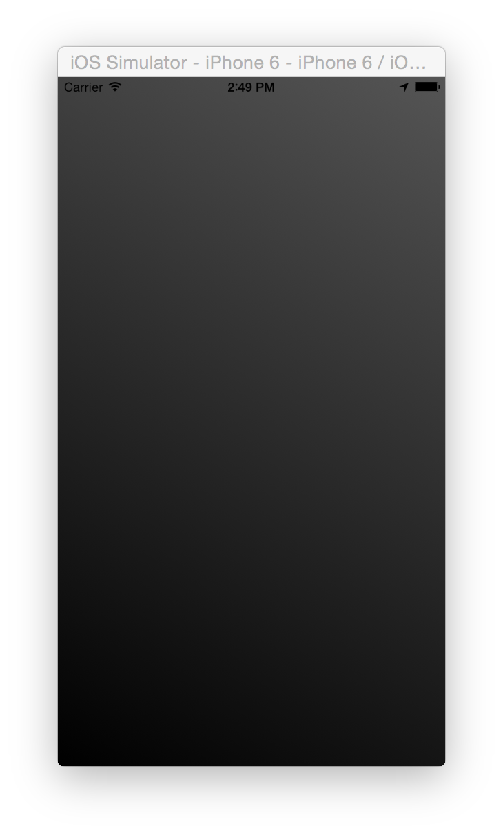
CAGradientLayerを使っても綺麗にディザリングされず、シマシマになってハマった。
以下で綺麗にできる。
GradientView.swift
final class GradientView: UIView {
  override func draw(_ rect: CGRect) {
    let context = UIGraphicsGetCurrentContext()!

    let startColor = UIColor.black.cgColor
    let endColor = UIColor.darkGray.cgColor
    let colors = [startColor, endColor] as CFArray

    let locations = [0, 1] as [CGFloat]

    let space = CGColorSpaceCreateDeviceRGB()

    let gradient = CGGradient(colorsSpace: space, colors: colors, locations: locations)!
    context.drawLinearGradient(gradient, start: .zero, end: CGPoint(x: rect.width, y: rect.height), options: [])
  }
}
UIViewを継承したクラスを作って、drawRectメソッドをオーバーライドする。
その中でUIGraphicsGetCurrentContext()を呼び出すとそのViewのContextが取得出来るので、
そこにグラデーションを書き込む。これで、綺麗にディザリングがかかる。
以下はでもディザリングはかかるっぽいが、iPhone6やMacのRetinaディスプレイで見た時に、シマシマが見えてしまう。
ViewController.swift
class ViewController: UIViewController {
    override func viewDidLoad() {
        super.viewDidLoad()
        let rect = UIScreen.mainScreen().bounds
        let space = CGColorSpaceCreateDeviceRGB()
        let bitmapInfo = CGBitmapInfo(CGImageAlphaInfo.PremultipliedLast.rawValue)
        let context = CGBitmapContextCreate(nil, UInt(rect.width), UInt(rect.height), 8, 0, space, bitmapInfo)

        let startColor = UIColor.blackColor().CGColor
        let endColor = UIColor.darkGrayColor().CGColor
        let colors = [startColor, endColor]
        let locations = [0, 1] as [CGFloat]
        let gradient = CGGradientCreateWithColors(space, colors, locations)
        CGContextDrawLinearGradient(context, gradient, .zeroPoint, CGPointMake(rect.width, rect.height), .allZeros)

        let image = UIImage(CGImage: CGBitmapContextCreateImage(context))
        view.backgroundColor = UIColor(patternImage: image!)
    }
}
contextの作り方とか、UIImageの作り方とかが悪いのかもしれない。
ここに何か書いてありそうだけど、読む気にならない。
画像比較
左が、UIViewを継承してかけたもの、右が、Bitmapを生成したもの。(方向を合わせるために多少実装を変えている)
そもそも、発色が全然違う。MacのRetinaディスプレイで比較すると分かりやすいと思う。