css3で作るloadingアニメーションの続き。
cssだけで作ったloadingアニメーションのまとめです。
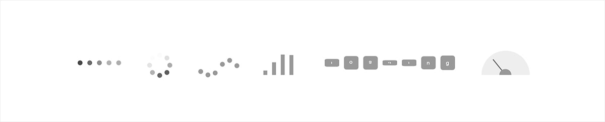
丸の透明度が変化する(横並び)

html
<body>
  <div class="circle">
    <div class="circle__item1"></div>
    <div class="circle__item2"></div>
    <div class="circle__item3"></div>
    <div class="circle__item4"></div>
    <div class="circle__item5"></div>
  </div>
</body>
scss
.circle {
  display: flex; // 丸を横並びにする。
}

// 丸1個の基本設定
@mixin circle__item($delay: 0s) { // 引数に開始時間を遅らせる変数を入れる。初期設定は0s。
  width: 10px;
  height: 10px;
  border-radius: 50%;
  background: #333;
  margin: 5px;
  animation: opacity 2s linear $delay infinite; // アニメーション追加。
}

// 丸を5個生成して開始時間を遅らせる。
@for $i from 1 through 5 {
  .circle__item#{$i} {
    @include circle__item($i*.25s); // 開始時間を0.25s遅らせる。
  }
}

// アニメーション設定。
@keyframes opacity {
  0% {
    opacity: 1;
  }

  50% {
    opacity: .3;
  }

  100% {
    opacity: 1;
  }
}
丸の透明度が変化する(円状)

html
<body>
  <div class="circle">
    <div class="circle__item1"></div>
    <div class="circle__item2"></div>
    <div class="circle__item3"></div>
    <div class="circle__item4"></div>
    <div class="circle__item5"></div>
    <div class="circle__item6"></div>
    <div class="circle__item7"></div>
    <div class="circle__item8"></div>
  </div>
</body>
scss
.circle {
  width: 50px;
  height: 50px;
  border-radius: 50%;
  position: relative;
  margin: 10px;
}

// 丸1個の基本設定
@mixin circle__item($delay: 0s) { // 引数に開始時間を遅らせる変数を入れる。初期設定は0s。
  width: 10px;
  height: 10px;
  border-radius: 50%;
  position: absolute;
  top: 0;
  left: 0;
  animation: rotate 2s linear $delay infinite; // アニメーション追加。
}

// 丸を8個生成して開始時間を遅らせる。
@for $i from 1 through 8 {
  .circle__item#{$i} {
    @include circle__item($i*.25s); // 開始時間を0.25s遅らせる。
  }
}

// 丸それぞれのポジション。
.circle__item1 {
  top: -1px;
  left: 20px;
}
.circle__item2 {
  top: 5px;
  left: 35px;
}
.circle__item3 {
  top: 20px;
  left: 41px;
}
.circle__item4 {
  top: 35px;
  left: 35px;
}
.circle__item5 {
  top: 41px;
  left: 20px;
}
.circle__item6 {
  top: 35px;
  left: 5px;
}
.circle__item7 {
  top: 20px;
  left: -1px;
}
.circle__item8 {
  top: 5px;
  left: 5px;
}

// アニメーション設定。
@keyframes rotate {
  0% {
    opacity: 0;
  }

  50% {
    background: #333;
    opacity: 1;
  }

  100% {
    opacity: 0;
  }
}
丸が上下に動く(虫みたい。。)

html
<body>
  <div class="circle">
    <div class="circle__item1"></div>
    <div class="circle__item2"></div>
    <div class="circle__item3"></div>
    <div class="circle__item4"></div>
    <div class="circle__item5"></div>
    <div class="circle__item6"></div>
  </div>
</body>
scss
.circle {
  display: flex; // 丸を横並びにする。
}

@mixin circle__item($delay) { // 引数に開始時間を遅らせる変数を入れる。初期設定は0s。
  width: 10px;
  height: 10px;
  border-radius: 50%;
  background: #999;
  margin-left: 5px;
  animation: jump 1.3s ease-in-out $delay infinite; // アニメーション追加。
}

// 丸を6個生成して開始時間を遅らせる。
@for $i from 1 through 6 {
  .circle__item#{$i} {
    @include circle__item($i*.1s); // 開始時間を0.1s遅らせる。
  }
}

// アニメーション設定。
@keyframes jump {
  0% {
  }

  20% {
    margin-top: 50px;
  }

  40% {
    margin-top: 20px;
  }

  60% {
    margin-top: 50px;
  }

  100% {
    margin-top: 0;
  }
}
棒が上下する(棒グラフ、もしくはガラケーの電波風)

html
<body>
  <div class="bar">
    <div class="bar__item4"></div>
    <div class="bar__item3"></div>
    <div class="bar__item2"></div>
    <div class="bar__item1"></div>
  </div>
</body>
scss
.bar {
  display: flex; // 棒を横並びにする。
  height: 50px;
  transform: rotate(180deg); // 下から上に伸びたように見せるため、180度回転させる。
}


// 棒1個の基本設定。
@mixin bar__item($delay: 0s) { // 引数に開始時間を遅らせる変数を入れる。初期設定は0s。
  width: 8px;
  height: 0;
  background: #999;
  margin-left: 10px;
  animation: stretch 1.5s linear $delay infinite; // アニメーション追加。
}

// 棒4個生成して開始時間を遅らせる。
@for $i from 1 through 4 {
  .bar__item#{$i} {
    @include bar__item($i*.25s); // 開始時間を0.25s遅らせる。
  }
}

// アニメーション設定。
@keyframes stretch {
  0% {
    height: 0;
  }

  50% {
    height: 50px;
  }

  100% {
    height: 0;
  }
}
パネルが360度回転する(hoverでカラーが変化する)
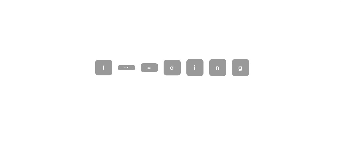
html
<body>
  <div class="square">
    <div class="square__item1">l</div>
    <div class="square__item2">o</div>
    <div class="square__item3">a</div>
    <div class="square__item4">d</div>
    <div class="square__item5">i</div>
    <div class="square__item6">n</div>
    <div class="square__item7">g</div>
  </div>
</body>
scss
.square {
  display: flex; // 四角を横並びにする。
}

// square 基本
@mixin square__item($delay: 0s) { // 引数に開始時間を遅らせる変数を入れる。初期設定は0s。
  width: 30px;
  height: 30px;
  border-radius: 5px;
  background: #999;
  color: #fff;
  font-size: 10px;
  margin: 5px;
  text-align: center;
  line-height: 30px;
  animation: rotate 5s ease $delay infinite; // アニメーション追加。
  &:hover {
    background: #00b7ee; // hoverでbackgroundのカラー変化。
    transition: .5s ease;
  }
}

// 四角を7個生成して開始時間を遅らせる。
@for $i from 1 through 7 {
  .square__item#{$i} {
    @include square__item($i*.15s); // 開始時間を0.15s遅らせる。
  }
}

// アニメーション設定。
@keyframes rotate {
  0% {
  }

  50% {
    transform: rotateX(360deg);
  }

  100% {
  }
}
ウインカー風(hoverでスピードアップ)

html
<body>
  <div class="blinker">
    <div class="blinker__background"></div>
    <div class="blinker__bar"></div>
    <div class="blinker__circle"></div>
  </div>
</body>
scss
.blinker {
  position: relative;
  &__background { // 背景の半円部分
    width: 100px;
    height: 50px;
    border-radius: 50px 50px 0 0;
    background: #eee;
  }
  &__bar { // ウィンカー部分
    width: 2px;
    height: 40px;
    background: #666;
    position: absolute;
    top: 8.5px;
    left: 47.5px;
    transform: rotate(-90deg);
    transform-origin: center bottom;
    animation: rotate 1s ease-in-out 0s infinite; // アニメーション追加。
  }
  &__circle { // 手前の半円部分
    width: 25px;
    height: 12.5px;
    border-radius: 12.5px 12.5px 0 0;
    background: #999;
    position: absolute;
    top: 37.5px;
    left: 37px;
  }
  &:hover {
    .blinker {
      &__background {
        background: #fb8c87; // hoverで背景の半円部分カラー変化。
        transition: .3s;
      }
      &__bar {
        background: #fff; // hoverでウィンカー部分カラー変化。
        transition: .3s;
        animation: rotate--fast .1s ease-in-out 0s infinite; // hoverでアニメーション追加。
      }
      &__circle {
        background: #fc5750; // hoverで手前の半円部分カラー変化。
        transition: .3s;
      }
    }
  }
}

// アニメーション設定。
@keyframes rotate {
  0% {
    transform: rotate(-40deg);
  }

  50% {
    transform: rotate(-30deg);
  }

  100% {
    transform: rotate(-40deg);
  }
}

// rotate--fastアニメーション設定。
@keyframes rotate--fast {
  0% {
    transform: rotate(60deg);
  }

  50% {
    transform: rotate(70deg);
  }

  100% {
    transform: rotate(60deg);
  }
}
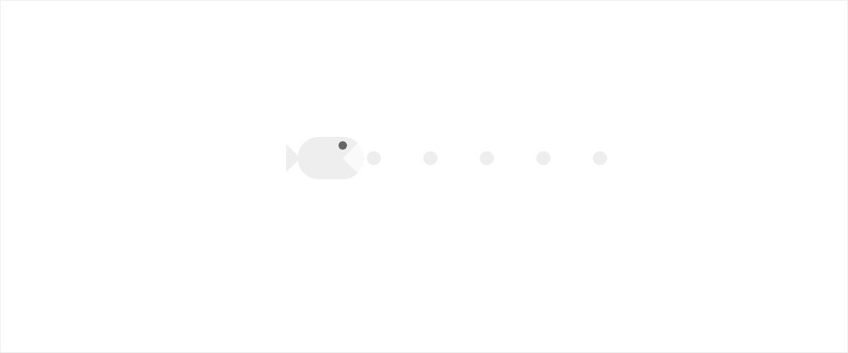
おまけ:ぶさいくな魚(パック◯ン風)
まとめ
See the Pen Css3 Loading Animation 02 by kayukihashimoto (@kfunnytokyo) on CodePen.
おわり。