※ この集計結果には、統計上の誤謬が多く含まれるので、どの言語を勉強すると儲かるかという視点でなく、あくまでもEnliveとIncanterを使うとWeb上のデータを使って簡単に集計プログラムが作れるよという点をお楽しみください。
どのプログラミング言語が儲かるのか、意識の高いエンジニアには気になるネタですよね。
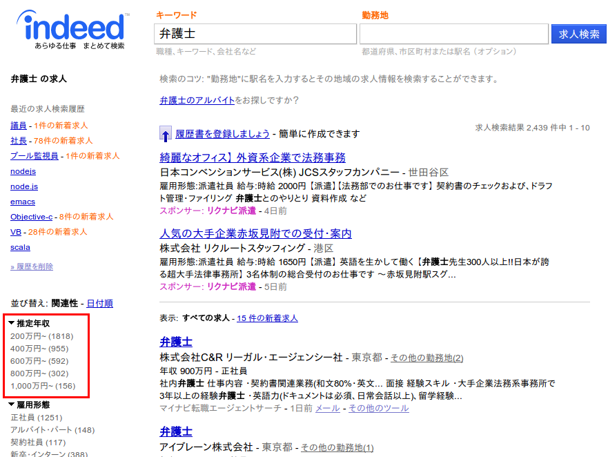
indeed.comという求人サイトがありますが、これはクローラー型求人サイトとよばれるタイプで、各求人サイトからの情報をかき集めて検索ができるようになっています。
IndeedにもAPIはあるのですが、給与レンジをとることは出来なさそうなので、スクレイピングで対応します。Indeedでキーワード検索すると、右下に推定年収が表示されます。これを拾いだしてグラフを書いてみます。
スクレイピングにはJsoupのラッパーとしても使い勝手のよいEnliveを使います。
推定年収のDiv要素を取得するのはこんな感じで書けます。
(with-open [rdr (io/reader "http://jp.indeed.com/%E6%B1%82%E4%BA%BA?l=&q=java")]
  (select (html-resource rdr) [:div (attr= :id "rb_Salary Estimate")])
簡単ですね!
ここから、実際の推定年収を抜き出して、Incanterのデータセットにします。総求人件数にはバラつきがあるので、年収レンジの比率を合わせて計算するようにします(:percentage列)。
(defn salary-range [lang]
  (with-open [rdr (io/reader (str "http://jp.indeed.com/%E6%B1%82%E4%BA%BA?l=&q=" lang))]
    (let [ds (->>
              (-> (select (html-resource rdr) [:div (attr= :id "rb_Salary Estimate")])
                  (select [:li :a]))
              (map #(re-matches #"([\d,]+)万円~ \((\d+)\)" (get-in % [:attrs :title])))
              (map (fn [_] (-> _
                               (update-in [1] #(-> % (.replace "," "") (Long/parseLong)))
                               (update-in [2] #(-> % (.replace "," "") (Long/parseLong))))))
              (dataset [:label :salary :count]))
          total (apply + (sel ds :cols :count))]
      (add-column :percentage ($map #(/ % total) :count ds) ds)
      ds)))
推定年収のレンジは200万円刻みで表示されるようなのですが、残念なことに検索キーワードによって、開始年収に100万円のズレがあります。これはいかんともしがたいので、あきらめてそれぞれのレンジの下限でプロットすることにします。
次にグラフを書くコードです。作ったデータセットをもとにxy-plotを読んでグラフを作るだけです。viewを呼ぶことでSwingのウィンドウが起動してグラフを表示できます。
(defn draw-salary-distribution [words]
  (let [ds (salary-range (first words))
        chart (xy-plot (sel ds :cols :salary)
                       (sel ds :cols :percentage)
                       :legend true
                       :series-label (first words)
                       :x-label "Salary"
                       :y-label "Percentage")]
    (doseq [lang (rest words)]
      (let [ds (salary-range lang)]
        (add-lines chart
                   (sel ds :cols :salary)
                   (sel ds :cols :percentage)
                   :series-label lang)))
    (view chart)))
準備ができました。求人数の比較的多い言語達でグラフを書いてみます。
(draw-salary-distribution ["java" "ruby" "scala" "php" "VB" "C#" "Objective-c" "Node.js"])
気になる結果はコチラ!
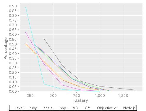
「金が欲しけりゃNodeJSをやれ!」 という結果のようです。
おっと2014年のBest Languageに輝いたClojureが無いではありませんか。
… いったい日本はどうしちゃったのでしょうか …
ということでUSのデータを使って同様のグラフを書いてみました。
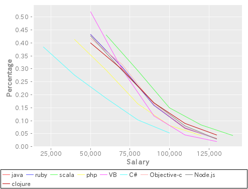
Scala!!