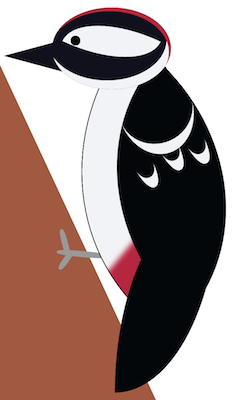
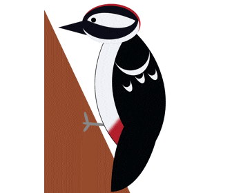
今回のモデルはアカゲラ(赤啄木鳥)です。
応用で他の鳥類もいけるはず。
html
<!-- キツツキ(アカゲラ) -->
<div class="woodpecker">
  <div class="head">
    <div class="face">
      <div class="eyes"></div>
      <!-- 目元の模様 -->
      <div class="eyes-pattern"></div>
    </div>
    <div class="beak"></div>
  </div>
  <div class="body-wrap">
    <div class="body"></div>
    <!-- 趾(足指) -->
    <div class="toe">
      <!-- 鉤爪 -->
      <div class="claw"></div>
      <div class="claw"></div>
      <div class="claw"></div>
    </div>
    <!-- 尾羽 -->
    <div class="tail-feather"></div>
    <!-- 翼 -->
    <div class="wing">
      <!-- 翼の模様 -->
      <div class="wing-pattern1"></div>
      <div class="wing-pattern2"></div>
      <div class="wing-pattern2"></div>
      <div class="wing-pattern2"></div>
    </div>
  </div>
</div>
CSS
css
/* キツツキ */
.woodpecker{
  position: absolute;
  top: 100px;
  left: 29%;
}

.head{
  position: absolute;
  z-index: 4;
}

.face{
  position: absolute;
  top: -80px;
  left: 30px;
  width: 160px;
  height: 110px;
  border-radius: 100%;
  background: #10111D;
  /* 顔の模様を表現 */
  box-shadow:
    -3px   5px 0 0 #B5263F inset,
    -6px -12px 0 0 #F2F3F6 inset;
  z-index: 2;
}

.eyes{
  position: absolute;
  top: 38px;
  left: 25px;
  width: 13px;
  height: 13px;
  border-radius: 100%;
  background: #000;
  z-index: 2;
}

.eyes-pattern{
  position: absolute;
  top: 18px;
  left: 20px;
  width: 120px;
  height: 55px;
  border-radius: 100% 0 100% 0;
  background: #F2F3F6;
  transform: rotate(25deg);
  z-index: 1;
}

.beak{
  position: absolute;
  top: -50px;
  left: -70px;
  width: 0;
  height: 0;
  border: 35px solid transparent;
  border-right: 130px solid #10111D;
  z-index: 1:
}

/* 頭以外のパーツ */
.body-wrap{
  position: absolute;
  transform: rotate(5deg);
}

.body{
  position: absolute;
  left: 20px;
  width: 280px;
  height: 260px;
  border: 1px solid #000;
  border-radius: 100% 0 100% 0;
  background: #F2F3F6;
  transform: rotate(-55deg);
  box-shadow: 10px -80px 10px 0 #B5263F inset;
  z-index: 1:
}

.toe{
  position: absolute;
  top: 240px;
  left: 48px;
  z-index: -1;
}

.claw{
  position: absolute;
  height: 8px;
  border-radius: 40%;
  background: #999999;
}

.claw:nth-child(1){
  width: 70px;
  left: 10px;
}

.claw:nth-child(2){
  width: 40px;
  top: -12px;
  left: -0px;
  transform: rotate(70deg);
}

.claw:nth-child(3){
  width: 30px;
  top: 10px;
  left: 8px;
  transform: rotate(-60deg);
}

.wing{
  position: absolute;
  top: 15px;
  left: 89px;
  width: 230px;
  height: 260px;
  border-radius: 100% 0 100% 0;
  background: #03070A;
  transform: rotate(-53deg);
  z-index: 3:
}

.wing-pattern1{
  position: absolute;
  top: -20px;
  left: 130px;
  width: 100px;
  height: 110px;
  border-bottom: 15px solid #F2F3F6;
  border-radius: 100%;
  transform: rotate(30deg);
}

.wing-pattern2{
  position: absolute;
  width: 25px;
  height: 50px;
  top: 50px;
  left: 100px;
  border-bottom: 15px solid #F2F3F6;
  border-radius: 100%;
  transform: rotate(20deg);
}

.wing-pattern2:nth-child(2){ top: 60px; left: 140px; }
.wing-pattern2:nth-child(3){ top: 80px; left: 170px; }


/* 尾羽 */
.tail-feather{
  position: absolute;
  top: 150px;
  left: 140px;
  width: 140px;
  height: 270px;
  border-radius: 100% 0 100% 0;
  background: #03070A;
  transform: rotate(-5deg);
  z-index: 2;
}
※画像にある(茶色の)木は省略しています。
アニメーション
.head{
  left: -20px;
  animation: peck 0.3s steps(1) infinite alternate;
}

@keyframes peck{
  0%{
    transform: translateX(0) rotate(0);
  }

  50%{
    transform: translateX(25px) rotate(0deg);
  }

  100%{
    transform: translateX(-45px) rotate(5deg);
  }
}
これをCSSに追加すれば動きます。