実際の動作確認はこちら
https://jsfiddle.net/junya_5102/4dz6ys9b/2/
html
<div class="tank"></div>
CSS
.tank{
  position: relative;

  /* size */
  font-size: 3em;

  width: 1em;
  height: 1em;
  margin-left: .25em;
  border-radius: 0 25% 15% 0;
  background-color: #646249;
}

.tank:before{
  content: '■';
  position: absolute;
  top: 50%; left: 100%;

  width: .6em;
  height: .40em;

  color: #646249;

  text-indent: -.75em;
  line-height: .4;
  background-color: currentColor;

  transform: translateY(-50%);
}

.tank:after{
  content: 'i';
  position: absolute;
  top: 100%; left: 50%;

  width: 1.6em;
  height: .6em;
  border: .0825em solid #222222;
  border-radius: 20% 20% 15% 20%;

  color: transparent;
  line-height: 0;
  text-align: center;
  text-shadow: .25em -.75em 0 #646249;

  box-shadow: 0 -.15em 0 0 #646249;

  /* image repeat position / size */
  background:
    radial-gradient(circle at 50% 60%,#646249 .18em,transparent 0em)
    repeat-x 50% 50% / .45em 100% border-box,

    radial-gradient(circle at 50% 00%,gray .14em,#222222 0em)
    50% 00% / .35em 100%  border-box;

  transform: translateX(-50%);
  box-sizing: border-box;
}

/* animations */
.tank:hover:before{
  content: '■o';
  white-space: nowrap;
  animation: shot_anim 3s linear infinite;
}

.tank:hover:after{
  animation: crawler_anim 3s linear infinite;
}

@keyframes shot_anim{
  0%{
    letter-spacing: 0;
  }

  5%,50%{
    left: 96.5%;
  }

  60%,95%{
    left: 100%;
  }

  100%{
    letter-spacing: 20em;
  }
}

@keyframes crawler_anim{
  from{
    background-position: 50% 50%, 50% 00%;
  }
  to{
    background-position: 50% 50%, 3.5em 00%;
  }
}
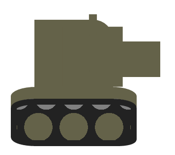
解説
胴体

div要素で作っています。
border-radiusで右上と右下を丸める
砲
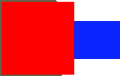
:beforeで作っています。
赤い部分は テキストの■(しかく)で 青い部分は width > heightの 矩形
テキストは text-indent と line-heightを使って配置
履帯
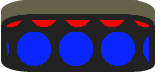
:afterで作っています。
赤い部分 と 青い部分は radial-gradientを使って作る。
.tank:after{
  background:
    radial-gradient(circle at 50% 60%,blue .18em,transparent 0em)
    repeat-x 50% 50% / .45em 100% border-box,

    radial-gradient(circle at 50% 00%,red .14em,#222222 0em)
    50% 00% / .35em 100%  border-box;
}
radial-gradient(形状 at 位置,色1,色2)
-
background(ショートハンド)で まとめ書く
- 左から順に background-image, background-repeat, background-position, background-size, background-origin となります
- sizeを指定する場合は positionのあとに
/で区切って指定する
-
background-origin
- image(gradient)の配置領域を指定するプロパティ
- border-box で ボーダー領域を含める
- image(gradient)の配置領域を指定するプロパティ
頭の出っ張り

:afterの テキストのiです。
line-heightを使った配置には限界があります、そこでtext-shadowを使います。
.tank:after{
  content: 'i';

  /* 'i'の影をつかうので'i'は透明にしておく */
  color: transparent;
  line-height: 0;
  text-align: center;
  text-shadow: .25em -.75em 0 red;
}