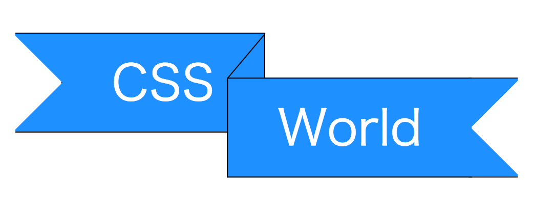
作り方1 (こちらがおすすめ。
<div class="label">
  <p class="text">CSS</p>
  <p class="text">World</p>
</div>
.label{
  position: relative;
  display: inline-block;

  font-size: 3em;
  white-space: nowrap;

  /* labelの端の空間を確保する */
  padding: 0 2em;
}

.label .text{
  position: relative;
  display: inline-block;

  padding: .25em 1em;
  border: 1px solid #000;


  color: #FFF;
  background-color: #1E90FF;
  box-sizing: border-box;
}

.label .text:nth-of-type(1){
  border-left: none;
}

.label .text:nth-of-type(2){
  border-right: none;
  /* 幅に合わせて調整が必要 */
  transform: translate(-22%, 45%);
}

/* labelの端デザイン */
.label .text:before{
  content: '';
  position: absolute;
  top: 50%;

  width: 1em; height: 100%;
  border: 1px solid #000;
  border-right: none;
  border-left: none;

  transform: translateY(-50%);
}

.label .text:nth-of-type(1):before{
  right: 99%;

  background-image:
    linear-gradient( -45deg, #1E90FF 35%, transparent 35%),
    linear-gradient(-135deg, #1E90FF 35%, transparent 35%);

  background-repeat: no-repeat;
}

.label .text:nth-of-type(2):before{
  left: 99%;
  background-image:
    linear-gradient( 45deg, #1E90FF 35%, transparent 35%),
    linear-gradient(135deg, #1E90FF 35%, transparent 35%);

  background-repeat: no-repeat;
}

/* 奥行き表現 */
.label .text:nth-of-type(2):after{
  content: '';
  position: absolute;
  bottom: 100%;
  /* 親要素のborder領域分、移動 */
  left: -1px;

  width: 1px; height: 60%;
  background-color: #000;

  transform-origin: left bottom;
  /* 親の大きさによって調整が必要 */
  transform: rotate(40deg);
}
補足
.text:beforeでラベル端(リボン)を作っています。
.textの幅を変えると デザインが崩れるので、調整してください。
親のfont-sizeの弄ってもデザインは崩れません。
奥行き表現
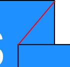
※ 分かり易く赤くしています
奥行きは 1本の線を利用して表現しています。
.textの要素の右上と左上を結ぶように線を配置すると良い感じ。
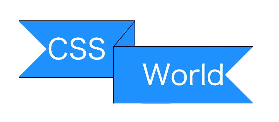
作り方2
<div class="label">
  <p class="text">CSS</p>
  <p class="text">World</p>
</div>
.label{
  position: relative;
  display: inline-block;

  font-size: 3em;
  white-space: nowrap;
}

.label .text{
  position: relative;
  display: inline-block;

  padding: .25em 1em;
  border: 1px solid #000;

  color: #FFF;
  background-color: #1E90FF;
  box-sizing: border-box;
}

.label .text:nth-of-type(1){
  border-left: none;
}

.label .text:nth-of-type(2){
  border-right: none;
  /* 幅に合わせて調整が必要 */
  transform: translate(-22%, 45%);
}

/* 奥行き表現 */
.label .text:nth-of-type(2):after{
  content: '';
  position: absolute;
  bottom: 100%;
  /* 親要素のborder領域分、移動 */
  left: -1px;

  width: 1px; height: 60%;
  background-color: #000;

  transform-origin: left bottom;
  /* 親の大きさによって調整が必要 */
  transform: rotate(40deg);
}

.label .text:nth-of-type(1){
  background:
    /* label端のデザイン */
    linear-gradient( -45deg, dodgerblue  1em, transparent 1em) -2.7em center,
    linear-gradient(-135deg, dodgerblue  1em, transparent 1em) -2.7em center,
    /* 背景色 */
    linear-gradient( +90deg, transparent 1em, dodgerblue  1em);

  background-repeat: no-repeat;
}

.label .text:nth-of-type(2){
  background:
    /* label端のデザイン */
    linear-gradient( +45deg, dodgerblue  1em, transparent 1em) 3.55em center,
    linear-gradient(+135deg, dodgerblue  1em, transparent 1em) 3.55em center,
    /* 背景色 */
    linear-gradient( -90deg, transparent 1em, dodgerblue  1em);

  background-repeat: no-repeat;
}
補足
擬似要素の代わりに.textを使って作ります。
.textを使うためコンテンツ(文字)に影響しやすいです。
疑似要素が余っているので他の目的に利用できます。
幅を変えるとラベル端(リボン)がズレるので位置調整が必要。
作り方1に比べて調整箇所が多くなっています。
※その他は同じなので省略します。