flexboxって?
- flexboxレイアウトは、複数の子要素を揃えてレイアウトする仕組み
- 親要素のCSSを設定するだけで子要素が簡単に揃ってくれる。 最低限「display: flex;」だけで横に揃う
- bootstrapの場合、揃えたい子要素全てにclass="col-xx-yy"を書く必要があるのに対して、flexboxの場合は必要な最小コードはたった一行、揃えたい子要素の親要素に加えるだけ。
目的
- 個人的にflexboxでよく使うコードのメモを残す
基本のき
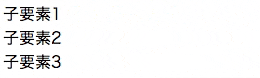
flexboxを使う最小限のコード
- 横に揃えるだけなら、親要素に
display: flex;を加えるだけ。
test.html
<div class="flex-container">
  <div>
    子要素1
  </div>
  <div>
    子要素2
  </div>
  <div>
    子要素3
  </div>
</div>
test.css
/* flexbox設定 */
.flex-container {
  display: flex;
}
実行イメージ
flexboxの初期値
- flexboxの設定は、親要素の設定と直下の子要素の設定の2つがある。
- 親要素(.flex-container)と子要素(.flex-item)のデフォルト値は以下の通り記す。
default.css
.flex-container {
	display: flex;
	flex-direction: row; /* デフォルト値 */
	align-items: stretch; /* デフォルト値 */
	justify-content: flex-start; /* デフォルト値 */
	flex-wrap: nowrap; /* デフォルト値 */
	align-content: stretch; /* デフォルト値 */
}
.flex-item {
	flex-grow: 0; /* デフォルト値 */
	flex-shrink: 1; /* デフォルト値 */
	flex-basis: auto; /* デフォルト値 */
}
よく使う設定
水平方向を揃える
(flexboxを試したい人向け)
先に示したtest.htmlとtext.cssに下記に示すex.cssの記述を追加すると同じ結果が得られます。
左揃えで横に並べたい
- display: flexを指定するだけ。あとはデフォルト値
ex.css
.flex-container {
  display: flex;
}
右揃えで横に並べたい

- justify-content: flex-end;を指定する。
ex.css
.flex-container {
  display: flex;
  justify-content: flex-end;
}
中央揃えで横に並べたい

- justify-content: center;を指定する。
ex.css
.flex-container {
  display: flex;
  justify-content: center;
}
両端揃えで横に並べたい

- justify-content: space-between;を指定する。
ex.css
.flex-container {
  display: flex;
  justify-content: space-between;
}
最初の要素だけ左揃えで、それ以外は右揃えで横に並べたい

- justify-content: flex-end;を指定する。
ex.css
.flex-container {
  display: flex;
  justify-content: flex-end;
}
.flex-container >:first-child {
  margin-right: auto;
}
最後の要素だけ右揃えで、それ以外は左揃えで横に並べたい

- justify-content: flex-end;を指定する。
ex.css
.flex-container {
  display: flex;
}
.flex-container >:last-child {
  margin-left: auto;
}
垂直方向を揃える
(flexboxを試したい人向け)
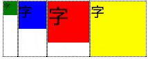
下記のtest2.htmlと下記のtest2.cssに下述のex.cssを追加すると同様の結果が得られます。
test2.html
<div class="flex-container">
	<div class="sub">
		<div class="box1"><span class="small">字</span></div>
	</div>
	<div class="sub">
		<div class="box2"><span class="middle">字</span></div>
	</div>
	<div class="sub">
		<div class="box3"><span class="large">字</span></div>
	</div>
	<div class="sub">
		<div class="box4"><span class="middle">字</span></div>
	</div>
</div>
test2.css
/* 飾り */
.sub {
	border: 1px dotted black;
}
.box1 {
	width: 20px;
	height: 20px;
	background-color: green;
}
.box2 {
	width: 40px;
	height: 40px;
	background-color: blue;
}
.box3 {
	width: 60px;
	height: 60px;
	background-color: red;
}
.box4 {
	width: 80px;
	height: 80px;
	background-color: yellow;
}
.large {
	font-size: 30px;
}
.middle {
	font-size: 20px;
}
.small {
	font-size: 10px;
}

/* flexbox設定 */
.flex-container {
  display: flex;
}
子要素の最大高さに揃える
- display: flexを指定するだけ。あとはデフォルト値(align-items: stretch;)
ex.css
.flex-container {
  display: flex;
}
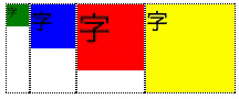
上部に揃える
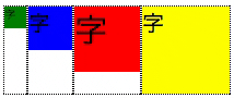
- align-items: stretch;と一見変わりない。違いは、子要素の高さ
- 前述のアニメーションで、子要素の枠(点線)が __最大高さから各々固有の高さ__に変化している事を確認のこと
ex.css
.flex-container {
  display: flex;
  align-items: flex-start;
}
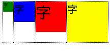
下部に揃える
- align-items: flex-end;を指定する。
ex.css
.flex-container {
  display: flex;
  align-items: flex-end;
}
垂直方向中央部に揃える
- align-items: center;を使う
ex.css
.flex-container {
  display: flex;
  align-items: center;
}
(あんまつかわないけど)一行目のテキストのベースラインに揃える
- align-items: baseline;を指定する
- 複数の大きさのフォントを使うときに便利なこともあるのかも。
ex.css
.flex-container {
  display: flex;
  align-items: baseline;
}
一部の子要素のみalign-itemsの設定を変える
- align-selfで該当の子要素を設定する
- 例えば、2番目の要素のみ下揃えにする場合は以下の通り
ex.css
.flex-container {
  display: flex;
}
.flex-container >:nth-child(2) {
  align-self: flex-end;
}
- align-selfの設定はalign-itemsと同じ。flex-start, flex-end, center, base-line, stretchがつかえる。
折り返し設定
何でも折り返す
- bootstrapで便利にお世話になっている画面が幅に伴って折り返す場合は、flex-wrap: wrap;を使う
ex.css
.flex-container {
  display: flex;
  flex-wrap: wrap;
}
指定のウィンドウ幅の時折り返す。
- メディアクエリを使い、特定の幅の時、flex-wrap: wrap;となるようにする。
.flex-container {
  display: flex;
  flex-wrap: nowrap;
}
@media screen and (max-width:1023px) {
  .flex-container {
    flex-wrap: wrap;
    }
}
- メディアクエリについては以下のページ参考
幅の制御
- flex-basis, flex-grow, flex-shrinkがある。
- すべて、子要素に指定してつかう。
flex-basis
-
flex-basis: 100px;など、子要素の初期幅を指定する。
-
例
- 一番目の子要素の初期幅を100pxにする
ex.css
.flex-container >:first-child {
  flex-basis: 100px;
}
flex-grow
- flex-grow: 1;など、空きスペースにたいして子要素が伸張するかどうかおよびは、伸張する割合を相対的指定できる。
- デフォルト値は0。 0以外の値を指定しないと子要素は伸張しない。
- 一つの子要素のみの指定の場合は「伸張するか否か」だけなので、数値はなんでもOK。
- 複数の子要素に異なるflex-grow値を設定すると、各数値の相対的大きさに従い、子要素が伸張する。(伸張の割合について、キチンとした定義があります。しかし、実務上は数値が大きければ良く伸びると思うぐらいで理解して、あとは実際のデザイン上で試行錯誤すれば良いと思う。)
- 例
- 一番目の子要素を空きスペースに対して伸張させる
ex.css
.flex-container >:first-child {
  flex-grow: 1;
}
flex-shrink
- flex-shrink: 1;など、親要素の幅が狭くなった時に、収縮する割合を指定できる。
- デフォルト値は1。
- 子要素を収縮させたくないときには flex-shrink: 0;にする。
- 応用
- ある一定の幅以下に収縮させたくないときに、flex-basisとセットで使う。例えば、一番目の子要素を100px以下に収縮させたくないときは以下の通り
ex.css
.flex-container >:first-child {
  flex-basis: 100px;
  flex-shrink: 0;
}
メモ
- div以外でもspanなどのインライン要素もflexboxでレイアウト可能。チョットした揃えであればレイアウトのためだけにdivで囲むことをしないで使えて便利。
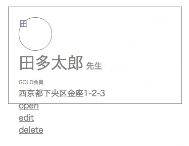
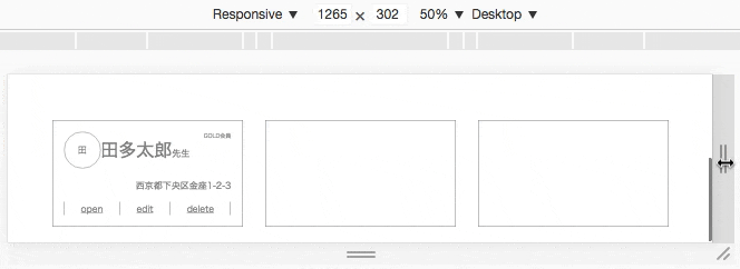
応用例
下記のレイアウトを作成する。
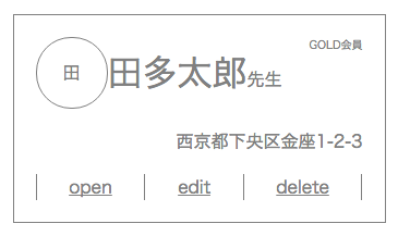
コード
card.html
<div class="card flex-container">
	<div class="main flex-container">
		<div class="personal-row flex-container">
			<div class="logo flex-container" style="">
				<span>田</span>
			</div>
			<div class="name-title flex-container">
				<span class="name">田多太郎</span>
				<span class="title">先生</span>
			</div>
			<span class="membership">GOLD会員</span>
		</div>
		<span class="address-row flex-container">西京都下央区金座1-2-3</span>
		<div class="menu-row flex-container">
			<div class="line"></div>
			<a href="#">open</a>
			<div class="line"></div>
			<a href="#">edit</a>
			<div class="line"></div>
			<a href="#">delete</a>
			<div class="line"></div>
		</div>
	</div>
	<div class="main flex-container">
	</div>
	<div class="main flex-container">
	</div>
</div>
card.css
/* flexbox以外の装飾  */
.main {
	margin: 20px;
	min-width: 300px;
	height: 150px;
	border: 1px solid grey;
	padding: 20px;
	color: grey;
}
.logo {
	width: 4rem;
	height: 4rem;
	border: 1px solid grey;
	border-radius: 2rem;
}
.name {
	font-size: 2rem;
}
.title {
	font-size: 1rem;
}
.membership {
	font-size: 0.5rem;
}
.address-row {
	font-size: 1rem;
}
.line	{
	border-left: 1px solid grey;
}
a {
	color: grey;
}


/* flexboxの設定 */
/* flexboxの基本設定 */
.flex-container {
	display: flex;
	flex-direction: row; /* デフォルト値 */
	align-items: stretch; /* デフォルト値 */
	justify-content: flex-start; /* デフォルト値 */
	flex-wrap: nowrap; /* デフォルト値 */
	align-content: strech; /* デフォルト値 */
}
.flex-item {
	flex-grow: 0; /* デフォルト値 */
	flex-shrink: 1; /* デフォルト値 */
	flex-basis: auto; /* デフォルト値 */
}

/* flexboxで装飾する */
.main {
	flex-flow: column; /* 縦に並べる */
}
.personal-row {
	align-items: center; /* 上下中央揃え */
}
.name-title {
	align-items: baseline; /* 1知行目のテキストのベースラインで揃える */
}
.membership {
	align-self: flex-start; /* このアイテムだけ上揃えにする */
	margin-left: auto; /* このアイテムだけ右揃えにするための設定 */
}
.logo {
	justify-content: center; /* 横方向中央 */
	align-items: center; /* 縦方向中央 */
}
.main {
	flex-flow: column; /* 縦に並べる */
	justify-content: space-between; /* 均等間隔で配置する */
}
.address-row {
	justify-content: flex-end; /* 右揃えにする */
}
.menu-row {
	justify-content: space-between; /* 均等間隔で配置する */
}
.card {
	justify-content: center;
	margin: auto;
}
/* 画面の幅が1023px以下では折り返す*/
@media screen and (max-width:1023px) {
	.card {
		flex-wrap: wrap; /* 折り返す */
	}
}
解説
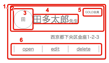
-
準備
- まず、クラスに__flex-container__と記述するだけでflexboxが使えるように準備
.flex-container {dislay: flex;}- 利点は、htmlを見るだけで"ここはflexboxで揃えている"とわかること。(bootstrapみたいな使い方をイメージしました)
- まず、クラスに__flex-container__と記述するだけでflexboxが使えるように準備
-
各部詳細
-
垂直方向縦揃え。(.main)
flex-flow: column; -
水平方向中央揃え(.personal-row)
justify-content: center; -
水平、垂直方向中央揃え(.logo)
justify-content: center; align-items: center;
これすごいべんりだと思う。 -
テキストベースライン揃え(.name-title)
align-items: baseline; -
一部の子要素だけ上揃えと右揃え(.membership)
align-self: flex-start; margin-left: auto;
特定の子要素にalign-selfとmargin-leftを指定する -
水平方向両端揃え(.menu-row)
justify-content: space-between; -
特定の幅の時に折り返す
.card {
	justify-content: center;
	margin: auto;
}

/* 画面の幅が1023px以下では折り返す*/
@media screen and (max-width:1023px) {
	.card {
		flex-wrap: wrap; /* 折り返す */
	}
}