こういう話がある。
非常に素晴らしいのでアニメーションにしてみた。
下が指数分布からサンプリングしたデータのヒストグラム、上がそのデータの平均値のヒストグラムである。
下図の赤い線はデータの平均値を表している。
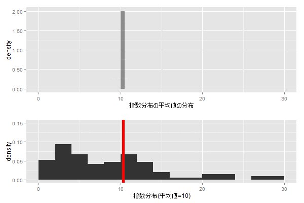
指数分布からサンプリングしたデータの平均値は正規分布に従うことがわかる。
コードは下記。
R
library(animation)
library(ggplot2)
library(gridExtra)

saveGIF( {
  means <- c()
  for(i in 1:100) {
    set.seed(i)
    x <- rexp(100, rate = 0.1)
    means <- c(means, mean(x))

    data <- data.frame(x=means)
    p1 <- ggplot(data, aes(x=x, y=..density..)) +
      geom_histogram(binwidth = 0.5, alpha = 0.5) +
      geom_density(color="blue", fill="blue", alpha=0.5) +
      scale_y_continuous(labels = function(x) sprintf("%0.2f", x)) +
      xlim(0, 30) + xlab("指数分布の平均値の分布")

    data <- data.frame(x=x)
    p2 <- ggplot(data, aes(x=x, y=..density..)) +
      geom_histogram(binwidth = 2) +
      geom_vline(xintercept = mean(data$x), color="red", size=2) +
      xlim(0, 30) + ylim(0,0.15) + xlab("指数分布(平均値=10)")

    grid.arrange(p1, p2, heights=5:3)
  }
  for(i in 1:10) {
    grid.arrange(p1, p2, heights=5:3)
  }
}, cmd.fun = system, interval = 0.4, ani.width=600, ani.height=400)
Enjoy!