こういうデータがある。
R
library(dplyr)
library(ggplot2)

data %>% sample_n(5) %>% arrange(date)

ggplot(data, aes(x=days, y=which)) +
  geom_point() +
  geom_smooth(method="glm", formula=y ~ x, family=binomial)
結果
        date which days wday
1 2014-07-16     0   76    4
2 2014-07-18     0   78    6
3 2014-11-17     1  200    2
4 2014-11-18     1  201    3
5 2015-01-19     1  263    2
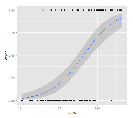
days が大きくなるにつれ、whichが 1 になりやすくなるというデータなんだけど、どうやら曜日の効果もあるみたい。
R
ggplot(data, aes(x=days, y=which)) +
  geom_point() +
  geom_smooth(method="glm", formula=y ~ x, family=binomial) +
  facet_wrap(~wday)
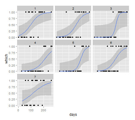
土日(1,7) と火木(3,5)は明らかに違うみたいだけど、他の曜日がどっちに入るのか、判別しにくい。
そこで、曜日を2つのグループに分けるようなすべての組み合わせを試してみて、AIC の小さい順に並べてみる。
R
library(pforeach)
library(broom)

grid <- do.call(expand.grid, rep(list(0:1), 7))
grid <- head(grid[-1, ], -1)
colnames(grid) <- c("Sun","Mon","Tue","Wed","Thu","Fri","Sat")

npforeach(row = rows(grid), .c=rbind)({
  split_wday <- function(wday) as.factor(unlist(Map(function(x) row[x], wday)))
  d <- data %>% mutate(split_wday=split_wday(wday))
  model <- glm(which ~ days + split_wday, family=binomial, data = d)
  coef <- tidy(model) %>% filter(term=="split_wday1") %>% select(-term, -statistic)
  data.frame(coef, AIC=AIC(model))
}) -> coefs

df <- cbind(grid, coefs) %>% filter(estimate>0) %>% arrange(AIC)
head(df)
結果
  Sun Mon Tue Wed Thu Fri Sat estimate std.error      p.value      AIC
1   1   0   0   0   0   0   1 2.262961 0.5485995 3.707707e-05 146.2671
2   1   1   0   0   0   0   1 1.873528 0.4828262 1.043118e-04 149.1362
3   1   1   0   0   0   1   1 1.615967 0.4643579 5.014098e-04 153.1555
4   1   1   1   0   0   0   1 1.545313 0.4507256 6.069261e-04 153.7826
5   1   0   0   0   0   1   1 1.513344 0.4520615 8.149990e-04 154.4657
6   1   0   1   0   0   0   1 1.510272 0.4510179 8.122497e-04 154.5508
結果は、土日をグループにした時の AIC が最も低く、次点は土日月だった。
これらのモデルの曜日効果をグラフにしてみる。
R
ggplot(df[1:6, ] %>% add_rownames("pattern"), aes(x=pattern, y=estimate)) +
  geom_bar(stat="identity") +
  geom_errorbar(aes(ymax=estimate+std.error, ymin=estimate-std.error) ,width=0.5)
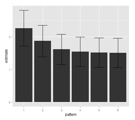
やはり土日をグループにしたもの(1)が一番高いようだ。
これらのモデルの曜日効果がどのように違うのかをグラフにしてみる。
R
my_plot <- function(data2) {
  model <- glm(which ~ days + factor(holiday), family=binomial, data = data2)
  pr <- predict(model, se.fit=TRUE)
  fam <- family(model)
  lcl <- fam$linkinv(pr$fit - qnorm(0.95) * pr$se.fit)
  ucl <- fam$linkinv(pr$fit + qnorm(0.95) * pr$se.fit)
  pred <- data.frame(fit=fam$linkinv(pr$fit), ucl, lcl)

  data3 <- cbind(data2, pred)

  ggplot(data3, aes(x=days, y=which, color=factor(holiday))) +
    geom_point(size=3) +
    geom_smooth(aes(ymin=lcl, ymax=ucl), stat="identity", linetype="blank") +
    geom_line(aes(y=fit), size=1.5)
}

data2 <- data %>% mutate(holiday=wday %in% c(1, 7))
g1 <- my_plot(data2)
plot(g1)
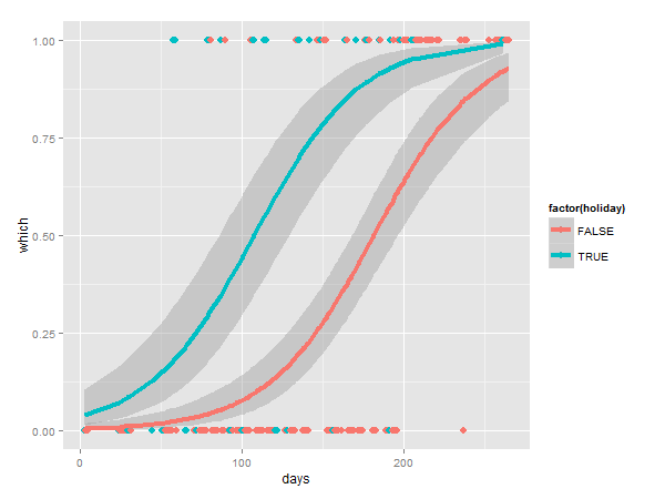
これは土日をグループにしたモデル。曜日による効果がはっきりとわかる。
R
library(gridExtra)

data3 <- data %>% mutate(holiday=wday %in% c(1, 2, 7))
g2 <- my_plot(data3)

grid.arrange(g1, g2, ncol=2)
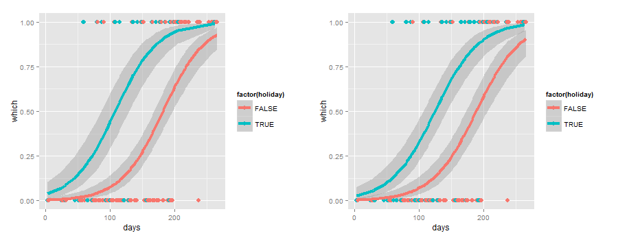
土日(左)と土日月(右)を比べてみると、やはり土日のみのほうが差が大きくて良さそう。
R
data4 <- data %>% mutate(holiday=ifelse(wday %in% c(1,7), "土日", ifelse(wday %in% c(4,5), "火木", "月水金")))
my_plot(data4)
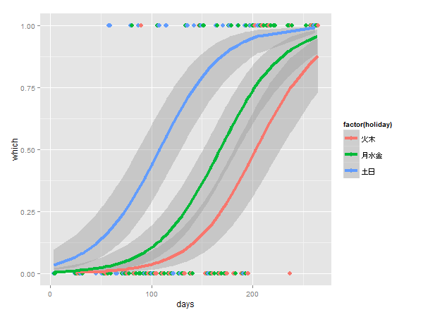
最初に述べたように、土日と火木は違いが大きい。
月水金はどちらかというと火木に近い。
最終的には土日をグループにしたモデルが良さそう。
ただし、土日ということは休日の効果なので、祝日を含んだモデルも考えてみるべき。
R
library(Nippon)
data5 <- data %>% mutate(holiday=is.jholiday(as.Date(date)) | wday %in% c(1,7))
my_plot(data5)
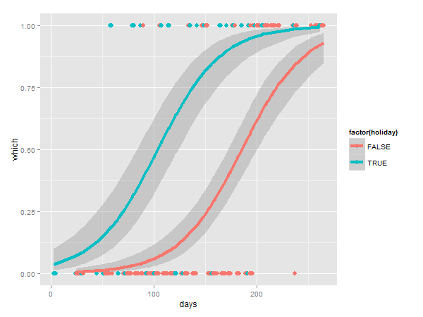
差が大きくなっている。
AIC を比べてみると、
R
model1 <- glm(which ~ days + factor(holiday), family=binomial, data=data2)
model2 <- glm(which ~ days + factor(holiday), family=binomial, data=data5)
AIC(model1, model2)
結果
       df      AIC
model1  3 146.2671
model2  3 138.9292
祝日を含んだほうが良いみたい。
以上です。