Q.
histogramと確率密度関数を同時に描きたいのですが。
A.
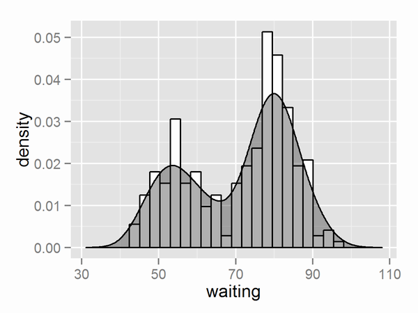
縦軸を確率密度にする(確率密度関数にあわせる)場合
以下のように書きます。
OK_example1.R
library(ggplot2)

dens <- density(faithful$waiting)
bw <- diff(range(faithful$waiting))/20

ggplot(faithful, aes(x=waiting)) +
  geom_histogram(aes(y=..density..), binwidth=bw, fill='white', color='black') +
  geom_density(fill='black', alpha=0.3) +
  xlim(range(dens$x))
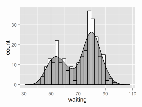
縦軸をcountにする(histogramにあわせる)場合
以下のように書きます。
OK_example2.R
library(ggplot2)

dens <- density(faithful$waiting)
bw <- diff(range(faithful$waiting))/20

ggplot(faithful, aes(x=waiting)) +
  geom_histogram(binwidth=bw, fill='white', color='black') +
  geom_density(eval(bquote(aes(y=..count..*.(bw)))), fill='black', alpha=0.3)+
  xlim(range(dens$x))
bquoteは.()で囲われたものを除いてquoteする関数です。他の方法としてはsubstituteやEPTイディオム(eval(parse(text=)))を使う方法があるようです。
参考資料
http://stackoverflow.com/questions/5688082/ggplot2-overlay-histogram-with-density-curve
http://stackoverflow.com/questions/11404531/r-ggplot2-adding-count-labels-to-histogram-with-density-overlay
http://stackoverflow.com/questions/27661852/adding-a-density-line-to-a-histogram-with-count-data-in-ggplot2