Excelデータをmatplotlibでグラフ化する
Excelデータをmatplotでグラフ化する(自分用の)基本のコードです。
普段は、これをもとに好きに拡張しています。
環境
・Ubuntu16.04
・Python3.5.2
・matplotlib2.0.0
・pandas0.19.2,numpy1.11.3
・Inkscape(eps→emf変換で使用)
まずはシンプルに
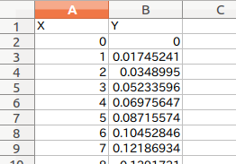
Excelシートの左上(A1セル)にグラフ用データ(X軸,Y軸)をコピペして使うケース。
グラフ化したいX軸とY軸のデータがすでに存在している場合を想定しています。
・報告書(Word)に貼り付けたいけど、Excelのグラフに不満があるとか
・Excelの指数表記に不満があるとか
そういうちょっとしたときに限って、プロット方法をすっかり忘れちゃってたりとかします。
既存Excelシートの任意のセル範囲のデータでグラフ化は(2)で述べたいと思います。
Inkscapeを使ってepsファイルをemf(拡張メタファイル)へ変換する
出力されたグラフはepsとpngで保存しています。
emfファイルはword文書に貼るときなどに便利ですので、その方法を。
Inkscapeはコマンドラインから使えるので、オプション-Mを使って
$ inkscape sample.eps -M sample.emf
としたいところなのですが、次のようなエラーがでてうまくいかない…
parser error : Start tag expected, '<' not found
%!PS-Adobe-3.0 EPSF-3.0
^
** (inkscape:5467): WARNING **: Specified document sample.eps cannot be opened (does not exist or not a valid SVG file)
このへんのことは一旦あと回しにして、
とりいそぎemfファイル作って報告書に貼らなきゃなので
普通にinkscapeを開いて変換する方法です。
(2017.2.21 追加)
↓ここに解決方法(Inkscape使用)を書きました
matplotlibのグラフをemfファイル形式に変換
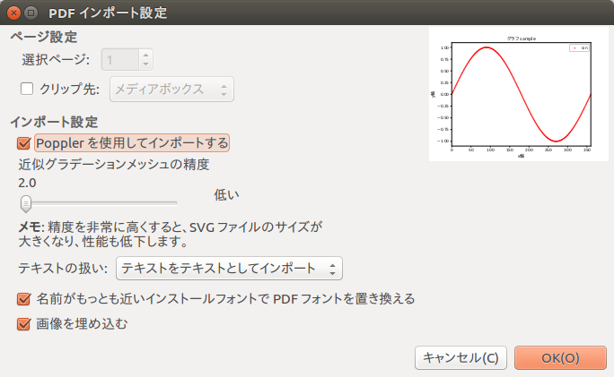
・Inkscapeでepsファイルを開いて、「名前をつけて保存」でemfを選択する。
グラフに日本語を使用している場合は、
[インポート設定]のPopplerを使用してインポートするをチェックしていないと文字化けする。(Popplerが何か知らない…)
ダイレクトにemf保存できればいいんだけどよくわかんない。
追記(2017.2.21)
ぴよぴよの日々さんによると、emfの出力機能は削除されている。なんと…
matplotlib-1.3.1 のドキュメントに "変更点" の説明がありました。
こう書かれていたのです。
「機能の整理をして、emf 出力機能はこのバージョンから削除された」
何ですって...
いまのmatplotlibのバージョンは2.0.0ですので、念の為
下の方法で調べました。
import matplotlib.pyplot as plt
fig = plt.figure()
print(fig.canvas.get_supported_filetypes())
で調べると
'pdf': 'Portable Document Format',
'ps': 'Postscript',
'rgba': 'Raw RGBA bitmap',
'pgf': 'PGF code for LaTeX',
'svgz': 'Scalable Vector Graphics',
'svg': 'Scalable Vector Graphics',
'raw': 'Raw RGBA bitmap',
'eps': 'Encapsulated Postscript',
'png': 'Portable Network Graphics'
これが現在の環境の出力可能ファイルタイプのようです。
コード
というわけで以下がそのコードとなります。
pandasで読み込んだExcelファイル(xls,xlsx)のDataFrameから
x軸とy軸データを抜き取り、plotに投げているだけです。
抜き取り方は、列で指定する方法やラベル名で指定する方法などがあります。
# coding: utf-8

import numpy as np
import pandas as pd
import matplotlib.pyplot as plt
from matplotlib.font_manager import FontProperties

# フォントファイルの場所を指定 ubuntu  (C:\Windows\Fonts\任意のFont)
fp = FontProperties(fname="/usr/share/fonts/truetype/fonts-japanese-gothic.ttf")

####################################################################
filepath='~/Desktop/sample.xls' #Xlsファイルの場所

df=pd.read_excel(filepath) #Pandas DataFrameに読込み

# データフレームからx軸とY軸データを読み込む

# 列で指定
x=df[[0]]
y=df[[1]]

# ラベルで指定する場合
# x=df['X']
# y=df['Y']

####################################################################
# Graph
####################################################################
fig = plt.figure()
ax1 = fig.add_subplot(111)

ax1.set_yscale('linear')
# ax1.set_yscale('log')

ax1.set_ylim(-1.1, 1.1)
ax1.set_xlim(0,360)

ax1.set_title("グラフ sample",fontdict = {"fontproperties": fp},fontsize=12)
ax1.set_xlabel("x軸",fontdict = {"fontproperties": fp},fontsize=12)
ax1.set_ylabel("y軸",fontdict = {"fontproperties": fp},fontsize=12)

# ax1.plot(x, y,'red',label='sin')
ax1.scatter(x, y,s=1,c='r',label='sin')
ax1.legend(loc="upper right")

# ファイルを保存 pngとepsの両方で保存
plt.savefig("sample.png")
plt.savefig("sample.eps")
plt.show()