MicrosoftのOffice UI Fabricを試してみる
UIフレームワークの「Office UI Fabric」がオープンソースになった!というニュースがありました。なんでもOffice 365などのWebサイトで使われているUIフレームワークなのだとか。
Webサイト向けのUIフレームワークとしては、Twitter Bootstrapがあり、Office UI Fabricは競合するプロダクトなのかなと思いつつ、どんな感じなのか興味があったのでちょっと試してみました。
Office UI FabricのソースコードはGitHubで公開されています。
Office UI Fabricの準備
まずはOffice UI Fabricの準備です。Office UI FabricのGitHubにある、Downloadから最新のリリースバージョンを入手できます。
ダウンロードしたOffice-UI-Fabric-master.zipを展開します。ソースコード等のファイル一式がありますが、Office UI Fabricを使用するだけであれば、distディレクトリ(に置かれているファイル群)があれば充分です。
$ ls -F Office-UI-Fabric-master/
CHANGELOG.md  README.md                bower.json  dist.ORIG/  gulp/        node_modules/  src/
LICENSE       Third Party Notices.txt  dist/       ghdocs/     gulpfile.js  package.json
今回はdistディレクトリのみをコピーし、以下のようなファイル構成でサンプルWebページを作ってみました。
my_sample/
|-- dist/
|-- fabric_sample01.js
`-- index.html
以下のひな型からサンプルを作って行きます。
<!DOCTYPE html>
<html>
  <head>
    <meta charset="utf-8" />
    <title>Office UI Fabricサンプル</title>
    <link rel="stylesheet" href="dist/css/fabric.components.min.css">
    <link rel="stylesheet" href="dist/css/fabric.min.css">
  </head>
  <body>
    <main class="Container">
      <div>
        <label class="ms-Label">Hello,World.</label>
      </div>
    </main>
    <script src="dist/js/jquery.fabric.min.js"></script>
  </body>
</html>
作成したサンプルWebページは以下のURLにて公開しています。
基本的なUI部品を試してみる
以下のUIについて、どんな使い方になるのかを試してみました。
- ラベル
- ボタン
- トグルボタン
- チェックボックス
- ラジオボタン
- テーブル
ラベル
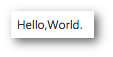
まずはラベルです。Twitter Bootstrapと同様に、class="..."でUIフレームワークのスタイルを指定する形になっています。「ms-Label」というスタイルを指定します。Office UI Fabricでは、スタイル名の先頭に「ms-」という接頭辞が付けられているようです。
<label class="ms-Label">Hello,World.</label>
表示は以下のようになります。
ボタン
ボタンは以下のタグで作成できます。
<button class="ms-Button">
  <span class="ms-Button-label">かしこまっ!</span>
</button>
表示は以下のようになります。
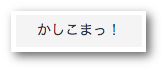 ボタンを押す前の表示
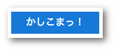 ボタンを押した時の表示
かなりフラットな表示ですね。マウスオーバ時とクリック時にボタンの色が変わるのですが、個人的には「ボタンを押した感」があまりしないので、ちょっと苦手(ボタンを押せているか不安になってしまう)な表示スタイルです。
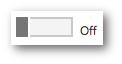
トグルボタン
トグルボタンは以下のタグで作成できます。タグを見るとbuttonタグではなく、チェックボックスの一形態のようですね。トグルボタンは複数のタグから構成されるようで、そのような場合はUI部品のスタイル(この場合は"ms-Toggle")を指定したdivタグでグルーピングしています。
<div class="ms-Toggle">
  <input type="checkbox" class="ms-Toggle-input">
  <label for="cyalume-change" class="ms-Toggle-field">
    <span class="ms-Label ms-Label--off">Off</span>
    <span class="ms-Label ms-Label--on">On</span>
  </label>
</div>
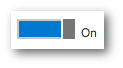
表示は以下のようになります。タブレットやスマートフォンでよく見かける表示スタイルですね。
チェックボックス
チェックボックスは以下のタグで作成できます。チェックボックスとラジオボタンは「ChiceField」というUI部品名となっています(パッと聞いた感じForceField(グラディウス)っぽい名前...)。
UIフレームワークを用いない場合でも、チェックボックスとlabelタグを組み合わせることでlabelの文字列クリックでチェックボックスのon/offが切り替えが行えますが、Office UI Fabricではinputタグにidを指定し、それをlabelに紐付ける形になっています。
<div class="ms-ChoiceField">
  <input id="happy_pa_lucky" class="ms-ChoiceField-input" type="checkbox">
  <label for="happy_pa_lucky" class="ms-ChoiceField-field">
    <span class="ms-Label">HAPPYぱLUCKY</span>
  </label>
</div>
<div class="ms-ChoiceField">
  <input id="dream_parade" class="ms-ChoiceField-input" type="checkbox">
  <label for="dream_parade" class="ms-ChoiceField-field">
    <span id="lbl_dream_parade" class="ms-Label">ドリームパレード</span>
  </label>
</div>
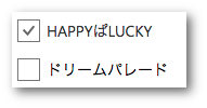
表示は以下のようになります。このチェックボックスのデザインは見やすくて個人的に気に入っています。
ちなみにTwitter Bootstrapでは以下のようにlabelとinputタグを組み合わせます。idで紐付けなくても良いので、この点においてはOffice UI Fabricでの記述は冗長な感じですね。
<!-- Twitter Bootstrapでの例です -->
<div class="checkbox-inline">
  <label>
    <input type="checkbox">チェックする項目
  </label>
</div>
ラジオボタン
ラジオボタンは以下の手順で作成できます。デフォルトでは各選択項目は縦に配置されるようです。まだ調べていませんが、グリッドレイアウトを使うことで選択項目の横配置がスマートに記述できるのかもしれません。
<div class="ms-ChoiceFieldGroup">
  <!-- 選択項目その1 -->
  <div class="ms-ChoiceField">
    <input id="radio_raara" class="ms-ChoiceField-input" type="radio" value="らぁら" name="solami_smile">
    <label for="radio_raara" class="ms-ChoiceField-field">
      <span class="ms-Label">らぁら</span>
    </label>
  </div>
  <!-- 選択項目その2 -->
  <div class="ms-ChoiceField">
    <input id="radio_mirei" class="ms-ChoiceField-input" type="radio" value="みれぃ">
    <label for="radio_mirei" class="ms-ChoiceField-field">
      <span class="ms-Label">みれぃ</span>
    </label>
  </div>
  <!-- 選択項目その3 -->
  <div class="ms-ChoiceField">
    <input id="radio_sofui" class="ms-ChoiceField-input" type="radio" value="そふぃ">
    <label for="radio_sofui" class="ms-ChoiceField-field">
      <span class="ms-Label">そふぃ</span>
    </label>
  </div>
</div>
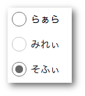
表示は以下のようになります。チェックボックスと同様に、このラジオボタンも見やすい表示なのでお気に入りです。
テーブル
テーブルは以下の手順で作成できます。ラベルに始まりボタン、チェックボックスと見てきましたが、基本的にはTwitter BootstrapのUIフレームワークとあまり変わらない感じでした。が、テーブルに関してはだいぶOffice UI Fabricの独自色が出ています。
テーブルの作成はtable,tr,tdタグではなく、ms-Table, ms-Table-row, ms-Table-cellのスタイルを指定したdiv,spanタグによって行います。個人的にテーブルを作成していて困ったのが、nobrタグによる列の折り返し無効化が指定できないという点でした(うまい方法がないか調査中です)。
<!--
テーブルのデータはプリパラのWikipedia(https://ja.wikipedia.org/wiki/プリパラ)より引用
-->
<div class="ms-Table">
  <div class="ms-Table-row">
    <span class="ms-Table-cell">ブランド名</span>
    <span class="ms-Table-cell">よみがな</span>
    <span class="ms-Table-cell">概要</span>
  </div>
  <div class="ms-Table-row">
    <span class="ms-Table-cell">Twinkle Ribbon</span>
    <span class="ms-Table-cell">トゥインクルリボン</span>
    <span class="ms-Table-cell">
      アニメ第1話で初めてPrism Stoneを訪れたらぁらに似合うブランドとして赤井めが姉ぇが選んだリボンやフリルを使ったコーデのラブリー系ブランド。
    </span>
  </div>
  <div class="ms-Table-row">
    <span class="ms-Table-cell">Candy Alamode</span>
    <span class="ms-Table-cell">キャンディアラモード</span>
    <span class="ms-Table-cell">
      みれぃが好んで使用するカラフルで元気いっぱいのポップ系ブランド。
    </span>
  </div>
</div>
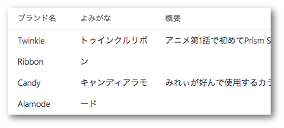
表示は以下のようになります。
その他のTips
Office UI Fabricに用意されているスタイル名の一覧
Office UI Fabricでは独自のスタイル名("ms-Label"とか)を指定しますが、まだ使い慣れていないのでスタイル名を探すのも一苦労です。幸いにも(?)ソースコードが公開されているので、そこからスタイルファイル名の一覧を列挙してみましょう。
スタイル名には"ms-"という接頭辞が付けられているので、ソースファイル中の".ms-"で始まるスタイル設定を探すことで一覧が得られます。
$ cd Office-UI-Fabric-master/src/
$ find components/ -name *.less | xargs grep ^\.ms-
例えばms-Buttonに関連するスタイル名の一覧は以下の手順で得られます。この中から目的に合いそうなスタイル名を見つけて行くという作業スタイル(スタイル違い)で進めると捗りそうです。
$ find components/ -name *.less | xargs grep ^\.ms- | grep Button
components/SearchBox/SearchBox.less:.ms-SearchBox-closeButton {
components/Button/Button.less:.ms-Button {
components/Button/Button.less:.ms-Button + .ms-Button {
components/Button/Button.less:.ms-Button-label {
components/Button/Button.less:.ms-Button-icon,
components/Button/Button.less:.ms-Button-description {
components/Button/Button.less:.ms-Button.ms-Button--primary {
components/Button/Button.less:.ms-Button.ms-Button--hero {
components/Button/Button.less:.ms-Button.ms-Button--compound {
components/Button/Button.less:.ms-Button.ms-Button--command {
components/Button/Button.less:.ms-Button.ms-Button--command + .ms-Button.ms-Button--command {
まとめ
Office UI Fabricの基本的なUI部品について試してみました。Webページ向けのUIフレームワークではTwitter Bootstrapが広く使われているという個人的な認識(思い込み?)があります。Office UI Fabricはまだノウハウが少ないと思われるので、折に触れて調査して行こうと思います。