訳注
http://topepo.github.io/caret/visualizations.html の和訳です
図は訳者がRで再現を試みたものです。
日本語としておかしいと思われるところやや改訳しました。
featurePlot 関数は、データ可視化のための lattice プロットのラッパーの1つとなっています。例えば、下図は連続値である目的変数をfeaturePlot 関数のデフォルトでのプロットを示したものです。
分類を目的としたデータセットである iris データを見てみましょう。
str(iris)

'data.frame':	150 obs. of  5 variables:
 $ Sepal.Length: num  5.1 4.9 4.7 4.6 5 5.4 4.6 5 4.4 4.9 ...
 $ Sepal.Width : num  3.5 3 3.2 3.1 3.6 3.9 3.4 3.4 2.9 3.1 ...
 $ Petal.Length: num  1.4 1.4 1.3 1.5 1.4 1.7 1.4 1.5 1.4 1.5 ...
 $ Petal.Width : num  0.2 0.2 0.2 0.2 0.2 0.4 0.3 0.2 0.2 0.1 ...
 $ Species     : Factor w/ 3 levels "setosa","versicolor",..: 1 1 1 1 1 1 1 1 1 1 ...
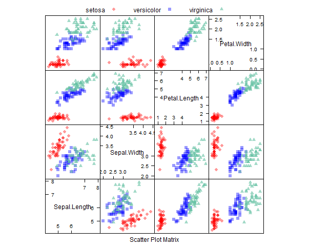
スキャッタープロット行列
library(AppliedPredictiveModeling)
transparentTheme(trans = .4)

library(caret)
featurePlot(x = iris[, 1:4],
            y = iris$Species,
            plot = "pairs",
            ## Add a key at the top
            auto.key = list(columns = 3))
スキャッタープロット行列に楕円を加えた例
featurePlot(x = iris[, 1:4],
            y = iris$Species,
            plot = "ellipse",
            ## Add a key at the top
            auto.key = list(columns = 3))
(訳注:Rが下記エラーで再現不可)
Error in grid.Call.graphics(L_downviewport, name$name, strict) :
  Viewport 'plot_01.panel.1.1.off.vp' was not found
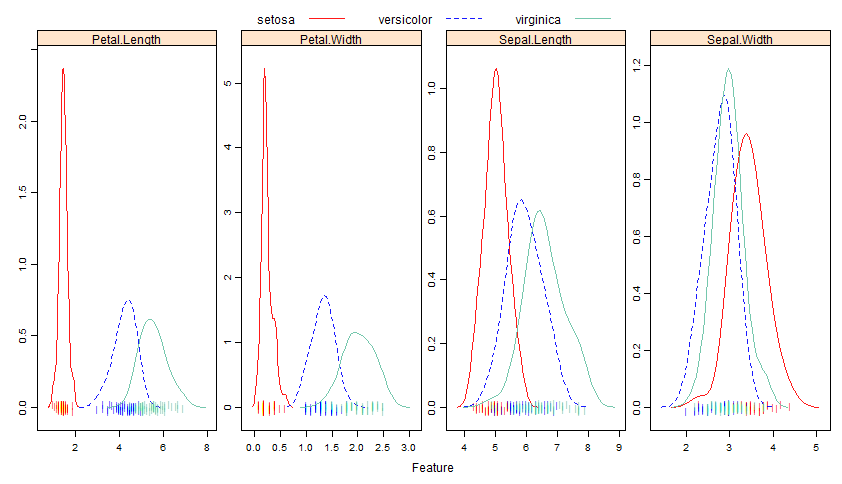
密度プロットの重ねあわせ
transparentTheme(trans = .9)
featurePlot(x = iris[, 1:4],
                  y = iris$Species,
                  plot = "density",
                  ## Pass in options to xyplot() to
                  ## make it prettier
                  scales = list(x = list(relation="free"),
                                y = list(relation="free")),
                  adjust = 1.5,
                  pch = "|",
                  layout = c(4, 1),
                  auto.key = list(columns = 3))
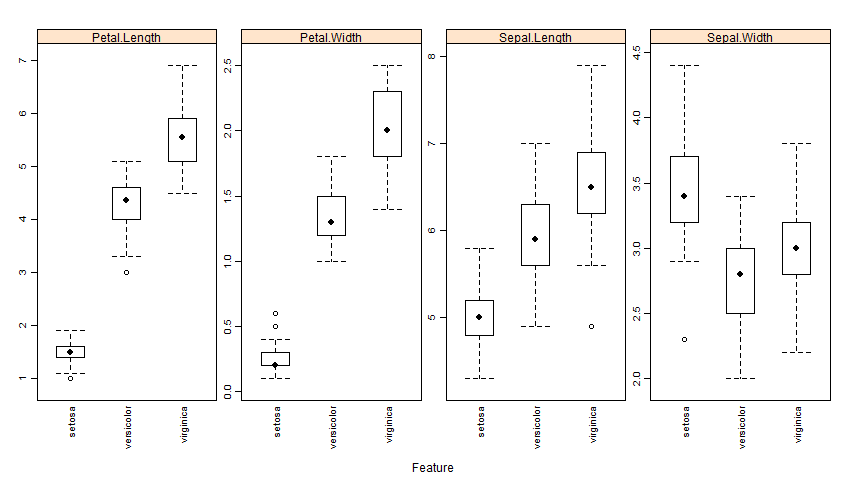
ボックスプロット
featurePlot(x = iris[, 1:4],
                  y = iris$Species,
                  plot = "box",
                  ## Pass in options to bwplot()
                  scales = list(y = list(relation="free"),
                                x = list(rot = 90)),
                  layout = c(4,1 ),
                  auto.key = list(columns = 2))
スキャッタープロット
回帰については、 Boston Housing データを用いて:
library(mlbench)
data(BostonHousing)
regVar <- c("age", "lstat", "tax")
str(BostonHousing[, regVar])

'data.frame':	506 obs. of  3 variables:
 $ age  : num  65.2 78.9 61.1 45.8 54.2 58.7 66.6 96.1 100 85.9 ...
 $ lstat: num  4.98 9.14 4.03 2.94 5.33 ...
 $ tax  : num  296 242 242 222 222 222 311 311 311 311 ...
説明変数が連続値の場合は、 featurePlot は目的変数と一緒にそれぞれの説明変数スキャッタープロットを出力します。例えば:
theme1 <- trellis.par.get()
theme1$plot.symbol$col = rgb(.2, .2, .2, .4)
theme1$plot.symbol$pch = 16
theme1$plot.line$col = rgb(1, 0, 0, .7)
theme1$plot.line$lwd <- 2
trellis.par.set(theme1)
featurePlot(x = BostonHousing[, regVar],
            y = BostonHousing$medv,
            plot = "scatter",
            layout = c(3, 1))
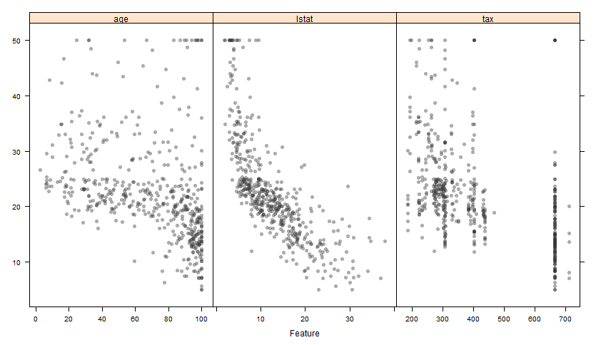
x軸のスケールが異なることに注意のこと。関数内で自動的に scales = list(y = list(relation = "free")) を実行しているのでユーザーが付け加える必要はありません。 lattice の xyplot 関数へのオプションも付与することができます。例えばスキャッタープロットに平滑化プロットを追加する場合のオプションは:
featurePlot(x = BostonHousing[, regVar],
            y = BostonHousing$medv,
            plot = "scatter",
            type = c("p", "smooth"),
            span = .5,
            layout = c(3, 1))
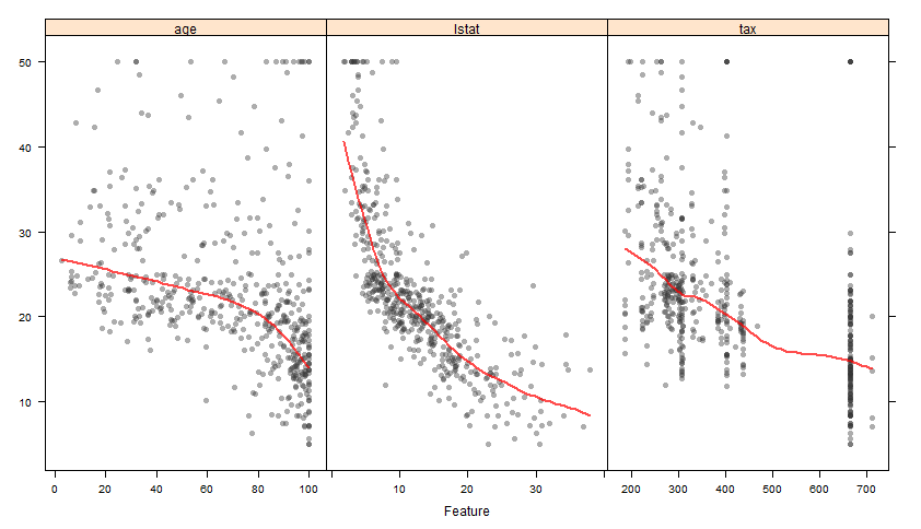
オプションの degree と span は平滑化の平滑度合いに関するものです。