レイアウトとは
レイアウトとは、GUIの配置を決めるための仕組みです。
このレイアウトを使うことによって、Androidアプリの画面を簡単に作成することができます。
Android開発においては.xmlで記述してGUIを配置していきます。
流れとしては.xmlでセットしたView部品(後述)を.javaで制御していく形になります。
レイアウトを構成する要素
画面を構成する要素(パーツ)は大きくわけて2種類あります。
- Wedget(ウィジェット)
- Layout(レイアウト)
です。これらの要素をまとめてViewといいます。
これらのViewは.javaで記載されており継承することでCustomのViewも作ることができます。
WedgetとLayoutの違いを超わかりやすく説明します。
ざっくり言うと、Layoutの中(要素)にWedgetを配置していくイメージです。
枯山水で例えると一番親要素のLayoutを「寺院」全体として、その中の小要素のレイアウトが「庭園」、さらにその中に配置される孫要素が「砂紋」や「石」です。
では、具体的にどのような種類があるか。
Wedget
- TextView
- EditText
- Button
- ImageView
- ListView
Layout
- FrameLayout
- LinearLayout
- TableLayout
- GridLayout
- RelativeLayout
以上が代表的なViewとなります。
また、先ほど言ったcustomのViewについてはこれらのViewを継承して自分の好みのViewを作っていくことを指します。
Sizeの記述
まずはViewのサイズの指定の仕方から。
WedgetであってもLayoutであってもSizeの指定方法は一緒です。まずはサイズの指定についてお話ししたいと思います。
一旦RelativeLayoutやらTextViewやらは無視してもらって...
サイズの指定は大きく分けて二通り存在します。
一つは[match_parent]や[wrap_content]を用いた指定と直接数字を指定する方法です。
matchとwrap
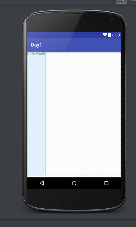
<RelativeLayout
    xmlns:android="http://schemas.android.com/apk/res/android"
    xmlns:tools="http://schemas.android.com/tools"
    android:layout_width="match_parent"
    android:layout_height="match_parent"
    android:paddingBottom="@dimen/activity_vertical_margin" tools:context=".MainActivity">

    <TextView
        android:text="@string/hello_world"
        android:layout_width="wrap_content"
        android:layout_height="wrap_content" />

</RelativeLayout>
AndroidStudioでprojectをEmptyActivityで作ると初期に書かれているlayout.xmlです。TextViewを用いて画面に"Hello world"と表示しています。
パーツごとに分解してみましょう。
    <TextView
        android:text="@string/hello_world"
        android:layout_width="wrap_content"
        android:layout_height="wrap_content" />
TextViewとは呼んで字のごとくTextを表示するためのViewです。
android:text でTextViewに表示するtextを指定します。
ここではstring.xmlのhello_worldを参照しHello worldと表示しろという命令です。
その下にある記述
android:layout_width="wrap_content"
android:layout_height="wrap_content"
では、
layout_width は Viewの横幅を指定しています。ここではwrap_contentにしろ、と言っています。
(wrap_contentについては後述)
layout_height は Viewの高さを指定しています。
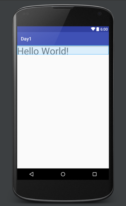
    <TextView
        android:text="@string/hello_world"
        android:layout_width="wrap_content"
        android:layout_height="match_parent" />
wrap_contentは中身を表示するのに十分なサイズを表示します。
たとえばここでは「Hello world」という文字を表示していますのでそのサイズに合わせてViewの領域を確保しています。
match_parentは親のViewと同じサイズ(最大)に表示します。
ですので今回の場合では、横を「Hello world」を十分に表示できるサイズとし、縦を画面いっぱいに表示しています。
↑こんな感じです。
数字での指定
Viewのサイズはwrapやmatchの他に数値で指定することができます。
その場合用いられるのは
- dp
- sp
- px
です。
dp
画面の密度に応じて変化する値で「比較的」相対的に用いることのできる単位です。「比較的」と含みを持たせました。基本的にはレイアウトはこれで指定するといいでしょう。
px
pxはpixelの略で絶対的な指定となります。ただし、Androidの場合は解像度がまちまちなので解像度の低い画面ではいい感じのサイズで表示されても解像度が高い画面ではめちゃくちゃ小さく表示されたりとあんまり搭乗頻度は高くないかと思われます。
sp
spは基本的にはdpと同じです。フォント向けのサイズ指定の単位なんですがユーザーがandroidOSレベルで設定しているフォントのサイズによってスケールする単位です。ぜひフォントはこれで設定してあげてください。
もっと詳しく書いてある投稿があるので今でないとしてもぜひ暇なときにご覧になってください。
いまさら聞けないdp入門
<?xml version="1.0" encoding="utf-8"?>
<RelativeLayout xmlns:android="http://schemas.android.com/apk/res/android"
    xmlns:tools="http://schemas.android.com/tools"
    android:layout_width="match_parent"
    android:layout_height="match_parent"
    tools:context="com.wacode.yuki.day1.MainActivity">

    <TextView
        android:layout_width="120dp"
        android:layout_height="40dp"
        android:text="Hello World!"
        android:textSize="40sp"/>

</RelativeLayout>
こんな感じで指定してあげます。
こんな感じで表示されます。
Layoutの記述
Layoutとは
先ほども少し触れましたがViewを並べる際にはLayoutの中にViewを記述していくことでViewを配置していきます。
Layoutは上記の通り複数個あります。Layoutの使い分けは「適材適所」です。使っていくうちに今何が適しているかわかってくるようになるでしょう。
よく用いるものはLinearLayoutとFrameLayout,RelativeLayoutです。私はあまりRelativeLayoutは使いませんが。
LinearLayout
LinearLayoutは「並べる」ことをテーマとしたLayoutです。LinearLayout内に記述された要素(ViewやLayout)を「縦」or「横」方向に並べるLayoutです。
実際のレイアウトを見てみましょう。
並べる方向を決めるのは
android:orientation
そして"horizontal","vertical"で指定します。
なお、未設定の場合はhorizontalが適用されます。
横に並べる
<?xml version="1.0" encoding="utf-8"?>
<LinearLayout
    xmlns:android="http://schemas.android.com/apk/res/android"
    xmlns:tools="http://schemas.android.com/tools"
    android:layout_width="match_parent"
    android:layout_height="match_parent"
    android:orientation="horizontal"
    tools:context="com.wacode.yuki.day1.MainActivity">

    <TextView
        android:layout_width="wrap_content"
        android:layout_height="wrap_content"
        android:text="TextView1"/>
    <TextView
        android:layout_width="wrap_content"
        android:layout_height="wrap_content"
        android:text="TextView2"/>

</LinearLayout>
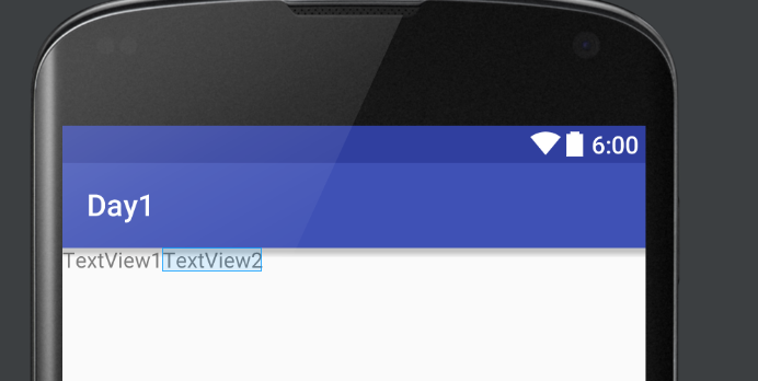
ここでは枯山水に置き換えると庭園一つ、石二つです。(もういい)
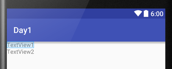
縦に並べる
orientationを"horizontal"から"vertical"に変更しますと縦になります。
<?xml version="1.0" encoding="utf-8"?>
<LinearLayout
    xmlns:android="http://schemas.android.com/apk/res/android"
    xmlns:tools="http://schemas.android.com/tools"
    android:layout_width="match_parent"
    android:layout_height="match_parent"
    android:orientation="vertical"
    tools:context="com.wacode.yuki.day1.MainActivity">

    <TextView
        android:layout_width="wrap_content"
        android:layout_height="wrap_content"
        android:text="TextView1"/>
    <TextView
        android:layout_width="wrap_content"
        android:layout_height="wrap_content"
        android:text="TextView2"/>

</LinearLayout>
FrameLayout
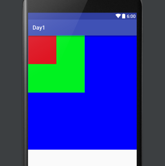
FrameLayoutはそれぞれのviewを重ねて表示する際に利用します。
これはLinearLayoutではできないのでLinearLayoutとFeameLayoutを使えばとりあえずすべてのレイアウトパターンが網羅できるわけですね。
上から順に階層ができていきます。
一番大きい青の枠を表示するviewをもし一番下に持ってきた場合他のviewは見えなくなってしまいます。
<FrameLayout
    xmlns:android="http://schemas.android.com/apk/res/android"
    xmlns:tools="http://schemas.android.com/tools"
    android:layout_width="match_parent"
    android:layout_height="match_parent"
    android:paddingBottom="@dimen/activity_vertical_margin" tools:context=".MainActivity">
    <ImageView
        android:layout_width="400dp"
        android:layout_height="400dp"
        android:background="#0000ff"/>
    <ImageView
        android:layout_width="200dp"
        android:layout_height="200dp"
        android:background="#00ff00"/>
    <ImageView
        android:layout_width="100dp"
        android:layout_height="100dp"
        android:background="#ff0000"/>
</FrameLayout>
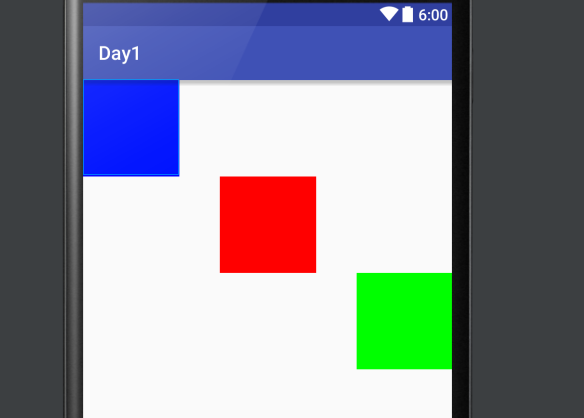
RelativeLayout
viewを相対的に配置するためのlayoutです。
<RelativeLayout
    xmlns:android="http://schemas.android.com/apk/res/android"
    xmlns:tools="http://schemas.android.com/tools"
    android:layout_width="match_parent"
    android:layout_height="match_parent"
    android:paddingBottom="@dimen/activity_vertical_margin" tools:context=".MainActivity">
    <ImageView
        android:layout_width="100dp"
        android:layout_height="100dp"
        android:background="#0000ff"
        android:id="@+id/imageView"
        android:layout_alignParentTop="true"
        android:layout_alignParentLeft="true"
        android:layout_alignParentStart="true" />
    <ImageView
        android:layout_width="100dp"
        android:layout_height="100dp"
        android:background="#00ff00"
        android:layout_below="@+id/imageView2"
        android:layout_alignParentRight="true"
        android:layout_alignParentEnd="true" />
    <ImageView
        android:layout_width="100dp"
        android:layout_height="100dp"
        android:background="#ff0000"
        android:layout_below="@+id/imageView"
        android:layout_centerHorizontal="true"
        android:id="@+id/imageView2" />
</RelativeLayout>
layout_alignParentLeft 左 親レイアウトの左側に配置します。
layout_alignParentRight 右 親レイアウトの右側に配置します。
layout_alignParentTop 上 親レイアウトの上側に配置します。
layout_alignParentBottom 下 親レイアウトの下側に配置します。
layout_centerInParent 中央 親レイアウトの中央に配置します。
layout_toLeftOf 左 指定 View の左側に配置します。
layout_toRightOf 右 指定 View の右側に配置します。
layout_above 上 指定 View の上側に配置します。
layout_below 下 指定 View 下側に配置します。
layout_alignLeft 左基準 指定 View の左位置を基準として配置します。
layout_alignRight 右基準 指定 View の右位置を基準として配置します。
layout_alignTop 上基準 指定 View の上位置を基準として配置します。
layout_alignBottom 下基準 指定 View の下位置を基準として配置します。
余白
余白は「paddding」「margin」で指定します。
一応言葉でも説明しますが実例を見たほうが理解しやすいと思います。
padding
paddingはviewの内部に余白を作ります。
margin
marginはviewの外に余白を作ります。
<?xml version="1.0" encoding="utf-8"?>
<LinearLayout xmlns:android="http://schemas.android.com/apk/res/android"
    xmlns:tools="http://schemas.android.com/tools"
    android:layout_width="match_parent"
    android:layout_height="match_parent"
    android:orientation="vertical"
    tools:context=".MainActivity">

    <TextView
        android:layout_width="match_parent"
        android:layout_height="wrap_content"
        android:background="@android:color/black"
        android:padding="10dp"
        android:textColor="@android:color/white"
        android:text="padding"/>
    <TextView
        android:layout_width="match_parent"
        android:layout_height="wrap_content"
        android:background="@android:color/black"
        android:layout_margin="10dp"
        android:textColor="@android:color/white"
        android:text="margin"/>

</LinearLayout>
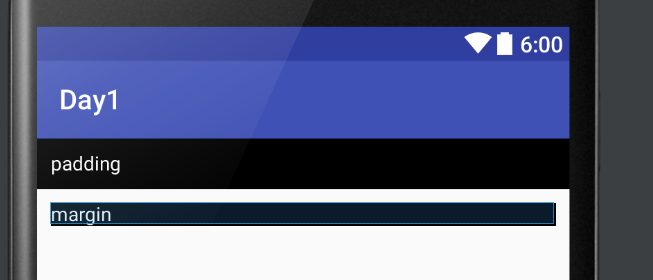
今回の場合では上のTextViewがpaddingを未指定(上下右左)に10dp設けています。
paddingは内部に余白を作るので「padding」という文字のスタートが10dp左にずれていたり上下に10dp枠があったりします。もちろん今回はわかりませんが右にも10dp枠があります。
一方で↓のTextViewではmarginを未指定(上下左右)に10dp設けていますのでTextViewの外側に10dpずつ余白が存在しています。ですのでviewのBackgroundの白が後ろに見えているわけですね。
padding,margin系の命令は以下です。
- android:padding 上下左右のpadding
- android:paddingTop 上のpadding
- android:paddingRihgt 右のpadding
- android:paddingBottom 下のpadding
- android:paddingLeft 左のpadding
- android:margin 上下左右のmargin
- android:marginTop 上のmargin
- android:marginRight 右のmargin
- android:marginBottom 下のmargin
- android:marginLeft 左のmargin
相対的な配置
画面サイズにばらつきの多いandroid OSにおいて数値での位置指定はあまり好ましくないでしょう。相対的に配置する方法がいくつかあるので紹介します。
- gravityでの指定
- weightでの指定
gravityでの指定
Gravityでの指定には二通り存在します。
読んで字のごとく(翻訳したまんま)重力の意ですのでViewそのもの、もしくはLayout内部に重力を発生させます。
android:gravity
内部の要素に重力をかけ位置を決定する
android:layout_gravity
自分自身に重力をかけ、位置を決定する。
<LinearLayout xmlns:android="http://schemas.android.com/apk/res/android"
    xmlns:tools="http://schemas.android.com/tools"
    android:layout_width="match_parent"
    android:layout_height="match_parent"
    android:orientation="vertical"
    tools:context=".MainActivity">

    <TextView
        android:layout_width="match_parent"
        android:layout_height="wrap_content"
        android:text="Hello"
        android:gravity="right"
        android:textColor="@android:color/white"
        android:background="@android:color/black"
        android:padding="30dp"/>
    <TextView
        android:layout_width="wrap_content"
        android:layout_height="wrap_content"
        android:background="@android:color/black"
        android:text="Hello"
        android:textColor="@android:color/white"
        android:layout_gravity="right"
        android:padding="30dp"/>

</LinearLayout>
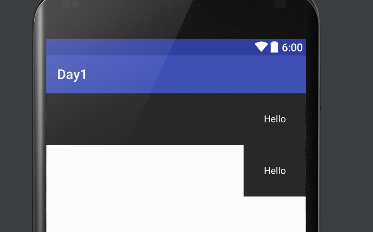
上のTextViewは「gravity ="right"」を指定しているため、Viewの内側の要素(Hello)を右に寄せています。
下のTextViewは「layout_gravity="right"」を指定しているため、LinearLayout内で要素そのもの(Helloと書かれたTextViewそのものが)右に寄っています。
これがgravityのかけ方の違いになります。
また、LinearLayout自体に「gravity="right"」を指定することで内部の要素すべてを右揃えにすることができます。
<LinearLayout xmlns:android="http://schemas.android.com/apk/res/android"
    xmlns:tools="http://schemas.android.com/tools"
    android:layout_width="match_parent"
    android:layout_height="match_parent"
    android:orientation="vertical"
    android:gravity="right"
    tools:context=".MainActivity">

    <TextView
        android:layout_width="wrap_content"
        android:layout_height="wrap_content"
        android:text="Hello"
        android:textColor="@android:color/white"
        android:background="@android:color/black"
        android:padding="30dp"/>
    <TextView
        android:layout_width="wrap_content"
        android:layout_height="wrap_content"
        android:background="@android:color/black"
        android:text="Hello"
        android:textColor="@android:color/white"
        android:padding="30dp"/>

</LinearLayout>
gravityの種類
- top
- bottom
- right
- left
- center
- center_vertical
- center_horizontal
上から説明
- viewの上部に配置
- viewの下部に配置
- viewの右側に配置
- viewの左側に配置
- viewの中央に配置
- viewの上下中央に配置
- viewの左右中央に配置
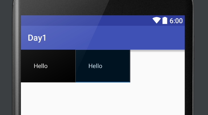
Weightでの指定
Weightは比での指定です。具体例を挙げて理解してみましょう。
<LinearLayout xmlns:android="http://schemas.android.com/apk/res/android"
    xmlns:tools="http://schemas.android.com/tools"
    android:layout_width="match_parent"
    android:layout_height="match_parent"
    android:orientation="horizontal"
    tools:context=".MainActivity">

    <TextView
        android:layout_width="0dp"
        android:layout_height="wrap_content"
        android:text="Hello"
        android:layout_weight="1"
        android:textColor="@android:color/white"
        android:background="@android:color/black"
        android:padding="30dp"/>
    <TextView
        android:layout_width="0dp"
        android:layout_height="wrap_content"
        android:background="@android:color/black"
        android:layout_weight="1"
        android:text="Hello"
        android:textColor="@android:color/white"
        android:padding="30dp"/>

</LinearLayout>
今回はLienarLayoutを横(horizontal)で指定しています。
比での指定をする際に重要なポイントは比で指定したい要素の幅を大きさ0で指定することです。
今回は横の要素同士の比を一緒にしたかったのでwidthを0dpにしています。
そして各要素にweight=1を指定してあげると以下のように要素の大きさが1:1になります。
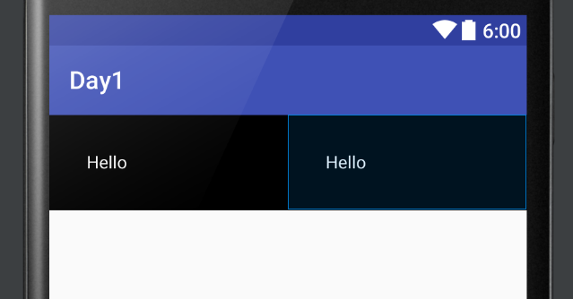
もちろん2:1 3:1も可能です。
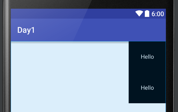
また、要素は二つなんだけど1:1:1(一つは空白)で並べたいというときはその親LayoutでweightSumを指定してあげます。
<LinearLayout xmlns:android="http://schemas.android.com/apk/res/android"
    xmlns:tools="http://schemas.android.com/tools"
    android:layout_width="match_parent"
    android:layout_height="match_parent"
    android:orientation="horizontal"
    android:weightSum="3"
    tools:context=".MainActivity">

    <TextView
        android:layout_width="0dp"
        android:layout_height="wrap_content"
        android:text="Hello"
        android:layout_weight="1"
        android:textColor="@android:color/white"
        android:background="@android:color/black"
        android:padding="30dp"/>
    <TextView
        android:layout_width="0dp"
        android:layout_height="wrap_content"
        android:background="@android:color/black"
        android:layout_weight="1"
        android:text="Hello"
        android:textColor="@android:color/white"
        android:padding="30dp"/>

</LinearLayout>
こうすることで全体の比率を3 そして要素は1と指定することができ実行結果は以下です。
1:1:1で要素が並んでいると思います。
以上のgravityとweightをうまく使うことで相対的な指定ができるようになるでしょう。