Pythonで時系列データ等を作図する際,pandasやmatplotlibを使用することになるが,データ分析モジュールpandasが,一部matplotlibの機能を取り込んでいるplot機能があり,このpandas.plotと純粋な(pure) matplotlib.plotをどのように使い分けるかを考えてみた.
pandas.plot はmatplotlibファンクションを使用して(wrapperとして)自分の機能を実現しているので,結果としてのplot図は(pandas.plotもpure matplotlibも)ほぼ同じとなることは明らかである.使い分けのポイントとしては,(主観的に)使い勝手がいいか/悪いかということであろう.
pandasは,DaraFrame構造の取扱いに優れており,折れ線のplotは,ほとんどコマンド一行で作成できる.
例として以下のデータ(pandas DataFrame class)を用意した.
In [11]: df_mkt[:10]
Out[12]:
            policy  actual       sp500
2000-01-01     5.5     NaN         NaN
2000-01-02     5.5     NaN         NaN
2000-01-03     5.5     NaN  1441.46997
2000-01-04     5.5     NaN  1441.46997
2000-01-05     5.5     NaN  1441.46997
2000-01-06     5.5     NaN  1441.46997
2000-01-07     5.5     NaN  1441.46997
2000-01-08     5.5     NaN  1441.46997
2000-01-09     5.5     NaN  1441.46997
2000-01-10     5.5     NaN  1465.15002
2000年から2014年までの米国政策金利と実効的な金利,及びS&P500 indexのデータである.これを以下のように作図する.
import numpy as np
import pandas as pd
import matplotlib.pyplot as plt

(中略)

df_mkt.plot(grid=True, figsize=(10,4), secondary_y=['sp500'])
右側軸の使用を指定する "secondary_y" オプションを使用したが,とても楽である.
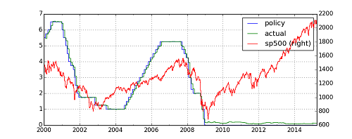
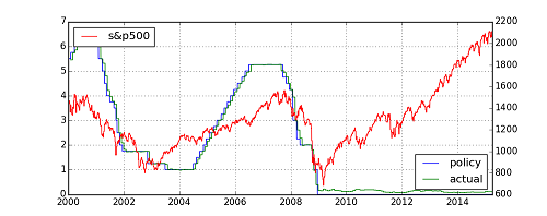
タイトルや軸ラベル等,図の装飾はまだであるが,ほぼ完成である.これをmatplotlibで描こうとすると以下のコードが必要となる.
import numpy as np
import pandas as pd
import matplotlib.pyplot as plt

(中略)

fig, ax1 = plt.subplots(figsize=(10,4))
plt.plot(df_mkt.index, df_mkt['policy'], 'b', label='policy')
plt.plot(df_mkt.index, df_mkt['actual'], 'g', label='actual')

plt.grid(True)
plt.legend(loc=4)

ax2 = ax1.twinx()
plt.plot(df_mkt.index, df_mkt['sp500'], 'r', label='s&p500')
plt.legend(loc=0)
(今回の作図では,縦軸を右側軸,左側軸と分ける指定が必要となってくる.)
一応,上のコードによる作図の結果を添付しておく.(仕上がりはほぼ同じになったが,Legendのラベルがまとまっていない.場所も”誤解”を与えるようなところに置いてしまった... 修正要.)
以上より,2つのplot機能の使用ケースおすすめは以下の通り.
-pandas DataFrame で扱った時系列データの折れ線チャート(historical line chart)を作図するケースでは,素直に pandas.plot ()を使う.
-時系列データの折れ線チャート以外,例えばscatter plot,あるいはもっと複雑なチャートを作図するケースでは, pandasのプロットではなく,素の(pureな)matplotlib作図functionを用いる.(pandas.plot がサポートしないチャートもたくさんあるので.)
参考文献
-"Python for Data Analysis": (O'reilly Media) http://shop.oreilly.com/product/0636920023784.do
-"Python for Finance": (O'reilly Media) http://shop.oreilly.com/product/0636920032441.do
-公式ドキュメント http://matplotlib.org/contents.html, http://pandas.pydata.org/pandas-docs/stable/visualization.html