iOS7 以降とYosemite になってから ヒラギノ角ゴシックにw1, w2 のウェイトが追加されたので、
CSS でHelvetica Neue とのいい感じの混植を模索。
とりあえず Yosemite だけでいい感じになるように。
.w1, .w2, .w3, .w6 { -webkit-font-smoothing: antialiased; }

.w1 {
  font-family: "HelveticaNeue-Thin", "Helvetica Neue Thin", "Helvetica Neue", ".HiraKakuInterface-W1";
  font-weight: 100;
}

.w2 {
    font-family: "HelveticaNeue-Light", "Helvetica Neue Light", "Helvetica Neue", ".HiraKakuInterface-W2";
    font-weight: 300;
}

.w3 {
  font-family: "Helvetica Neue", 'ヒラギノ角ゴ Pro W3','Hiragino Kaku Gothic Pro';
  font-weight: 400;
}

.w6 {
  font-family: "HelveticaNeue-Bold", "Helvetica Neue Bold", "Helvetica Neue", 'ヒラギノ角ゴ Pro W6','Hiragino Kaku Gothic Pro';
  font-weight: 700;
}
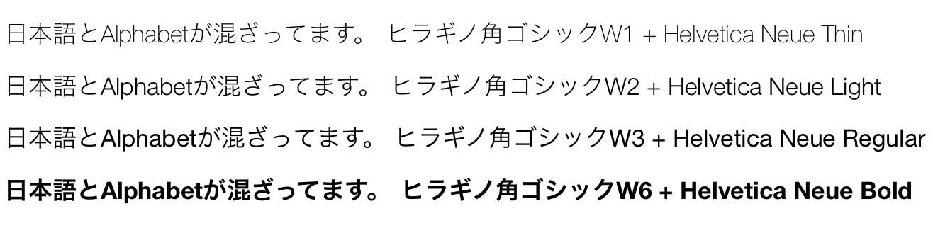
W3 + Regular がほんのちょっと…。
Helvetica Neue Medium との組み合わせほしい。(買えよ…