前回の記事(XAML+C#で簡単なタイマーを作る)では、
非常に単純なストップウォッチのような画面のアプリを作成しました。
前回の課題:通知が出ても気付けない
通知用のウィンドウを作成して最前面にどーん!と表示でも良いと思いましたが、
さすがに作業の邪魔になるのと、他の通知と統一感が無いので
Windowsのタスクバー通知を使用する事にしました。
今回はNuGetで公開されているWPF NotifyIconを使用して、
オリジナルの通知アイコンを表示できるようにしてみます。(Windows7・10で動作を確認)
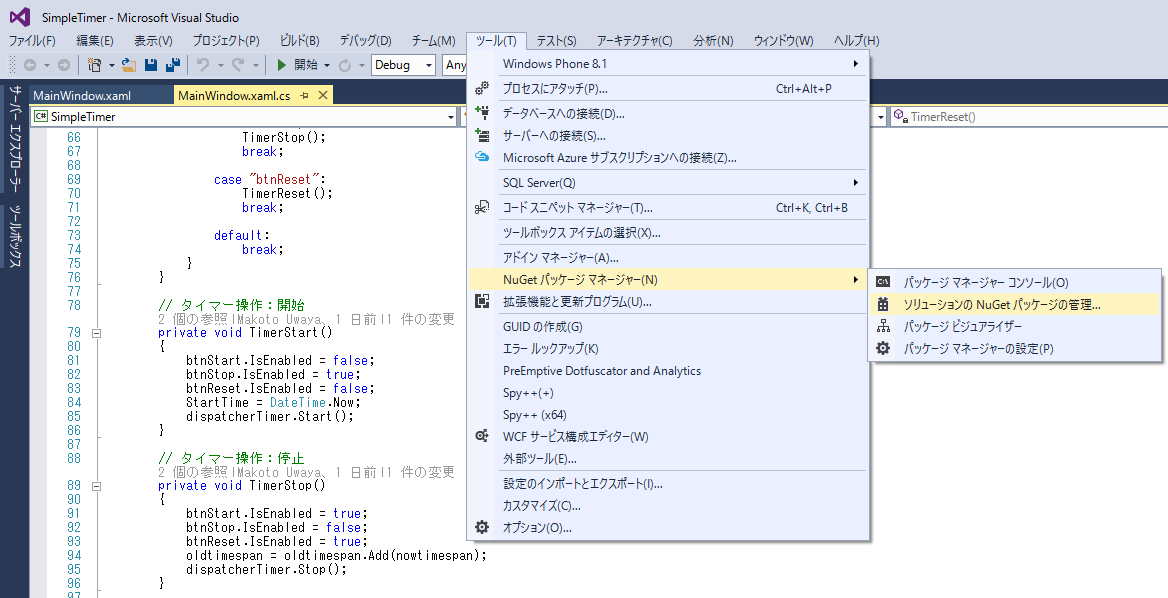
1.NuGetパッケージの追加
Visual Studio のメニューバーから、「ツール」→「NuGetパッケージマネージャー」→「ソリューションのNuGetパッケージの管理」ウィンドウを開きます。
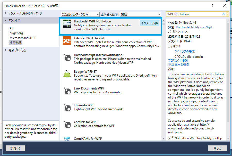
2.WPF NotifyIconのインストール
検索ウィンドウに「WPF NotifyIcon」と入力し、一番上に表示される「HardCodet WPF NotifyIcon」をインストールします。
3.サンプルダウンロード
色々な通知を試してみたい方は、サンプルをダウンロードしておきましょう。
→ Download Control & Sample Application
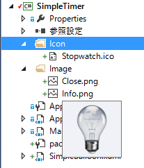
4.素材ファイルの追加
通知アイコンに表示する画像をプロジェクトに追加しておきます。
お好きな画像を使用できますので、上記のサンプルなどからコピーしたファイルをリネームして下さい。
-Icon // フォルダを新規に作成
|-Stopwatch.ico // ストップウォッチのアイコン
-Image // フォルダを新規に作成
|-Close.png // 赤背景に✖(閉じる)画像
|-Info.png // 電球画像
5.通知コントロールの作成
プロジェクトメニューで「追加」→「新しい項目」→「ユーザーコントロール(WPF)」と選択して下さい。
ファイル名を「SimpleBalloon.xaml」に変更して、作成します。
6.通知コントロールのXAML編集
SimpleBalloon.xamlの内容を以下の通り変更します。
<UserControl x:Class="SimpleTimer.SimpleBalloon"
        xmlns="http://schemas.microsoft.com/winfx/2006/xaml/presentation"
        xmlns:x="http://schemas.microsoft.com/winfx/2006/xaml"
        xmlns:tb="http://www.hardcodet.net/taskbar"
        x:Name="me"
        Height="120"
        Width="240">
    <UserControl.Resources>
        <Storyboard x:Key="FadeIn">
            <DoubleAnimationUsingKeyFrames BeginTime="00:00:00"
                                           Storyboard.TargetName="grid"
                                           Storyboard.TargetProperty="(UIElement.Opacity)">
                <SplineDoubleKeyFrame KeyTime="00:00:00"
                                      Value="0" />
                <SplineDoubleKeyFrame KeyTime="00:00:01"
                                      Value="0.95" />
                <SplineDoubleKeyFrame KeyTime="00:00:03"
                                      Value="0.95" />
            </DoubleAnimationUsingKeyFrames>
        </Storyboard>
        <Storyboard x:Key="HighlightCloseButton">
            <DoubleAnimationUsingKeyFrames BeginTime="00:00:00"
                                           Storyboard.TargetName="imgClose"
                                           Storyboard.TargetProperty="(UIElement.Opacity)">
                <SplineDoubleKeyFrame KeyTime="00:00:00"
                                      Value="0.4" />
                <SplineDoubleKeyFrame KeyTime="00:00:00.3000000"
                                      Value="1" />
            </DoubleAnimationUsingKeyFrames>
        </Storyboard>
        <Storyboard x:Key="FadeCloseButton">
            <DoubleAnimationUsingKeyFrames BeginTime="00:00:00"
                                           Storyboard.TargetName="imgClose"
                                           Storyboard.TargetProperty="(UIElement.Opacity)">
                <SplineDoubleKeyFrame KeyTime="00:00:00"
                                      Value="1" />
                <SplineDoubleKeyFrame KeyTime="00:00:00.3000000"
                                      Value="0.4" />
            </DoubleAnimationUsingKeyFrames>
        </Storyboard>
        <Storyboard x:Key="FadeBack">
            <DoubleAnimationUsingKeyFrames BeginTime="00:00:00"
                                           Storyboard.TargetName="grid"
                                           Storyboard.TargetProperty="(UIElement.Opacity)">
                <SplineDoubleKeyFrame KeyTime="00:00:00"
                                      Value="1" />
                <SplineDoubleKeyFrame KeyTime="00:00:00.3000000"
                                      Value="1" />
            </DoubleAnimationUsingKeyFrames>
        </Storyboard>
        <Storyboard x:Key="FadeOut"
                    Completed="OnFadeOutCompleted">
            <DoubleAnimationUsingKeyFrames BeginTime="00:00:00"
                                           Storyboard.TargetName="grid"
                                           Storyboard.TargetProperty="(UIElement.Opacity)">
                <SplineDoubleKeyFrame KeyTime="00:00:00"
                                      Value="1" />
                <SplineDoubleKeyFrame KeyTime="00:00:00.3000000"
                                      Value="0.2" />
            </DoubleAnimationUsingKeyFrames>
        </Storyboard>
    </UserControl.Resources>
    <UserControl.Triggers>
        <EventTrigger RoutedEvent="tb:TaskbarIcon.BalloonShowing">
            <BeginStoryboard Storyboard="{StaticResource FadeIn}"
                             x:Name="FadeIn_BeginStoryboard" />
        </EventTrigger>
        <EventTrigger RoutedEvent="Mouse.MouseEnter"
                      SourceName="imgClose">
            <BeginStoryboard Storyboard="{StaticResource HighlightCloseButton}"
                             x:Name="HighlightCloseButton_BeginStoryboard" />
        </EventTrigger>
        <EventTrigger RoutedEvent="Mouse.MouseLeave"
                      SourceName="imgClose">
            <BeginStoryboard Storyboard="{StaticResource FadeCloseButton}"
                             x:Name="FadeCloseButton_BeginStoryboard" />
        </EventTrigger>
        <EventTrigger RoutedEvent="Mouse.MouseEnter">
            <StopStoryboard BeginStoryboardName="FadeIn_BeginStoryboard" />
            <BeginStoryboard x:Name="FadeBack_BeginStoryboard1"
                             Storyboard="{StaticResource FadeBack}" />
        </EventTrigger>
        <EventTrigger RoutedEvent="tb:TaskbarIcon.BalloonClosing">
            <BeginStoryboard Storyboard="{StaticResource FadeOut}"
                             x:Name="FadeOut_BeginStoryboard" />
        </EventTrigger>
    </UserControl.Triggers>
    <Grid x:Name="grid"
          MouseEnter="grid_MouseEnter">
        <Border HorizontalAlignment="Stretch"
                Margin="5,5,5,5"
                BorderThickness="1,1,1,1"
                BorderBrush="#FF997137">
            <Border.Effect>
                <DropShadowEffect Color="#FF747474" />
            </Border.Effect>
            <Border.Background>
                <LinearGradientBrush EndPoint="0.5,1"
                                     StartPoint="0.5,0">
                    <GradientStop Color="#FF4B4B4B"
                                  Offset="0" />
                    <GradientStop Color="#FF8F8F8F"
                                  Offset="1" />
                </LinearGradientBrush>
            </Border.Background>
        </Border>
        <Image HorizontalAlignment="Left"
               Margin="0,10,0,0"
               Width="72"
               Source="/Image/Info.png"
               Stretch="Fill"
               Height="72"
               VerticalAlignment="Top" />
        <TextBlock Margin="72,49.2,10,0"
                   VerticalAlignment="Top"
                   Foreground="#FFECAD25"
                   TextWrapping="Wrap">
            <Run Text="{Binding Path=BalloonBody, ElementName=me, Mode=Default}" />
        </TextBlock>
        <Path Fill="#FFFFFFFF"
              Stretch="Fill"
              Margin="72,38.2,34,0"
              VerticalAlignment="Top"
              Height="1"
              Data="M26,107 L220.04123,107"
              SnapsToDevicePixels="True">
            <Path.Stroke>
                <LinearGradientBrush EndPoint="0.973,0.5"
                                     StartPoint="0.005,0.5">
                    <GradientStop Color="#00ECAD25"
                                  Offset="1" />
                    <GradientStop Color="#87ECAD25"
                                  Offset="0" />
                </LinearGradientBrush>
            </Path.Stroke>
        </Path>
        <TextBlock Margin="72,10,10,0"
                   VerticalAlignment="Top"
                   Height="23.2"
                   Text="{Binding Path=BalloonText, ElementName=me, Mode=Default}"
                   TextWrapping="Wrap"
                   Foreground="#FFECAD25"
                   FontWeight="Bold" />
        <Image HorizontalAlignment="Right"
               Margin="0,10,10,0"
               VerticalAlignment="Top"
               Width="16"
               Height="16"
               Source="/Image/Close.png"
               Stretch="Fill"
               Opacity="0.4"
               ToolTip="Close Balloon"
               x:Name="imgClose"
               MouseDown="imgClose_MouseDown" />

    </Grid>
</UserControl>
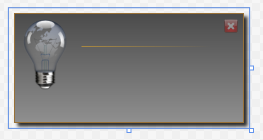
プレビューウィンドウが下記の画像のように変わっていると思います。
XAMLの内容について、ざっくり解説です。
-
UserControl.Resources
スタイルやアニメーションの指定を記述します。
HTMLの<head>セクションでCSSを読み込むイメージに近いです。(XAMLのコントロール=HTMLのDOM)
上記サンプルではアニメーションに関する指定のみ記述されていますね。
ここでは割愛しますが、BlendでStoryboardを編集するとアニメーションの挙動を変えられます。 -
UserControl.Triggers
SourceNameで対象オブジェクトを指定し、RoutedEventでイベントハンドラ
(BalloonShowingMouseEnterなど)を指定してイベントトリガーを定義しています。
-
Grid
画像*2(電球と✖)、水平線、テキストボックス*2のコントロールを配置しています。
7.通知コントロールのビハインドコード編集
SimpleBalloon.xamlのビハインド(SimpleBalloon.xaml.cs)についても、以下の通り変更します。
using Hardcodet.Wpf.TaskbarNotification;
using System;
using System.Windows;
using System.Windows.Controls;
using System.Windows.Controls.Primitives;
using System.Windows.Input;

namespace SimpleTimer
{
    public partial class SimpleBalloon : UserControl
    {
        private bool isClosing = false;

        public static readonly DependencyProperty BalloonTextProperty =
                DependencyProperty.Register("BalloonText",
                typeof(string),
                typeof(SimpleBalloon),
                new FrameworkPropertyMetadata(""));

        public static readonly DependencyProperty BalloonBodyProperty =
                DependencyProperty.Register("BalloonBody",
                typeof(string),
                typeof(SimpleBalloon),
                new FrameworkPropertyMetadata(""));

        public string BalloonText
        {
            get { return (string)GetValue(BalloonTextProperty); }
            set { SetValue(BalloonTextProperty, value); }
        }

        public string BalloonBody
        {
            get { return (string)GetValue(BalloonBodyProperty); }
            set { SetValue(BalloonBodyProperty, value); }
        }

        /// <summary>
        /// コンストラクタ
        /// </summary>
        public SimpleBalloon()
        {
            InitializeComponent();
            TaskbarIcon.AddBalloonClosingHandler(this, OnBalloonClosing);
        }

        private void OnBalloonClosing(object sender, RoutedEventArgs e)
        {
            e.Handled = true;
            isClosing = true;
        }

        private void imgClose_MouseDown(object sender, MouseButtonEventArgs e)
        {
            TaskbarIcon taskbarIcon = TaskbarIcon.GetParentTaskbarIcon(this);
            taskbarIcon.CloseBalloon();
        }

        private void grid_MouseEnter(object sender, MouseEventArgs e)
        {
            if (isClosing) return;
            TaskbarIcon taskbarIcon = TaskbarIcon.GetParentTaskbarIcon(this);
            taskbarIcon.ResetBalloonCloseTimer();
        }

        private void OnFadeOutCompleted(object sender, EventArgs e)
        {
            Popup pp = (Popup)Parent;
            pp.IsOpen = false;
        }
    }
}
こちらも内容について、ざっくり解説です。
-
バインド用に
BalloonTextBalloonBodyの2つのプロパティを宣言しています。
starticでDependencyPropertyを宣言しないとバインドできないのがポイントですね。
DependencyPropertyの変数名は[プロパティ名] + Propertyにします。 -
後はコンストラクタで
Closingイベントを追加して、先ほどXAMLで定義したイベントに
対応するメソッドが続きます。
8.タイマーウィンドウに通知アイコンを追加
下記のコードをタイマーのXAMLに追加します。
<!-- <window>要素に追記 -->
xmlns:tb="http://www.hardcodet.net/taskbar"
Icon="/Icon/Stopwatch.ico"

<Window x:Class="SimpleTimer.MainWindow"
        xmlns="http://schemas.microsoft.com/winfx/2006/xaml/presentation"
        xmlns:x="http://schemas.microsoft.com/winfx/2006/xaml"
        xmlns:tb="http://www.hardcodet.net/taskbar"
        Title="StopWatch"  Height="195" Width="369" ResizeMode="CanMinimize" Icon="/Icon/Stopwatch.ico">

<!-- <Grid>に追加 -->
<tb:TaskbarIcon
 x:Name="MyNotifyIcon"
  IconSource="/Icon/Stopwatch.ico"
  ToolTipText="Simple Timer Balloon" />
9.タイマーウィンドウのビハインドコードを変更
下記のコードを追加します。
private void showBalloon()
{
  SimpleBalloon balloon = new SimpleBalloon();

  balloon.BalloonText = String.Format("{0}秒経過しました。",TimeLimit);
  balloon.BalloonBody = "ダウンロードを開始できます。";

  MyNotifyIcon.ShowCustomBalloon(balloon, PopupAnimation.Slide, 10000);
}

// dispatcherTimer_Tickメソッドのif文に追記
showBalloon();
showBalloonメソッドを作成して、メッセージボックスの変わりに表示するようにします。
showBalloonメソッドでは、SimpleBalloonのインスタンスを生成した後、
表示メッセージを指定して、ShowCustomBalloonメソッドで通知を表示します。
10.完成、、、と今後の課題
以上でタイマーウィンドウが非アクティブでも、通知が表示されるようになりました。
通知コントロールのデザインやアニメーションを編集して、遊んで頂けたらと思います。
次回は通知アイコン表示に合わせて音声ファイルを再生してみます。
これまでWinForms onlyだった私には、データバインドの応用とBlendの操作(主にアニメーション)が今後の課題です。。。
XAML(WPF)とBlend関係の良い教則本がありましたら教えてください~。
ソースコードはこちら→GitHub