Pythonを使ったデータサイエンティストになるための修行です。
ここではPythonデータ解析の3種の神器、Matplotlibをやります。
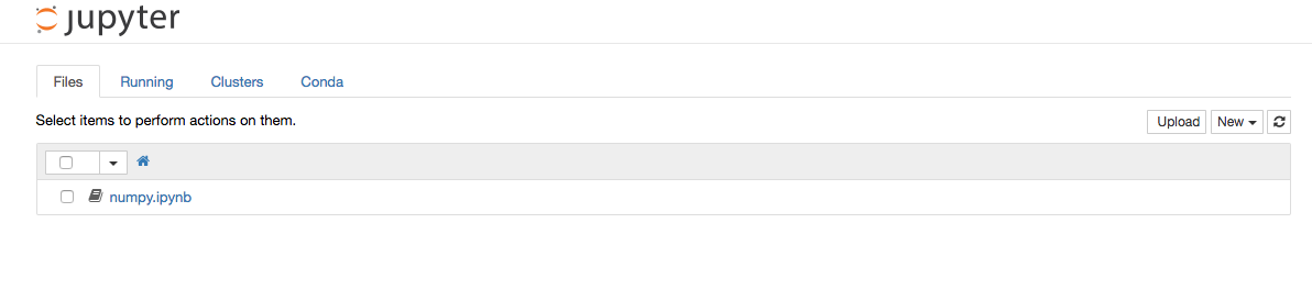
いままでのPythonの実行はなんでも良かったのですが、これからはipython notebookを使っていきます。
PREV →【Python】蛇使いへの道 (4) Numpyを手なずける
NEXT →【Python】蛇使いへの道 (6) Pandasを操る
IPython Notebook
IPythonはpython shellよりも高性能なインタラクティブシェルです。
これをブラウザ上で実行できるようにしたものが IPython Notebook になります。
コードの実行、編集、保存がGUIでできるため、Python 初心者にもオススメです。
また、MatplotlibやPandasなどの主要ライブラリとの連携が取れているので、出力を画像として埋め込むことができます。
以下のコマンドで起動できます。
IPython NotebookはAnacondaに含まれているのですでにインストールされているはずです。
起動に成功すると自動でブラウザが立ち上がります。
$ ipython notebook
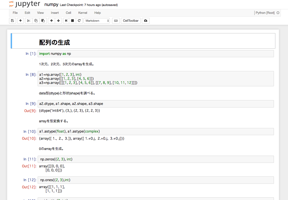
起動するとこんな感じです。
右の[New] > [Notebooks] > [Python]を選択すると新しいNotebookが作成されます。
Notebookを開いたら好きなようにコードを書くことができます。
Markdownでコメントを書くこともできます。
上の再生マークを押すか、shift + enterで実行できます。
Matplotlib
グラフの書き方
まずはmattplotlibのpyplotをpltとしてインポートします。
これは定型的な書き方です。
%matplotlib inlineはIPython Notebookでmatplotlibのグラフをインラインで表示させるために必要です。
import matplotlib.pyplot as plt
%matplotlib inline
とりあえず適当なグラフを描画してみましょう。
plt.plot([1, 3, 2, 4])
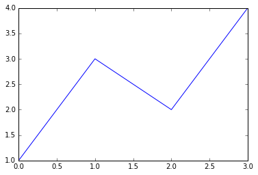
こんな感じでインラインで表示できます。
次はsin波とcos波を書いてみます。
import numpy as np
from math import pi
# 0から2πまで100分割したarrayを生成
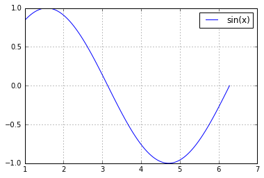
x = np.linspace(1, 2*pi, 100)
y = np.sin(x)
plt.plot(x, y)
# グリッド線を描画
plt.grid()
# ラベルを描画
plt.legend(['sin(x)'])
複数のLine
%pylabと入力するとnumpyやmatplotlibなどがすでにインポートされた状態になります。
%pylab
複数のLineを描画するにはplot(x1, y1); plot(x2, y2)のように分けるか、plot(x1,y1,x2,y2)のように一つにまとめてplotします。
xが共通ならyはnp.arrayが使える。
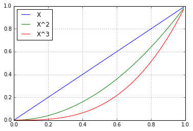
# 0から1まで0.01刻みでarrayを生成
x  = arange(0, 1, 0.01)
# 3つの1D arrayを縦に積んで2D arrayを作る
a1 = vstack((x, x**2, x**3)); a1
# 転置して描画する
plot(x, a1.T)
grid()
legend('X X^2 X^3'.split(), loc='best')
ファイルへの出力
上記の図をファイルに出力する。
savefig('lines.png')
!をつければシェルのコマンドも使えます。
>>> !ls *.png
lines.png
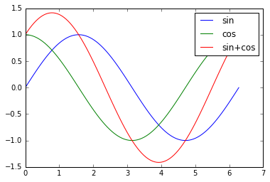
Object明示方式
これまで説明したようにObjectを明示しなくてもMatplotlibは利用できますが、複数のグラフやLineを操作する場合はこれらのObjectを明示的に操作するほうが良いです。
x = linspace(0, 2*pi, 100)
figure1 = gcf()
axis1 = gca()

line1, line2, = axis1.plot(x, sin(x), x, cos(x))
line3, = axis1.plot(x, sin(x)+cos(x))
axis1.legend([line1, line2, line3], ['sin', 'cos', 'sin+cos'])
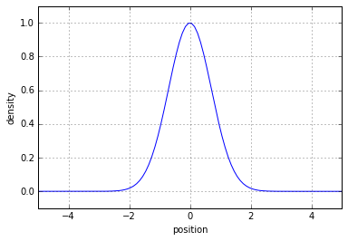
軸の設定
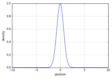
x = linspace(-10, 10, 200)
y = exp(-x ** 2)
plot(x, y)
grid()
# x軸のラベルを書く
xlabel('position')
# y軸のラベルを書く
ylabel('density')
plot(x, y)
# 自動設定された軸の範囲を調べる
xmin, xmax, ymin, ymax = gca().axis()
# 軸の範囲を調整して少し見やすくする
xlim([xmin*0.5, xmax*0.5])
ylim([ymin-0.1, ymax+0.1])
grid()
xlabel('position')
ylabel('density')
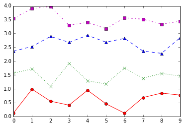
Line style
線の色や形を変えることができます。
from numpy.random import random


for i, style in enumerate(['r-o', 'g:x', 'b--^', 'm-.s']):
    plot(random(10)+i, style)
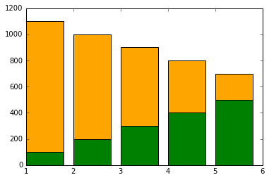
棒グラフ
left = np.array([1, 2, 3, 4, 5])
height1 = np.array([100, 200, 300, 400, 500])
height2 = np.array([1000, 800, 600, 400, 200])
p1 = plt.bar(left, height1, color="green")
p2 = plt.bar(left, height2, bottom=height1, color="orange")
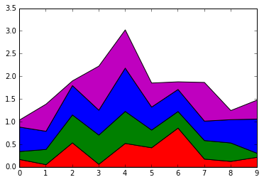
積み上げグラフ
a1 = random((4,10))
x = range(10)
colors = list('rgbm')
stackplot(x, a1, colors=colors)
bars=[bar([0], [0], color=color) for color in colors]
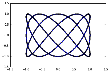
散布図
直交座標での散布図(scatter graph)
t = linspace(0, 2*pi, 1000)  # 角度
x = sin(3*t)
y = cos(5*t)
scatter(x, y, s=10)  # sは点の大きさ
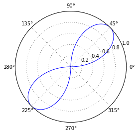
極座標でのグラフ
r = sin(2*t)
polar(t, r)
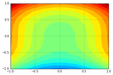
等高線
z(x,y)=x^2+y^3
の色分けした等高線を描画する。
x1 = y1 = linspace(-1, 1, 10)
x, y = meshgrid(x1, y1)
z = x**2 + y**3
n = linspace(-2, 2, 20)  # 等高線密度
contourf(x, y, z, n) # z軸が色で表現される
grid()
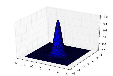
3Dグラフ
# 3D用にモジュールをインポートします
from mpl_toolkits.mplot3d import Axes3D

figure1 = gcf()
axis1 = Axes3D(figure1)
x1 = y1 = linspace(-5, 5, 50)
x, y = meshgrid(x1, y1)
z = exp(-(x**2 + y**2))
axis1.plot_surface(x, y, z, rstride=1, cstride=2)