■はじめに
今回は、システムカラーの一覧を2種類のレイアウトで表示してみます。
複数のコントロールに共通のスタイルを適用する方法もやります。
キーワード:SystemColors, TabControl, ScrollViewer, WrapPanel, Style, region
[注意]
これまでの回で説明済みの操作方法等は、説明を省略したり簡略化している場合があります。
■開発環境
- Windows 10
- Visual Studio Community 2015 Update 3
- .NET Framework 4.x
■作ってみる
◇TabControl
ツールボックスから「TabControl」を画面デザイナのGridにドラッグ&ドロップします。
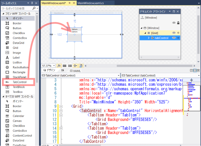
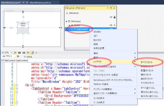
ドキュメントアウトラインでTabControlを右クリックし、「レイアウト」 - 「すべてリセット」を選択します。
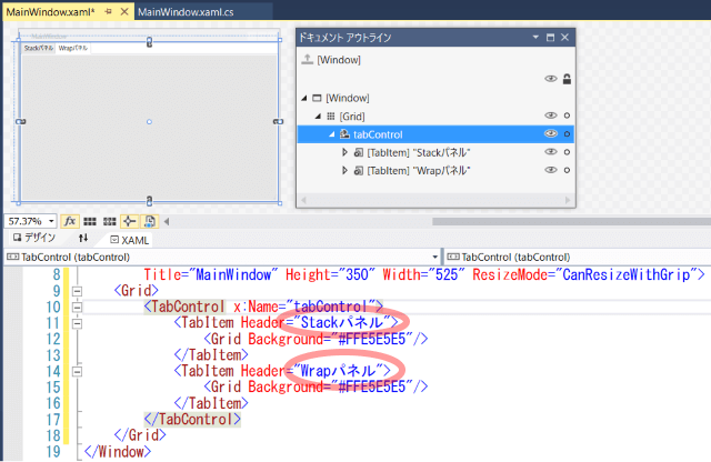
TabItemのHeaderプロパティをStackパネル、Wrapパネルに書き換えます。
これはタブのテキスト部分になります。
WindowのResizeModeをCanResizeWithGripに設定します。
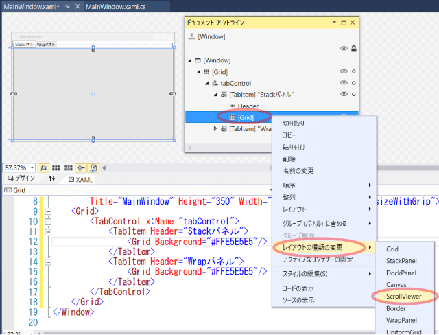
◇ScrollViewer
1つ目のタブの中にあるGridを右クリックし、「レイアウトの種類の変更」 - 「ScrollViewr」を選択します。
ScrollViewerの上にStackPanelをドラッグ&ドロップします。
更にそのStackPanelの上にTextBlockをドラッグ&ドロップします。
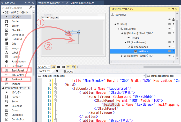
TabControl同様、StackPanelのサイズもリセットしてください。
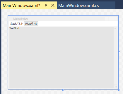
画面デザイナ上ではこのように表示されるはずです。
ScrollViewrを使うことで、画面に表示しきれないほどコントロールがある場合、スクロールして表示できるようになります。
◇WrapPanel
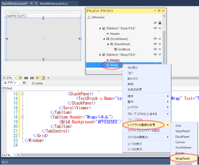
次にもう一つのタブの方を編集していきます。
Gridを右クリックし、「レイアウトの種類の変更」 - 「WrapPanel」を選択します。
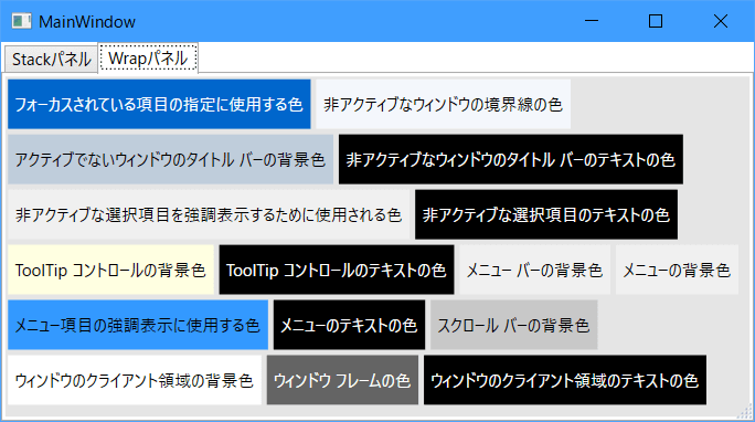
(ScrollViewerを使わない場合)画面からあふれたコントロールは表示されないStackPanelとは違い、WrapPanelはあふれそうになったら次の行または列に配置しようとします。
このコントロールもOrientationプロパティがあって縦並び・横並びを選択できます。
サンプルでは既定値の横並び(Horizontal)のままで使用します。
同じようにTextBlockを配置します。
ここまででXamlのコンテンツは以下のようになっているはずです。
<Grid>
    <TabControl x:Name="tabControl">
        <TabItem Header="Stackパネル">
            <ScrollViewer Background="#FFE5E5E5">
                <StackPanel>
                    <TextBlock x:Name="textBlock" TextWrapping="Wrap" Text="TextBlock"/>
                </StackPanel>
            </ScrollViewer>
        </TabItem>
        <TabItem Header="Wrapパネル">
            <WrapPanel Background="#FFE5E5E5">
                <TextBlock x:Name="textBlock1" TextWrapping="Wrap" Text="TextBlock"/>
            </WrapPanel>
        </TabItem>
    </TabControl>
</Grid>
◇SystemColors
1つ目のタブ内のTextBlockからx:Name, TextWrappingを削除し、
プロパティウィンドウの「ブラシ」カテゴリ、Backgroundプロパティを選択、一番右端の「ブラシリソース」タブを選択、「システムBrushリソース」の一覧から適当に何か選択します。
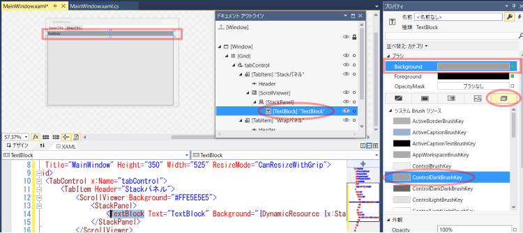
そうすると、以下のような感じでBackgroundプロパティが設定されます。
<TextBlock Text="TextBlock" Background="{DynamicResource {x:Static SystemColors.ControlDarkBrushKey}}"/>
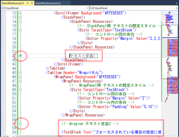
TextBlockの上下を#region~#endregionで挟みます。
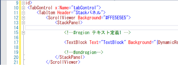
このTextBlock定義を元に編集・コピペしながら以下のように入力します。
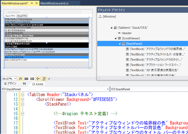
<StackPanel>
    <!--#region テキスト定義1 -->

    <TextBlock Text="アクティブなウィンドウの境界線の色" Background="{DynamicResource {x:Static SystemColors.ActiveBorderBrushKey}}"/>
    <TextBlock Text="アクティブなタイトルバーの背景色" Background="{DynamicResource {x:Static SystemColors.ActiveCaptionBrushKey}}"/>
    <TextBlock Text="アクティブなウィンドウのタイトル バーのテキストの色" Background="{DynamicResource {x:Static SystemColors.ActiveCaptionTextBrushKey}}" Foreground="White"/>
    <TextBlock Text="アプリケーション ワークスペースの色" Background="{DynamicResource {x:Static SystemColors.AppWorkspaceBrushKey}}"/>
    <TextBlock Text="3D 表示要素の表面の色" Background="{DynamicResource {x:Static SystemColors.ControlBrushKey}}"/>
    <TextBlock Text="3D 表示要素の影の色" Background="{DynamicResource {x:Static SystemColors.ControlDarkBrushKey}}"/>
    <TextBlock Text="3 次元表示要素の暗いシャドウの色" Background="{DynamicResource {x:Static SystemColors.ControlDarkDarkBrushKey}}" Foreground="White"/>
    <TextBlock Text="3 次元の表示要素のライト色" Background="{DynamicResource {x:Static SystemColors.ControlLightBrushKey}}"/>
    <TextBlock Text="3 次元表示要素の強調表示の色" Background="{DynamicResource {x:Static SystemColors.ControlLightLightBrushKey}}"/>
    <TextBlock Text="3 次元表示要素のテキストの色" Background="{DynamicResource {x:Static SystemColors.ControlTextBrushKey}}" Foreground="White"/>
    <TextBlock Text="デスクトップの色" Background="{DynamicResource {x:Static SystemColors.DesktopBrushKey}}" Foreground="White"/>
    <TextBlock Text="アクティブなウィンドウのタイトル バーのグラデーションの右側の色" Background="{DynamicResource {x:Static SystemColors.GradientActiveCaptionBrushKey}}"/>
    <TextBlock Text="非アクティブなウィンドウのタイトル バーのグラデーションの右側の色" Background="{DynamicResource {x:Static SystemColors.GradientInactiveCaptionBrushKey}}"/>
    <TextBlock Text="使用できないテキストの色" Background="{DynamicResource {x:Static SystemColors.GrayTextBrushKey}}" Foreground="White"/>
    <TextBlock Text="選択した項目の背景色" Background="{DynamicResource {x:Static SystemColors.HighlightBrushKey}}"/>
    <TextBlock Text="選択した項目のテキストの色" Background="{DynamicResource {x:Static SystemColors.HighlightTextBrushKey}}"/>

    <!--#endregion-->
</StackPanel>
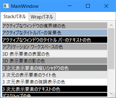
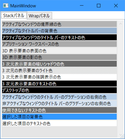
画面デザイナではこのように表示されます。
※システムで設定された色を表示しているので、ご利用の環境によってはこの通りの色にならない可能性があります。
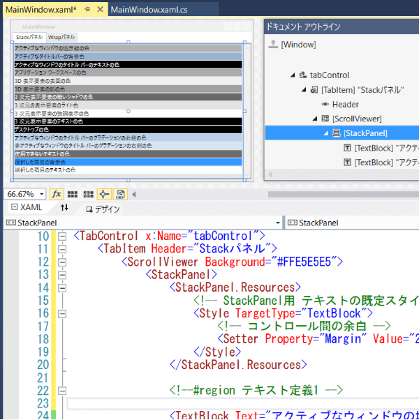
◇共通スタイルの設定
HTMLで使うCSSのように、複数の項目に一括で設定を適用しましょう。
1つ目のタブ内のStackPanelの中にStackPanel.Resourcesタグを入力し、その中にStyleタグを定義します。
<StackPanel>
    <StackPanel.Resources>
        <!-- StackPanel用 テキストの既定スタイル -->
        <Style TargetType="TextBlock">
            <!-- コントロール間の余白 -->
            <Setter Property="Margin" Value="2,2,2,0"/>
        </Style>
    </StackPanel.Resources>
    :
    :
TargetTypeに適用対象のコントロールの型を、Propertyに設定するプロパティ名、Valueに設定値を指定します。
※Marginプロパティの指定方法のバリエーションは、 こちらの記事 参照。
これでこのStackPanel内にあるTextBlockにMarginプロパティが一括で設定され、テキスト間に少し余白が空きました。
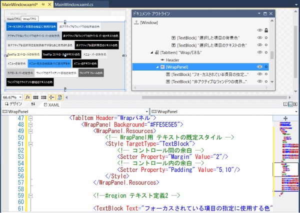
2つ目のタブも同じ感じで以下のように入力します。
<TabItem Header="Wrapパネル">
<WrapPanel Background="#FFE5E5E5">
<WrapPanel.Resources>
<!-- WrapPanel用 テキストの既定スタイル -->
<Style TargetType="TextBlock">
<!-- コントロール間の余白 -->
<Setter Property="Margin" Value="2"/>
<!-- コントロール内の余白 -->
<Setter Property="Padding" Value="5,10"/>
</Style>
</WrapPanel.Resources>
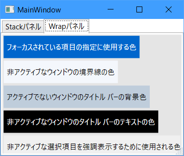
<!--#region テキスト定義2 -->
<TextBlock Text="フォーカスされている項目の指定に使用する色" Background="{DynamicResource {x:Static SystemColors.HotTrackBrushKey}}" Foreground="White"/>
<TextBlock Text="非アクティブなウィンドウの境界線の色" Background="{DynamicResource {x:Static SystemColors.InactiveBorderBrushKey}}"/>
<TextBlock Text="アクティブでないウィンドウのタイトル バーの背景色" Background="{DynamicResource {x:Static SystemColors.InactiveCaptionBrushKey}}"/>
<TextBlock Text="非アクティブなウィンドウのタイトル バーのテキストの色" Background="{DynamicResource {x:Static SystemColors.InactiveCaptionTextBrushKey}}" Foreground="White"/>
<TextBlock Text="非アクティブな選択項目を強調表示するために使用される色" Background="{DynamicResource {x:Static SystemColors.InactiveSelectionHighlightBrushKey}}"/>
<TextBlock Text="非アクティブな選択項目のテキストの色" Background="{DynamicResource {x:Static SystemColors.InactiveSelectionHighlightTextBrushKey}}" Foreground="White"/>
<TextBlock Text="ToolTip コントロールの背景色" Background="{DynamicResource {x:Static SystemColors.InfoBrushKey}}"/>
<TextBlock Text="ToolTip コントロールのテキストの色" Background="{DynamicResource {x:Static SystemColors.InfoTextBrushKey}}" Foreground="White"/>
<TextBlock Text="メニュー バーの背景色" Background="{DynamicResource {x:Static SystemColors.MenuBarBrushKey}}"/>
<TextBlock Text="メニューの背景色" Background="{DynamicResource {x:Static SystemColors.MenuBrushKey}}"/>
<TextBlock Text="メニュー項目の強調表示に使用する色" Background="{DynamicResource {x:Static SystemColors.MenuHighlightBrushKey}}"/>
<TextBlock Text="メニューのテキストの色" Background="{DynamicResource {x:Static SystemColors.MenuTextBrushKey}}" Foreground="White"/>
<TextBlock Text="スクロール バーの背景色" Background="{DynamicResource {x:Static SystemColors.ScrollBarBrushKey}}"/>
<TextBlock Text="ウィンドウのクライアント領域の背景色" Background="{DynamicResource {x:Static SystemColors.WindowBrushKey}}"/>
<TextBlock Text="ウィンドウ フレームの色" Background="{DynamicResource {x:Static SystemColors.WindowFrameBrushKey}}" Foreground="White"/>
<TextBlock Text="ウィンドウのクライアント領域のテキストの色" Background="{DynamicResource {x:Static SystemColors.WindowTextBrushKey}}" Foreground="White"/>
<!--#endregion -->
</WrapPanel>
</TabItem>
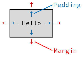
今度はMarginの他にPaddingプロパティもスタイルに設定しています。
Paddingはコントロールの中の余白です。指定方法はMarginと同じです。
スタイルを画面全体で利用したい場合、
Window.Resourcesタグを作って、その中にスタイルを定義します。
<Window x:Class="XXXXXXX.XXXXXX"
        :
        :>
    <Window.Resources>
        <!-- 画面内共通スタイル -->
        <Style xxxx>
            :
        </Style>
    </Window.Resources>

    <Grid>
        :
    </Grid>
</Window>
複数の画面で使うような全体的なスタイルは、
App.xaml内のApplication.Resourcesの中に定義します。
◇regionによる折り畳み
regionコメントで囲まれた範囲は、左端の[-]をクリックすることで折り畳むことができます。
開始タグ~終了タグとは別の単位でまとめたい場合など、うまく使うとXamlの見通しが良くなります。
■動かしてみる
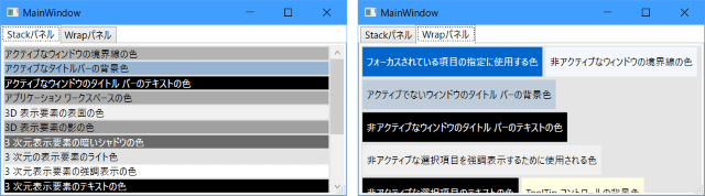
まずは「Stackパネル」タブの内容。
スクロールバーが表示されています。
画面を縦に伸ばして全部表示するとスクロールバーが無効表示になりました。
「Wrapパネル」タブを選択します。
画面の横幅を広げてみると、上から順に右に向かって配置されていき、入らない場合は次の行に配置されるのがわかります。
おしまい