地球惑星科学の研究などをやっていると、1つの図に複数の地図とデータを同時にプロットしたいという場面にしばしば遭遇する。
試しに今回は、Pythonのmatplotlibを用いて、
- 1〜12月の1ヶ月毎の2次元データ(全球の海面水温データ)を地図とともに同時に1つの図にプロットする
ことを目標とする。
1. 複数の地図を同時にプロット
コード
import matplotlib.pyplot as plt
import numpy as np
from mpl_toolkits.basemap import Basemap

xlim = [100, 170]			# 図の範囲(x軸方向:経度)
ylim = [10, 60]				# 図の範囲(y軸方向:緯度)
column = 3					# 列の数
fsizex, fsizey= 16, 18		# 図の横・縦の長さ
line_interval = 15			# 地図上に描く緯線・経線の間隔
fontsize = 20				# 文字サイズ

if 12 % column != 0:
    raise ValueError('column must be a divisor of 12!')

row = 12 / column			# 行の数
months =  [ 'Jan',  'Feb',  'Mar',  'Apr',
            'May',  'Jun',  'Jul',  'Aug',
            'Sep',  'Oct',  'Nov',  'Dec' ]

fig = plt.figure(figsize = (fsizex, fsizey))
plt.rcParams['font.size'] = fontsize

ax = [0] * 12
for i in range(0, 12):
    ax[i] = fig.add_subplot(row, column, 1 + i)
    m = Basemap(projection = 'cyl', llcrnrlat = ylim[0], urcrnrlat = ylim[1], \
                llcrnrlon = xlim[0], urcrnrlon = xlim[1], resolution = 'c', lon_0 = 180)
    m.drawcoastlines(linewidth = 0.5)
    m.drawmapboundary()
    m.fillcontinents(color = '#eeeeee')
    if i == 12 - column:
        label = [1, 1]
    elif i > 12 - column:
        label = [1, 0]
    elif i % column == 0:
        label = [0, 1]
    else:
        label = [0, 0]

    m.drawmeridians(np.arange(0, 360, line_interval), labels = [0, 0, 0, label[0]], linewidth = 0.5)
    m.drawparallels(np.arange(-90, 90, line_interval), labels = [label[1], 0, 0, 0], linewidth = 0.5)
    ax[i].set_xlim(xlim)
    ax[i].set_ylim(ylim)
    ax[i].set_title(months[i])

fig.tight_layout()
plt.show()
図

2. 複数の地図とデータを同時にプロット
下準備
各月でプロットするのが2次元データである場合、12ヶ月のそれぞれのデータを一つの3次元配列にまとめておく。
xn = 360			# データのx軸(経度)方向のグリッド数
yn = 155            # データのy軸(緯度)方向のグリッド数
data = np.zeros((12, yn, xn))
for i in range(0, 12):
	data[i, :, :] = .....  # (i+1)月のデータを取得する処理
また、その2次元データのx軸(経度)とy軸(緯度)に対応する1次元配列を取得しておく。今回はそれぞれ、
- xgrid
- ygrid
とする(いずれもnumpy.ndarray)。
コード
import matplotlib.pyplot as plt
import numpy as np
from mpl_toolkits.basemap import Basemap

xlim = [100, 170]			# 図の範囲(x軸方向:経度)
ylim = [10, 60]				# 図の範囲(y軸方向:緯度)
column = 3					# 列の数
fsizex, fsizey= 16, 18		# 図の横・縦の長さ
cb_min, cb_max = -2, 32     # カラーバーの最小値・最大値
cb_div = 17					# カラーバーで使う色の数
clabel = 'Sea Surface Temperature(deg)' # カラーバーにつけるラベル
line_interval = 15						# 地図上に描く緯線・経線の間隔
fontsize = 20							# 文字サイズ

if 12 % column != 0:
    raise ValueError('column must be a divisor of 12!')

row = 12 / column			# 行の数
months =  [ 'Jan',  'Feb',  'Mar',  'Apr',
            'May',  'Jun',  'Jul',  'Aug',
            'Sep',  'Oct',  'Nov',  'Dec' ]

fig = plt.figure(figsize = (fsizex, fsizey))
plt.rcParams['font.size'] = fontsize

delta = (cb_max - cb_min) / cb_div
interval_of_cf = np.arange(cb_min, abs(cb_max) * 2 + delta, delta)[0:int(cb_div) + 1]

ax = [0] * 12
for i in range(0, 12):
    ax[i] = fig.add_subplot(row, column, 1 + i)
    m = Basemap(projection = 'cyl', llcrnrlat = ylim[0], urcrnrlat = ylim[1], \
                llcrnrlon = xlim[0], urcrnrlon = xlim[1], resolution = 'c', lon_0 = 180)
    m.drawcoastlines(linewidth = 0.5)
    m.drawmapboundary()
    m.fillcontinents(color = '#eeeeee')
    if i == 12 - column:
        label = [1, 1]
    elif i > 12 - column:
        label = [1, 0]
    elif i % column == 0:
        label = [0, 1]
    else:
        label = [0, 0]

    m.drawmeridians(np.arange(0, 360, line_interval), labels = [0, 0, 0, label[0]], linewidth = 0.5)
    m.drawparallels(np.arange(-90, 90, line_interval), labels = [label[1], 0, 0, 0], linewidth = 0.5)

    # カラーコンターを描く
    x, y = np.meshgrid(xgrid, ygrid)
    X, Y = m(x, y)
    CF = ax[i].contourf(X, Y, data[i, :, :], interval_of_cf)

    ax[i].set_xlim(xlim)
    ax[i].set_ylim(ylim)
    ax[i].set_title(months[i])

# カラーバーを描く
cax = fig.add_axes([1.00, 0.15, 0.04, 0.7])
cb = fig.colorbar(CF, cax)
cb.set_label(clabel)

fig.tight_layout()
plt.show()
図
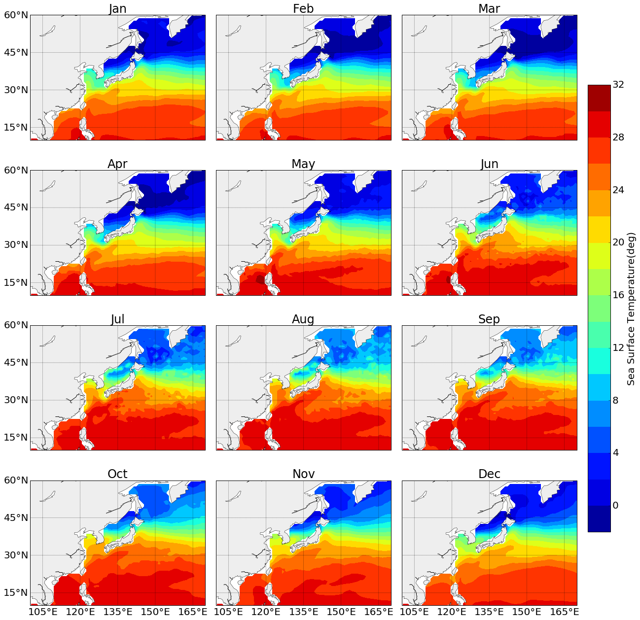
無事作成することに成功。
縦×横の組み合わせは、columnの値を変えることで自由に変更することが出来る。
参考URL
http://seesaawiki.jp/met-python/d/matplotlib/plot
http://bicycle1885.hatenablog.com/entry/2014/02/14/023734
http://nm-player.blogspot.jp/2012/09/matplotlibbasemap-1.html
http://qiita.com/AnchorBlues/items/0dd1499196670fdf1c46