こんな感じです。
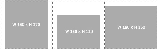
わかりやすくするために親要素の li に点線を指定しています。
商品画像を下揃えで表示したいときに使えると思います。
記述は下記です。
<!DOCTYPE html>
<html>
<head>
<meta charset="utf-8">
<title>不揃いな画像たちを中央下揃えに表示する</title>
<style>
/* リストのスタイルや無駄な余白を消すために記述
---------------------------------- */
.abc li {
	margin:0;
	padding:0;
	list-style:none;
	float:left;
	border:1px dotted #666;
}

/* 中央下揃えに関するスタイル
---------------------------------- */
.abc li {
	width:180px; /* 表示する画像の最大横幅を指定 */
	height:170px; /* 表示する画像の最大縦幅を指定 */
	position:relative;
}
.abc img {
	position:absolute;
	left:0;
	right:0;
	bottom:0;
	margin:auto;
}
</style>
</head>
<body>

<ul class="abc">
	<li><img src="01.jpg" width="150" height="170" alt=""></li>
	<li><img src="02.jpg" width="150" height="120" alt=""></li>
	<li><img src="03.jpg" width="180" height="150" alt=""></li>
</ul>


</body>
</html>
親要素の li に画像の最大サイズを指定しないといけないのが、うーん...という感じです。
コメントの display バージョン、flex バージョンもお楽しみください。