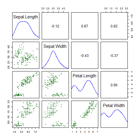
R言語で散布図行列を書くサンプルプログラムです。
右上に相関係数、対角線はヒストグラムの代わりに確立密度を書いています。
05_Liner_regression_by_lm.R
#-------Making data------------------------------
data_iris<-iris

#-----------Draw Scatterplot Matrix Function------------------------------------
ScatterplotMatrix <- function(DataMatrix) {
  panel.cor<-function(x,y,digits=2,prefix="",cex.cor,...){
    usr<-par("usr")
    on.exit(par(usr))
    par(usr=c(0,1,0,1))
    #r<-abs(cor(x,y,use="complete.obs"))
    r<-cor(x, y)
    txt<-format(c(r,0.123456789),digits=2)[1]
    if(missing(cex.cor))
      cex.cor<-0.8/strwidth(txt)
    text(0.5,0.5,txt,cex=1.5)
  }

  #Set histogram panel
  panel.hist.density<-function(x,...) {
    usr <- par("usr")
    on.exit(par(usr))
    par(usr = c(usr[1:2], 0, 1.5) )
    h <- hist(x, plot = FALSE)
    breaks <- h$breaks
    nB <- length(breaks)
    y <- h$counts
    y <- y/max(y)

    #draw histgram
    #rect(breaks[-nB],0,breaks[-1],y,col="green",...)

    #draw density
    tryd <- try( d <- density(x,na.rm=TRUE,bw="nrd",adjust=1.2),silent=TRUE)
    if(class(tryd) != "try-error") {
      d$y <- d$y/max(d$y)
      lines(d,col="blue",lwd=1.5)
    }
  }


  #Set lower panel
  panel.lower <- function(x, y, ...){
    points(x, y, pch = 20, col = "darkgreen")
  }

  pairs(DataMatrix,upper.panel=panel.cor,diag.panel=panel.hist.density,lower.panel=panel.lower)

  return
}

png("06_output.png") #Open device
ScatterplotMatrix(data_iris[,1:4])
dev.off() #Close device
結果